Lift Interactive

Lift Interactive

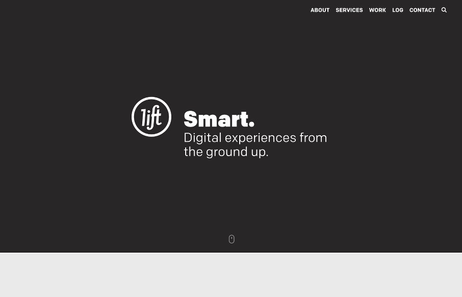
Love it when we get a chance to review sites a second (and third time) like Lift Interactive out of Edmonton. They’ve made another good one here. Like the mix of text treatments, b/w background images / color images / flat color illustrations. It all seems to work as you go down the page. Also like the non-uniform card / block design on the Work page – still in grid, but gives some depth.


@liftinteractive
We’ve reviewed Lift Interactive a couple times in years past.

https://unmatchedstyle.com/gallery/liftinteractive-com.php
https://unmatchedstyle.com/gallery/lift-interactive.php

alt screenshot:

 

Lift Interactive


Love it when we get a chance to review sites a second (and third time) like Lift Interactive out of Edmonton. They’ve made another good one here. Like the mix of text treatments, b/w background images / color images / flat color illustrations. It all seems to work as you go down the page. Also like the non-uniform card / block design on the Work page – still in grid, but gives some depth.


@liftinteractive
We’ve reviewed Lift Interactive a couple times in years past.

https://unmatchedstyle.com/gallery/liftinteractive-com.php
https://unmatchedstyle.com/gallery/lift-interactive.php

alt screenshot:

 

Lift Interactive


Kinsta

0 Comments

Submit a Comment

Your email address will not be published. Required fields are marked *

Time limit exceeded. Please complete the captcha once again.

News & Articles

Fitts’s Law: Why the Easy Button Wins

Fitts’s Law: Why the Easy Button Wins

Large, close targets are faster to hit than small, distant ones, that’s Fitts’s Law. A look at the 1954 rule behind buttons, prime and magic pixels, thumb zones, and dark patterns.

The Call to Action, Revisited

The Call to Action, Revisited

The Call to Action hasn’t changed in a decade, but the bar has. A fresh look at prominence, copy, mobile tap targets, and accessibility, with lessons from three major design systems.


