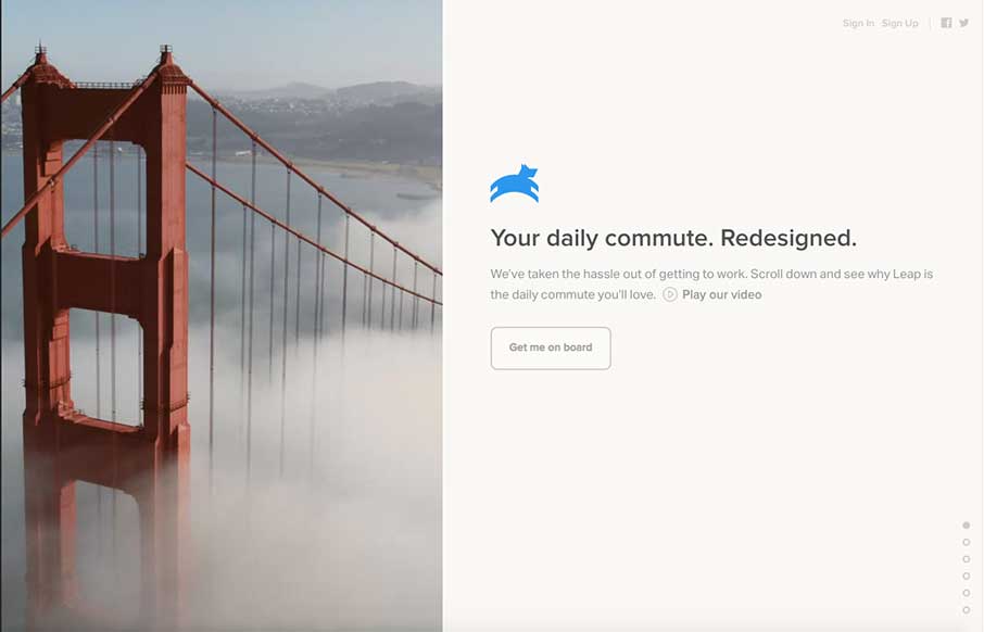
I’m going to assume that the initial pitch for Leap was “It’s like Uber – for buses.” I drive daily now, but when we lived in Sydney – I would have paid extra for this service since my commute was 45 minutes from the CBD to North Ryde where I was going to school. The site is light with a small video background and filtered images – that run perfectly with the copy – they give users a direct route to get on board…the bus… and the app… I kill me.


The Call to Action, Revisited
The Call to Action hasn’t changed in a decade, but the bar has. A fresh look at prominence, copy, mobile tap targets, and accessibility, with lessons from three major design systems.


0 Comments