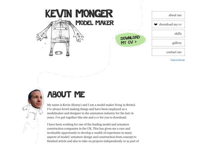
The overall implementation of this website isn’t spectacular but the work and illustrations used on it are. It’s clever and perfectly fits for the context of this portfolio site. I love the work too, really neat.
The overall implementation of this website isn’t spectacular but the work and illustrations used on it are. It’s clever and perfectly fits for the context of this portfolio site. I love the work too, really neat.


The Call to Action hasn’t changed in a decade, but the bar has. A fresh look at prominence, copy, mobile tap targets, and accessibility, with lessons from three major design systems.

Glassmorphism brings transparency, depth, and light back into modern UI. Learn how this “frosted glass” design trend enhances hierarchy, focus, and atmosphere, plus how to implement it in CSS responsibly.

Brutalism in web design rejects perfection for authenticity. Stark grids, raw type, and honest structure create interfaces that feel human, intentional, and impossible to ignore. Break the rules, on purpose.
I’m always a sucker for hand drawn illustration. I love this site becuase of it. Nice use of color as well to really highlight important elements.