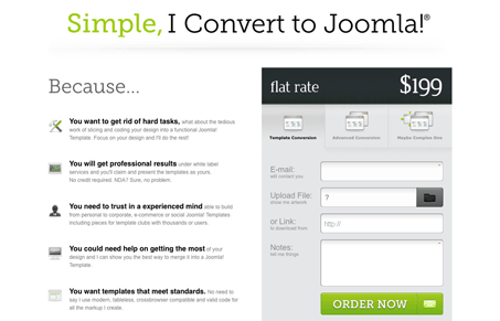
This site is in here just for the form on the page. Don’t get me wrong, I like the rest of the page design, it’s nicely done. But the form has a lot of intricacies that deserve some attention. The mouse overs are well done and placed for the different service levels, they also act as form select options. The file upload form element is also cleverly designed. Really great looking form, study it…


Hi Gene, thanks for the inclusion. I know it isn’t a stunning design but that’s secondary.
I wanted to build a different form and I was there, offering peculiar ways to show info like the tabs or upload file option. Did you also notice the “send to friend” option next to order now? I encourage you to click on it and see how it works 🙂
Thanks again 🙂
Oh that’s cool, the mad-libs format. Neato man. Usability wise though, I missed it since that part of the button just looks like the same overall submit button.
Great form work man!
I supposed that would be a problem. As you say it looks like the same button, my fault. Perhaps will change it in next revision.
Thanks for your comments.