Hell’o Baby

http://hell-o-baby.com

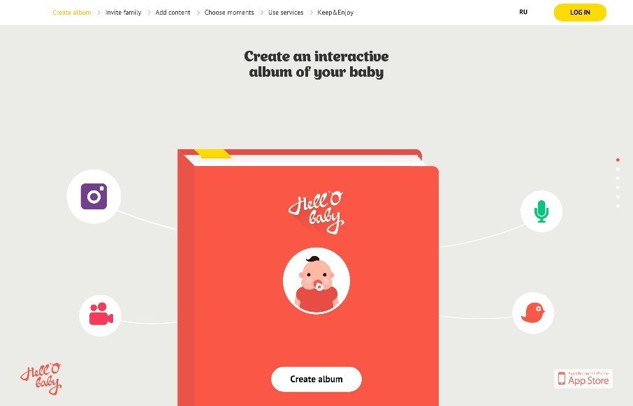
I wasn’t a fan of this app product page for Hell’o Baby at first. When we have a site submitted to us, we immediately check for responsiveness by pulling the browser left and right, checking for how the site resizes. Hell’o Baby at the iPhone view on desktop, not so good – but on an actual iPhone – very good. After I realized that, I went back and looked at the site again – fun illustration and icons – really playing to their audience (moms and/or really hip dads). the features of the app itself are really cool too (as someone who has three kids, and have been over-documenting their every step for 10 years…).


From the Designer: Interactive cross-platform baby album with additional services: measurements, stickers, video stories, printed albums, postcards

Submitted by: Vitaliy Urban
Twitter: @v_urban
Role: Designer

1 Comment

Submit a Comment

Your email address will not be published. Required fields are marked *

News & Articles

Sign-Up: Enhancing Conversions through good UX

Sign-Up: Enhancing Conversions through good UX

Optimize your website’s sign-up process by focusing on clarity, ease, and user mindset. Clearly explain the purpose, benefits, and steps, and use social proof to build trust and drive conversions.

The Essential Guide to Getting Started on Freelance Writing

The Essential Guide to Getting Started on Freelance Writing

Explore the lucrative and fulfilling world of freelance writing with our essential guide. Learn about specialties like blogging, social media, article, and technical writing. Build a portfolio, find work, set up your business, and discover the potential earnings. Embrace the freedom of working from home and follow tips for success in your dream career.