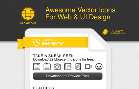
Aside from being some really nifty icons, this one page site is great. I love this layout, with the overall shape containing the content being really just a big page icon. The colors work well together and the overall simple nature of the artwork and type choice really make it a nice experience.


0 Comments