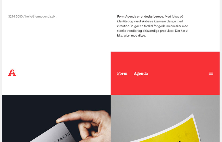
Super non-traditional looking layout for the Form Agenda website. It does everything right IMHO. I like the contact info in the top left – instead of a logo. Very clever. Then the rest of the grid is very active and keeps it fresh feeling as you scroll down the page. Bravo.


The Call to Action, Revisited
The Call to Action hasn’t changed in a decade, but the bar has. A fresh look at prominence, copy, mobile tap targets, and accessibility, with lessons from three major design systems.


0 Comments