by Gene Crawford | Jul 25, 2016 | Gallery
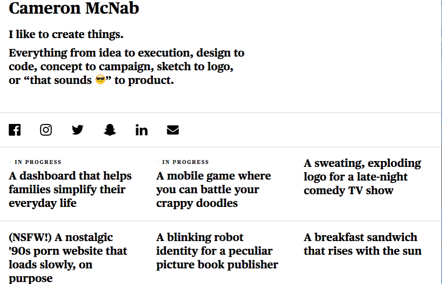
Not much to the site technically but this personal site for Cameron McNab is actually pretty cool. Minimal in it’s design approach but cool in it’s color shift affect. Pretty nifty idea. From the Designer: A simple take on my personal portfolio. Fully...
by Gene Crawford | May 19, 2016 | Gallery, Portfolio
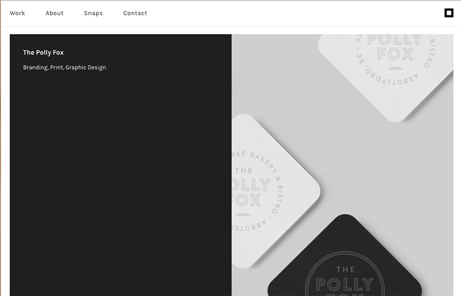
I love this simple portfolio site for David Arias. It’s simple yet impactful design like this that gets me going. I love the interaction that’s in place on each work sample and the way the work just slides up into the header area as you scroll just gives...

by Gene Crawford | Feb 9, 2016 | Fashion, Gallery
Nice flat areas for the make up of this layout. They have a masonry type effect on them as well as you resize the browser. Clever. I love the way the images are different sizes and stuff as you scroll down too, keeps it feeling dynamic. From the Designer:...
by Gene Crawford | Nov 5, 2015 | Gallery
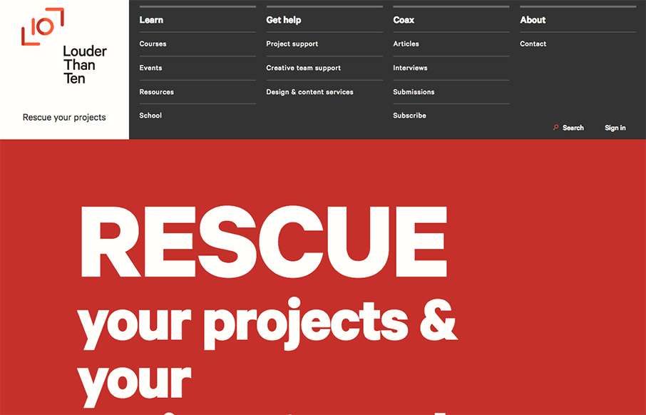
Louder than Ten, the digital home of Rachel and Travis Gertz, is a wonderfully designed approach to a digital services company website. I love the thoughtfully placed main navigation, including it’s transformation on smaller screen widths, and the large and easy...

by Gene Crawford | Sep 21, 2015 | Gallery
Nice use of images and supporting graphical elements. The flowers and website element colors match up with the photography really well, that’s not easy to get done. I like the way it scrolls rhythm wise as well as slight parallax scroll on the header...