by Gene Crawford | Jan 18, 2024 | Gallery, Product
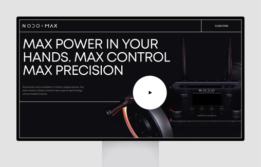
The dynamic promo page brings the emotion of the brand forward while emphasizing product benefits.

by Gene Crawford | Jan 12, 2024 | Gallery, Product
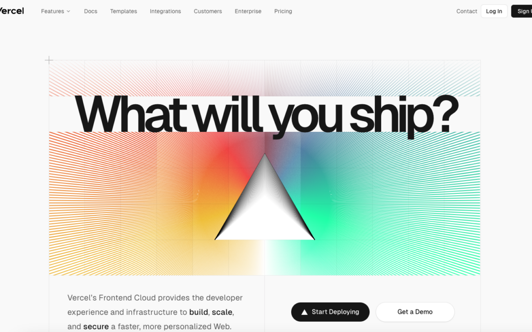
I love the simple elements used in this design. Keeps everything clean and straightforward for the user. Some clever grid usage as you scroll down drives home a solid layout. Good stuff here.

by Gene Crawford | Jan 11, 2024 | Gallery, Product
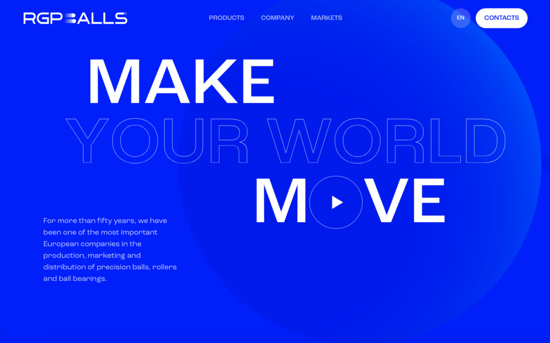
There is some neat stuff going on with this website. It feels overly “engineering” and has solid grid work and monochromatic coloring. I love the hover effect of going from blue to b&w color photos in the section selector area. The subtle animations...

by Gene Crawford | Jan 9, 2024 | Gallery, Product
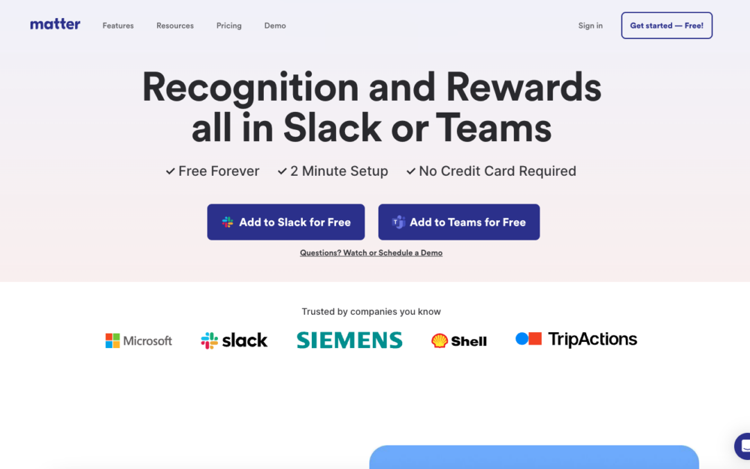
At first glance it’s just a straight forward, minimal-ish looking product website. When you study it, it is a class in minimalism; keeping things easy to understand, telling the story of the product and getting you hooked with clean and classy illustration work....

by Gene Crawford | Dec 26, 2023 | Gallery, Product
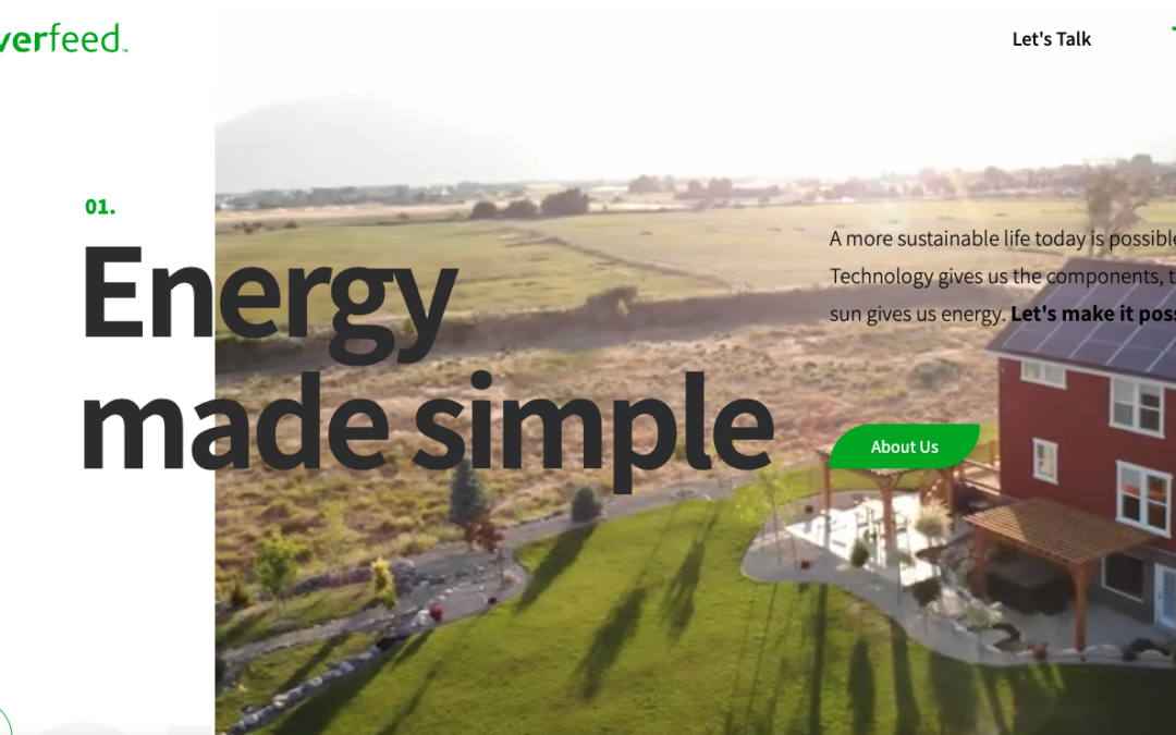
Ever Feed is a typical product-focused website, but it uses HTML5 to stand out. It introduces the company’s services, engages visitors, and boosts conversions. It offers a captivating storytelling experience with animations and interactive elements, all while...

by Gene Crawford | Dec 15, 2023 | Design Firm, Gallery, Product
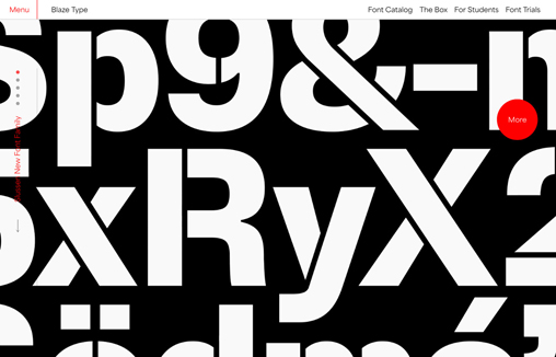
Blaze Type is an independent type foundry designing retail and custom fonts for blazing hot projects.This website is our 2.0 version of the foundry release of 2017
