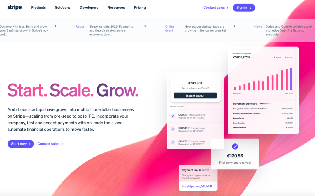
by Gene Crawford | Apr 2, 2024 | Gallery, Marketing, Product
Holy cow what a super detailed design for Stripe Startups. Now this isn’t the most trendy, over the top, designer portfolio style design but if you are a UX professional you’ll just love to pick this one apart. Dig into it with the video...
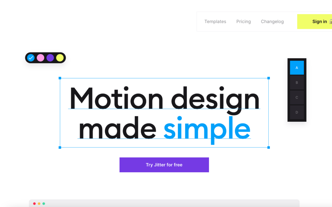
by Gene Crawford | Mar 29, 2024 | Gallery, Product
Very cool interactions. Well, it kinda has to have it, yeah? Lolz. Seriously though this is a fun one to scroll down the page on. Check it out.
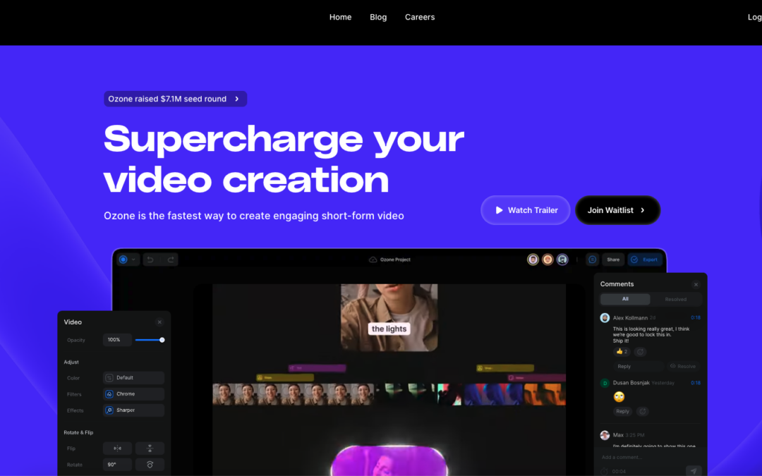
by Gene Crawford | Mar 26, 2024 | Gallery, Product
Super cool interactions and scrolling sections. I dig this as a ‘coming soon’ website too, it’s engaging. Something that we often forget to deliver for people who visit our...
by Gene Crawford | Mar 22, 2024 | Gallery, Product
I dig the soft/thin lines and screen captures. This app website has a look & feel that’s unique but understated. Love it.
by Gene Crawford | Mar 20, 2024 | Gallery, Product
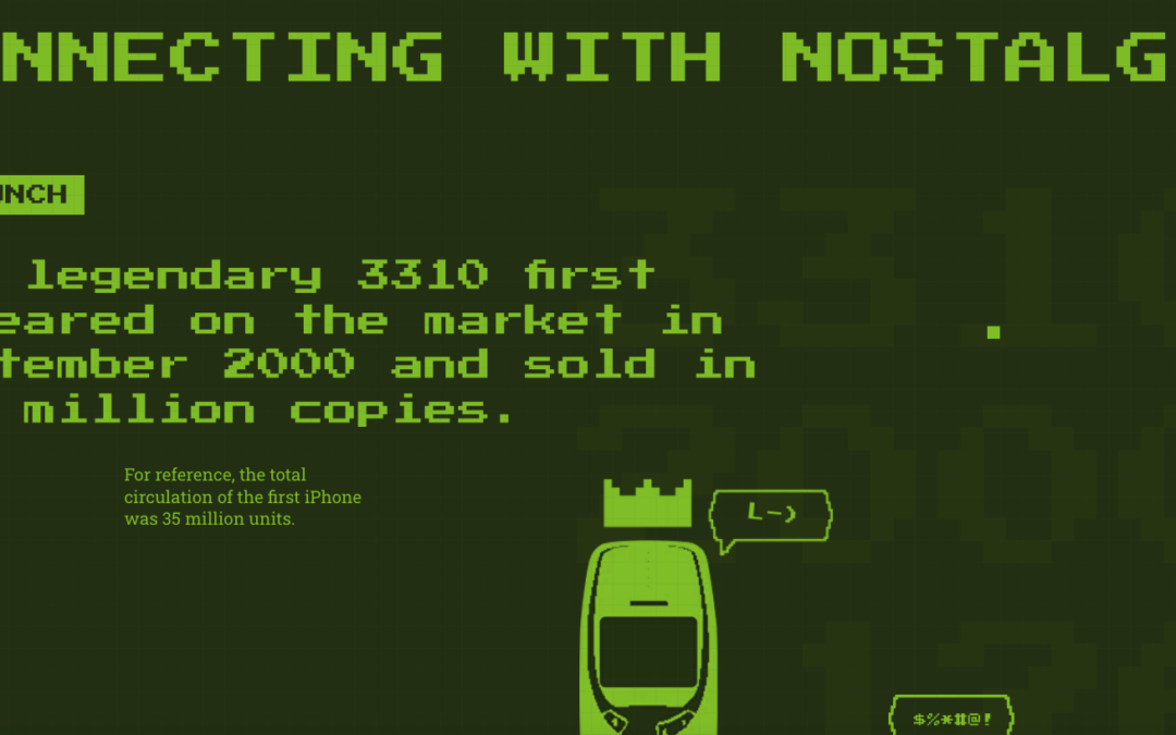
The legendary 3310 first appeared on the market in September 2000 and sold in 126 million copies. This website is a testament to that indestructible piece of history. 🙂 Also, this website is quite fun.

by Gene Crawford | Mar 19, 2024 | Gallery, Product, Screencast Review
Very cool animation and scrolling triggered animations. It’s one of the first i’ve seen that make sense to the page’s concept. Making it tie together with the copy is smart and makes me...