
by Gene Crawford | May 9, 2012 | Education, Gallery
Awesome concept and beautiful execution of this website. The responsive design details are nice and worth a study. I particularly like the fixed header and the “contact” link interaction. The signup page is also very nicely done. A super clean and minimal...

by Gene Crawford | May 9, 2012 | Gallery
Really nice announcement website design for pixelivery.com. It has just enough info to entice you and the interactions with the scrolling links and responsive design are cool – which is what this needs to get you interested. Me. want. Shirts. Too!

by Giovanni DiFeterici | May 9, 2012 | Gallery
This beautiful site takes full advantage of responsive design to deliver a compelling visual experience at every resolution. The massive imagery is nicely offset by asymmetrical text and bold, hard-lined shapes. In my humble opinion, stry.us seems to look best at...

by Gene Crawford | May 8, 2012 | Gallery
A lovely responsive site for a non-profit that looks equally lovely: givecloaks.com /via @hotmeteor— Responsive Design (@RWD) April 23, 2012 A great idea and an interesting solution to a real problem. The website quickly tells the story of what this is about and...

by Gene Crawford | May 8, 2012 | Gallery
The Editorial WordPress template sales page is very effective. The main header image is really the only image on the page and it’s used as sort of a collage to show off the template at work and further sell the idea that’s it’s designed for...
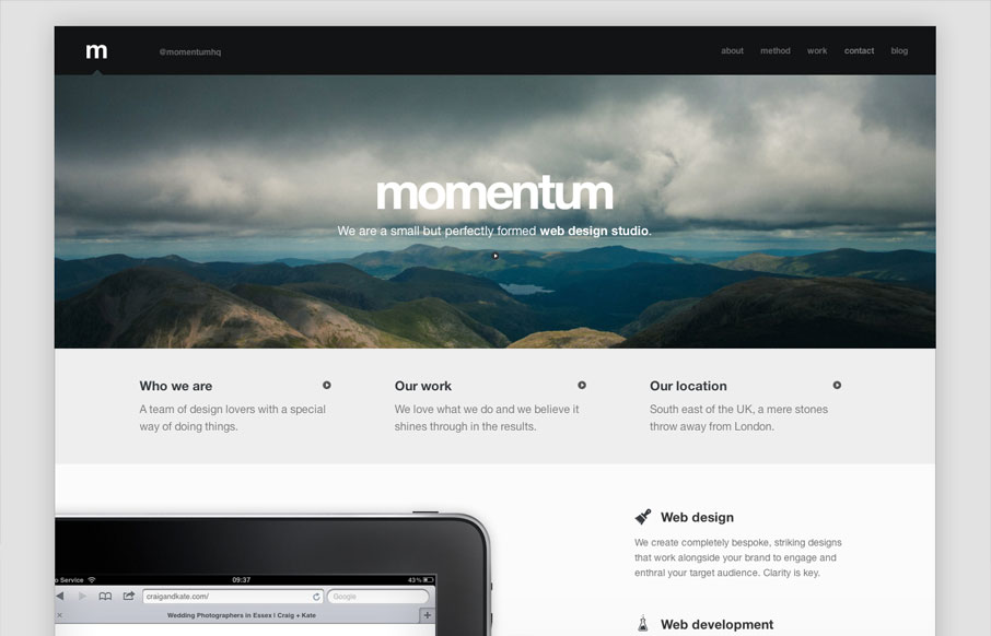
by Gene Crawford | May 8, 2012 | Gallery
Beautifully designed responsive website. I love the simplicity of this design it’s fairly minimal in it’s approach but just skirts to the line. Plenty of content to get to know the team behind the company including a nice little video on their studio...
