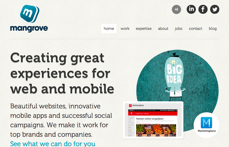
by Giovanni DiFeterici | Aug 6, 2012 | Gallery
I really like the simple typography and strong asymmetrical composition of mangrove.com. The site has a minimal, but judicious application of color that leaves plenty of room for their content. Coupled with simple, yet sophisticated interactions, mangrove.com is the...
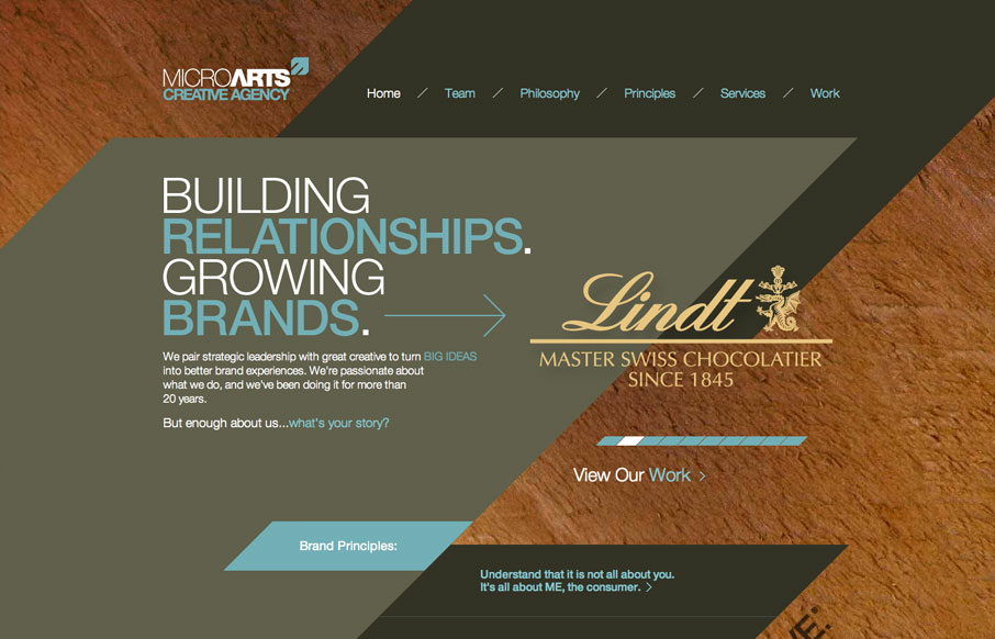
by Gene Crawford | Aug 6, 2012 | Gallery
The diagonals really make this website dynamic visually. The flat shapes of color laid on top of the textured background image also adds to the visual interest to keep you looking. I find the colors a bit muted personally but it still works tone wise when you read the...
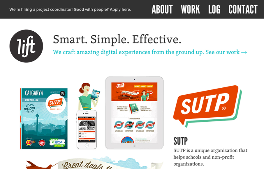
by Giovanni DiFeterici | Aug 3, 2012 | Gallery
Damn, this is a cool site. Mixture of multiple illustration styles is awesome, as is the overall experience. liftinteractive.com has everything. The typography is tight and varied (if maybe a little uninspired), and structured beautifully. The interactions are...
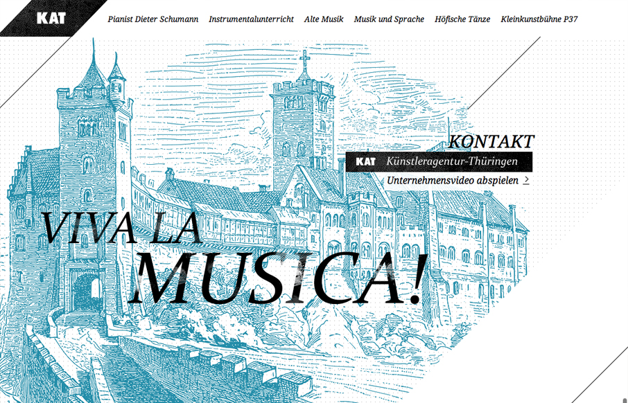
by Giovanni DiFeterici | Aug 3, 2012 | Gallery
I love the consistent use of art throughout this site. It couples with the monochromatic palette and helps to create the victorian feel that is clearly evident. It also compliments the typography to create a tight, consistent visual experience. At times, i get a...
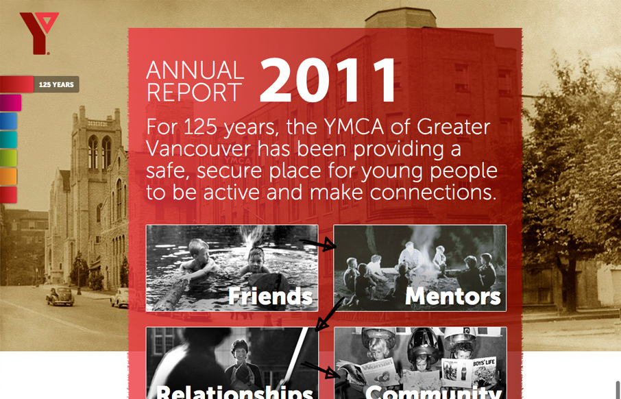
by Giovanni DiFeterici | Aug 2, 2012 | Community / Social Networking, Gallery
imagineourymca.ca is clearly designed to push the brand and to present a lot of information in a tight little package. I really like how the ‘pages’ have so much activity without getting in the way of the content. I especially enjoy the community sections...
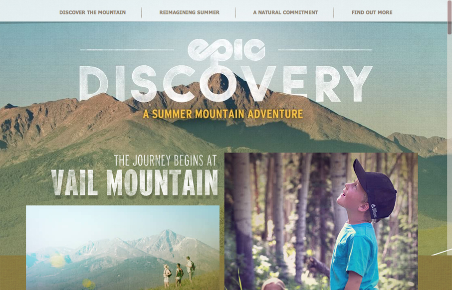
by Giovanni DiFeterici | Aug 2, 2012 | Gallery, Travel
epicdeiscovery.com is a lovely little site with a whole lot of personality. It’s clearly designed to get a user to want to be out in nature and I think it succeeds beautifully. While structurally complex, the content is fairly minimal as are interactions. Each...