by Gene Crawford | Sep 26, 2012 | Gallery
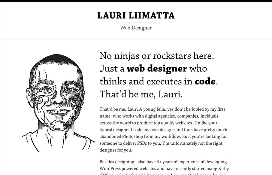
Submitted by: Lauri Liimatta @laurilii Role: Designer & Developer My new redesigned portfolio. Responsive design and powered by Kirby CMS. I like the design approach of going light to dark from top to bottom, or light to dense visually. However you want to look...
by Gene Crawford | Sep 26, 2012 | Food and Beverage, Gallery
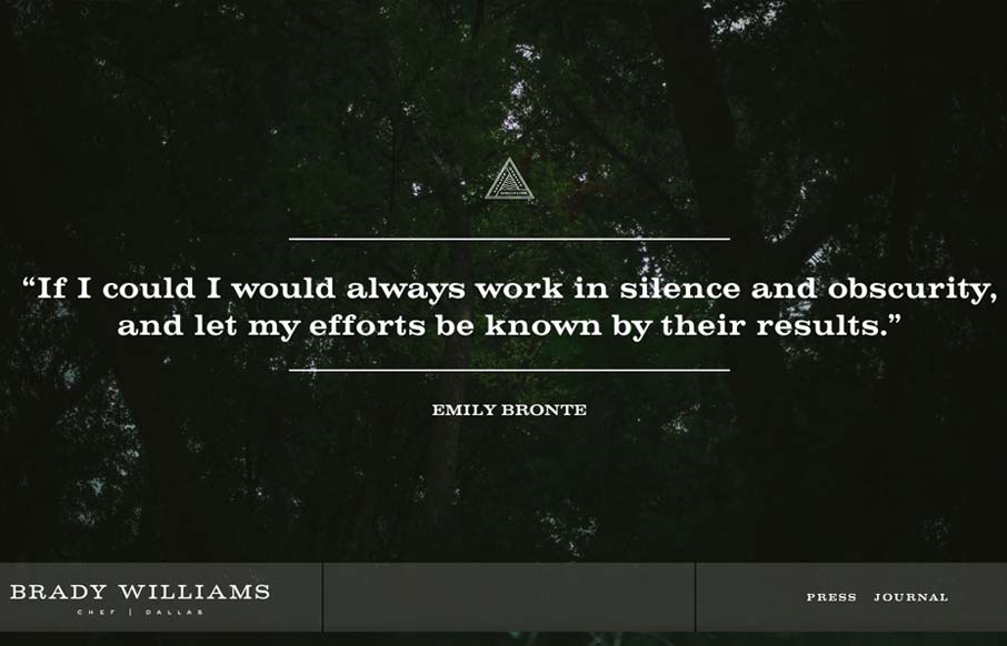
“Brady Williams, a chef in Dallas, TX, shows his craftsmanship and passion for the culinary arts in this elegantly simple website. Personal sites tend to focus on the maker first, and the things created second. Not so here. Brady shows his passion, he...
by Gene Crawford | Sep 25, 2012 | Gallery, Gaming
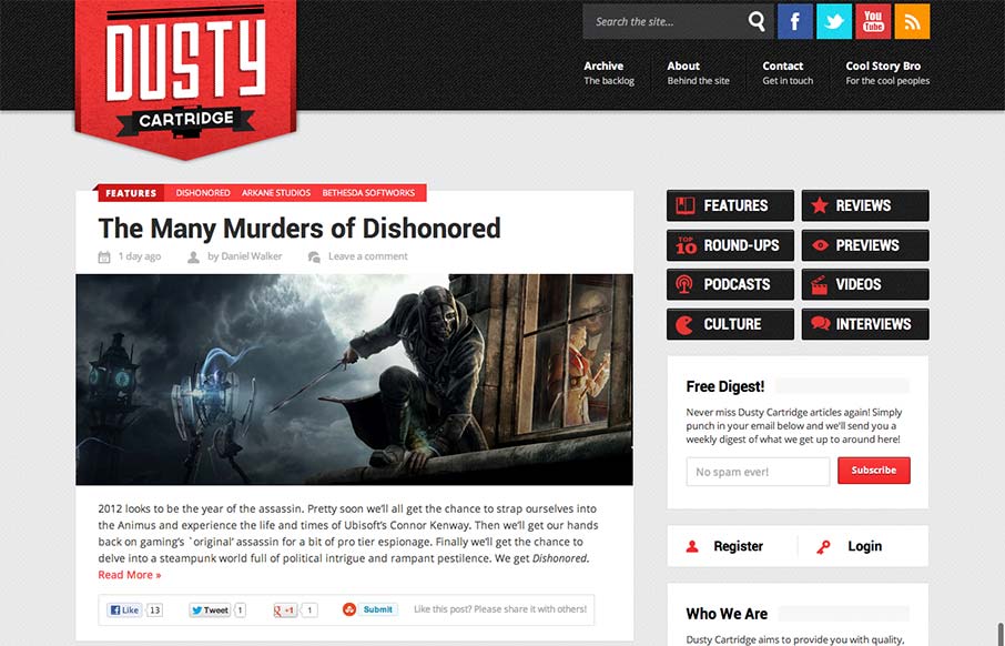
I like the blocky type design of this blog. It looks like it may be a theme but that doesn’t take away from it being a nice design. The logo is bold and the nav matches it in simplicity visually. Nice responsive layout too.
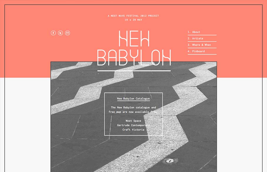
by Gene Crawford | Sep 25, 2012 | Gallery
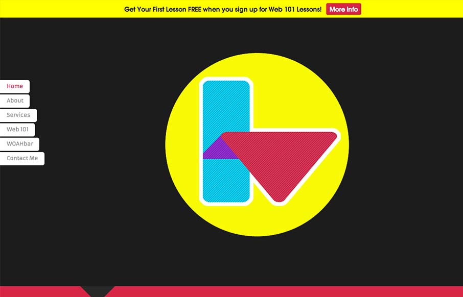
Interesting single pager. Chock full of bright colors and solid looking illustrations/icons. I like the fixed nav on the left, it’s a nav design i’ve seen before but it just looks like it fits here better than others. There are some sections where the...
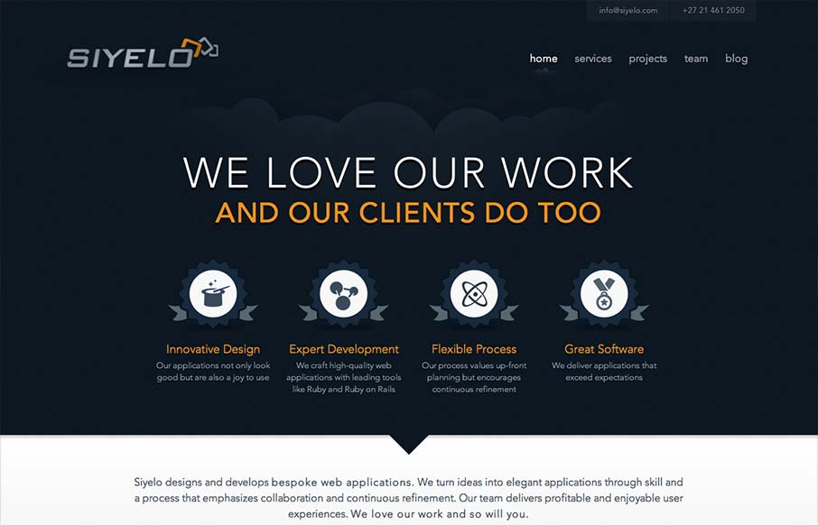
by Gene Crawford | Sep 25, 2012 | Gallery
I like the contrast between the dark background in the top half and the white in the bottom half. It’s a nice responsive layout too, check out how those main 4 icon/sections change when targeting different screen widths yo. I also really dig how there is...
by Gene Crawford | Sep 24, 2012 | Entertainment, Gallery
I like the way the lines used in this design and the big blocks of color or no color work together. Even into the type it feels unified yet unbalanced. Rich yet minimal that’s how i’d describe this design. Lovely.