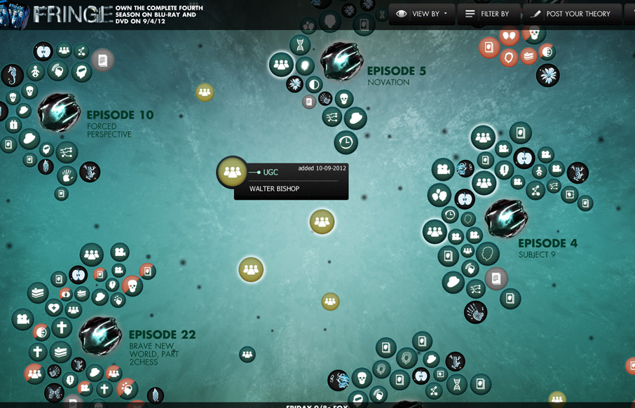
by Giovanni DiFeterici | Jan 2, 2013 | Entertainment, Gallery
This is a super cool experiment in interactive exploration. It’s not entirely practical but it’s stuff like this that keeps us pushing what we think of as a typical website interaction and we always need that. It seems a bit outdated technically –...
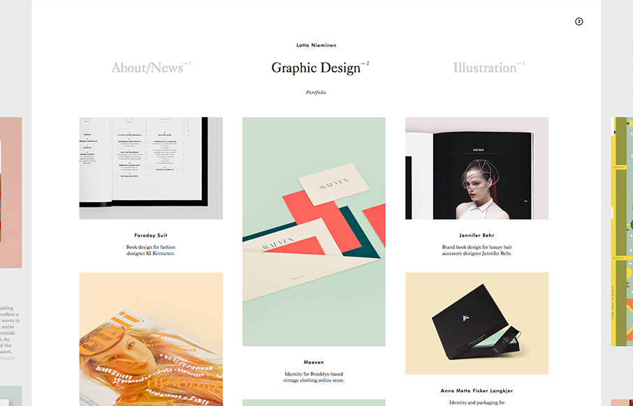
by Gene Crawford | Dec 21, 2012 | Gallery
Very nice minimal layout with some nice design interest sprinkled here and there on the periphery. Then, BAM! You find out that stuff is actual navigational pieces to the site. What a great interaction surprise and reward for exploring as well as smart way to make...

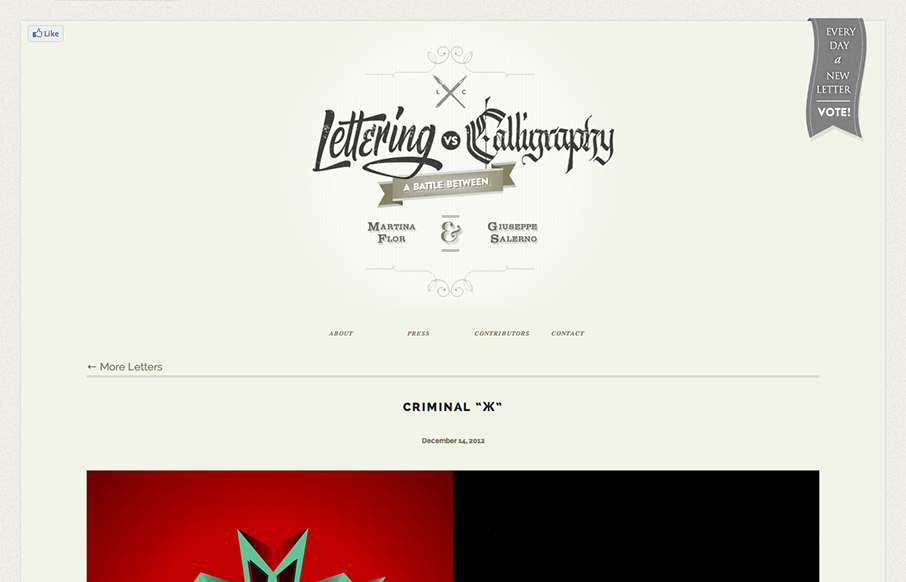
by Gene Crawford | Dec 21, 2012 | Gallery
This design is very crisp and nicely worked out. What I like most is the discreet interactions between scrolling/navigating down the page. The black to red shift in the line & icons keeps you informed and engaged on a visceral level. I just found this design a...
by Gene Crawford | Dec 20, 2012 | Gallery
First I didn’t know whether to make this a radar resource or a gallery entry. Duh! The design is hot so it goes in the gallery. There’s some nice little design flourishes here and there and I just want to keep scrolling and voting. Love this.
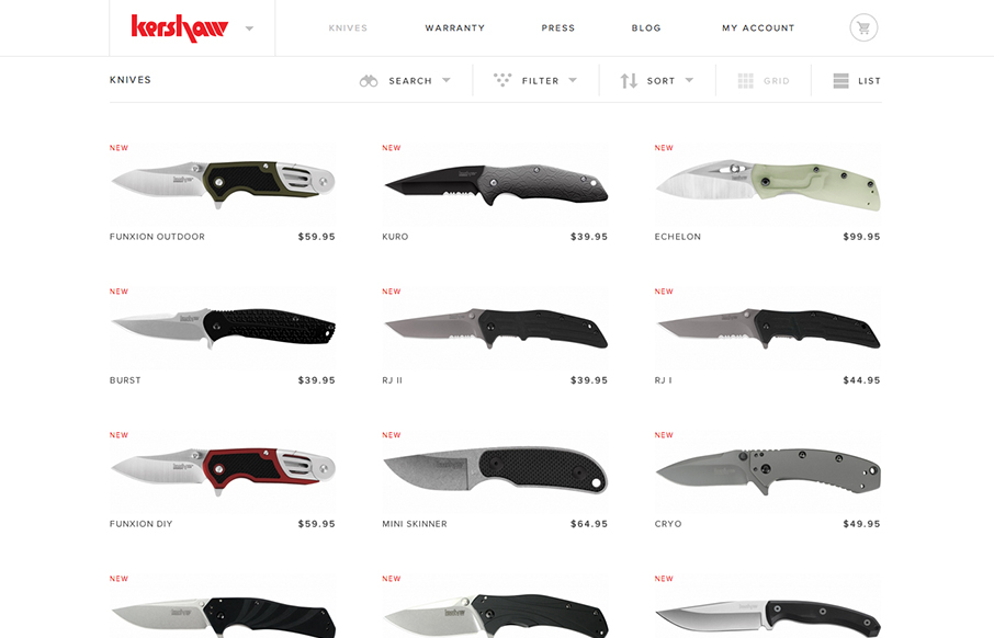
by Maria | Dec 20, 2012 | Gallery, Shopping
Another superb responsive ecommerce website design. Looks like some image swapping going on for the different screen widths too. Smartness.
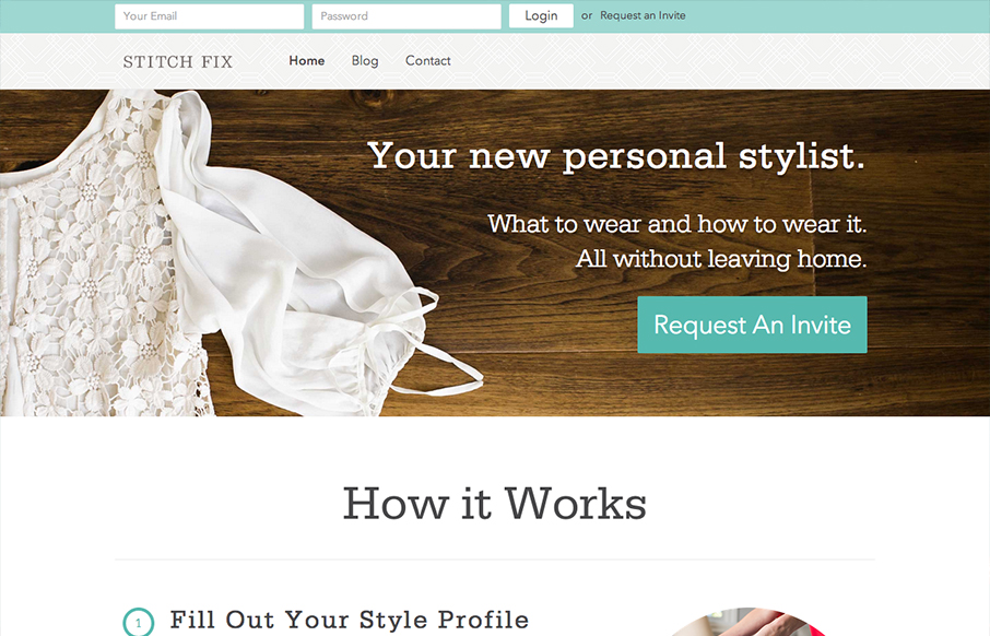
by Gene Crawford | Dec 20, 2012 | Gallery
The new stitchfix.com looks hot! Bravo to @mrmrs_ !— Samantha Warren (@SamanthaToy) December 15, 2012 Looks good indeed. I particularly like the login box in the header area, the changes it goes through for each screen width design. I like details like that a...