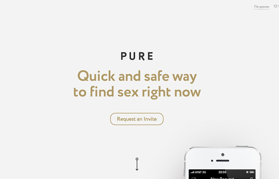
by Giovanni DiFeterici | Sep 3, 2013 | Gallery
I have now seen everything. Pure is a hookup app with no illusions about it’s intended purpose: booty calls. So, there’s that. Now lets talk about the site! getpure.org/en is a slick little single page scroller that snaps to particular scroll heights. The...
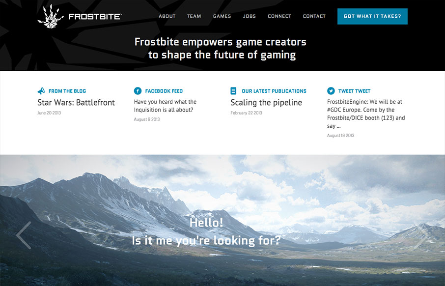
by Giovanni DiFeterici | Aug 29, 2013 | Gallery, Gaming
First of all: Badass domain name. Second: Frostbite 3 looks like it’ll blow your hair back and then some and I can’t wait to see it on the next generation of consoles. I’m a gamer and it looks beautiful. Third: Pretty nice site. Game studio/engine...

by Gene Crawford | Aug 27, 2013 | Gallery
I really dig the Hashrocket site design. It’s concise but not minimal, it’s functional but not trendy. Lovely! It’s just fine looking working website which is something I really like. There’s plenty of nice illustration pieces across the site...
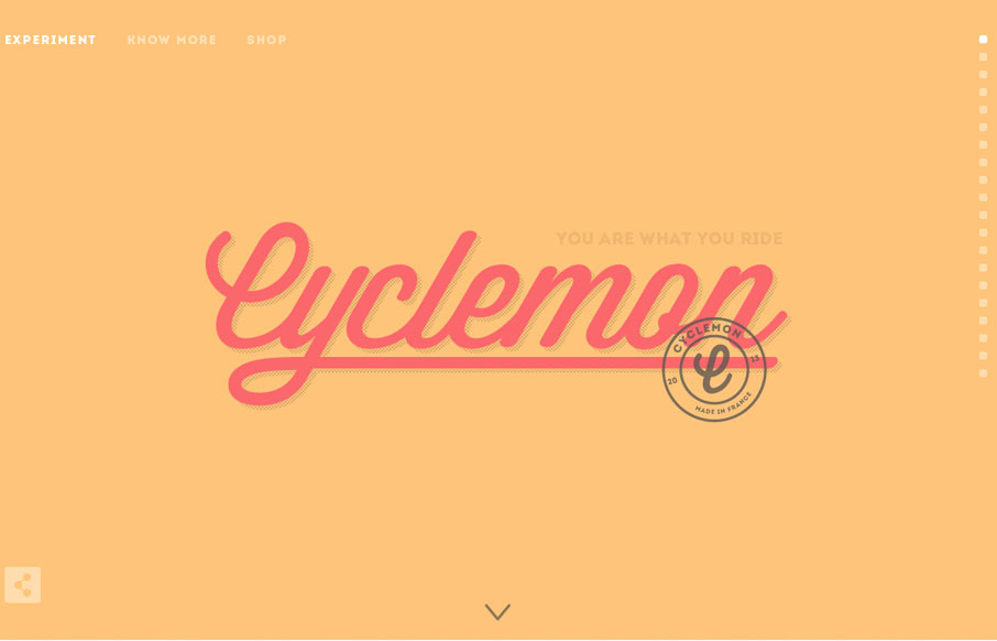
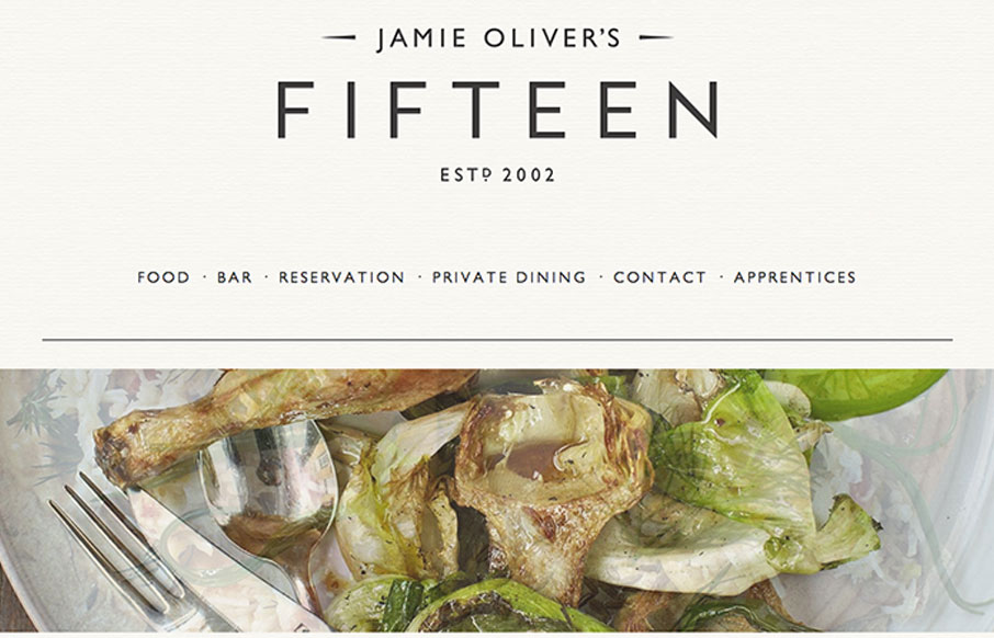
by Jay Barry | Aug 27, 2013 | Gallery, Sports/Recreation
The simple, slightly art deco vibe of this site is really cool. The type is beautifully done and its great how the site engages as you scroll down. It really makes you want to scroll down to the bottom, and there’s even a bit of a punchline at the end. That...
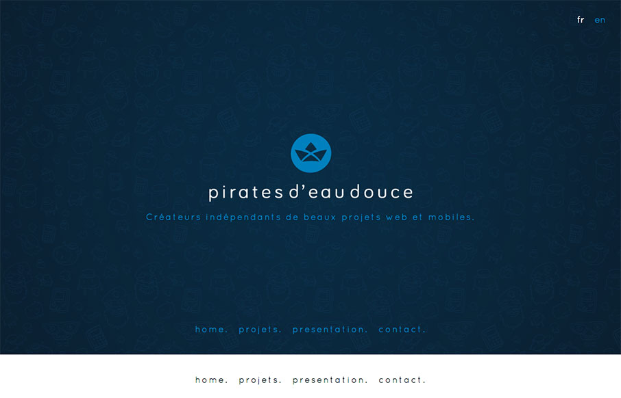
by Giovanni DiFeterici | Aug 26, 2013 | Gallery
Pirates d’eau douce is a fun site to say the least. I really enjoy the subtle animated characters and the playful branding of each of their apps. Blink, blink.
by Maria | Aug 26, 2013 | Food and Beverage, Gallery
Just another polished, parallax site with beautiful imagery and svelte typography. Ho hum. 🙂 Doesn’t mean we can’t call it out for being nice, right? Either way, it’s got a nice feel and I appreciate subtle details like the rotating images and the...