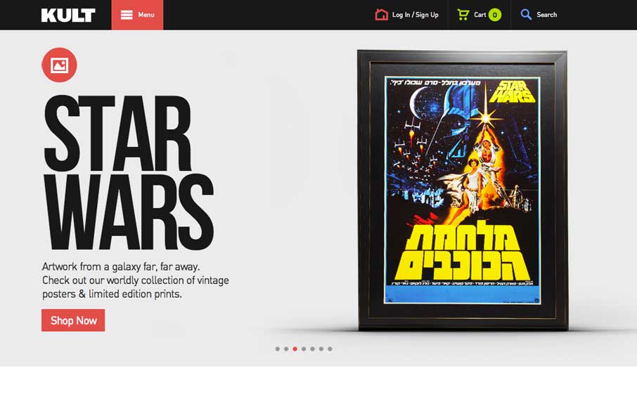
by Gene Crawford | Mar 17, 2014 | Gallery
Good simple layout, just kind of a blocky and bold presentation of stuff. What’s interesting to me is how when you interact with the menu it grays out the content, keeping you focused on the menu navigation itself. What do you guys think of that?
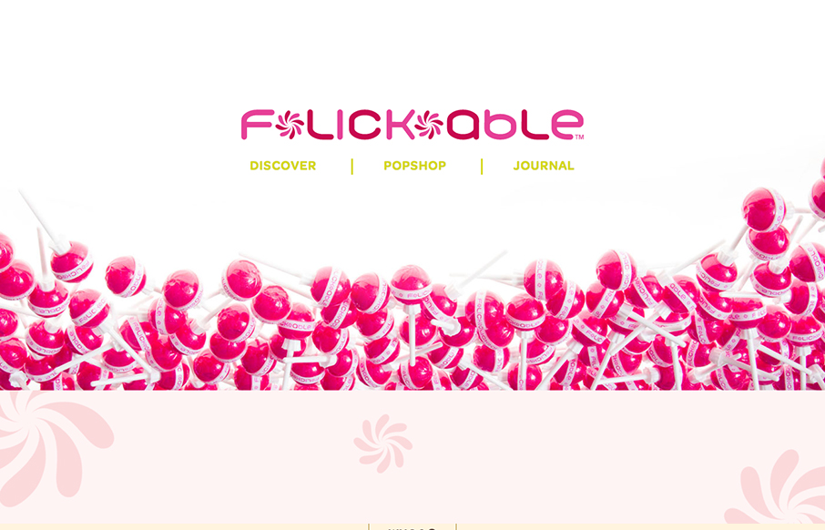
by Gene Crawford | Mar 17, 2014 | Gallery
You don’t see too many “fashion” sites that are decently done. If you have, please send ’em in to us. This one is of course over the top with all the “pop” stuff but it is well done. It’s responsive, and has some nifty...
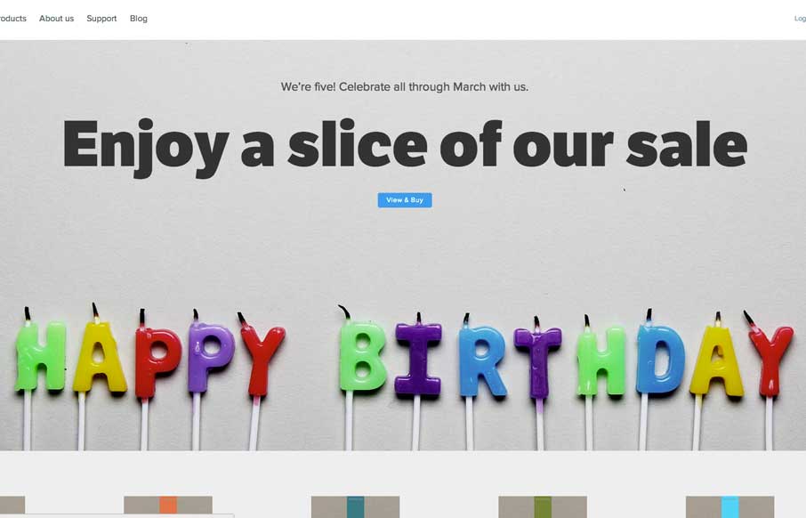
by Gene Crawford | Mar 17, 2014 | Gallery
Pretty slick looking design. I love the colors and illustration work a lot. I also really dig the interactions/animations on the main marquee blocks – those are just great. Overall a really great and simple experience picked up by some clever illustration and...
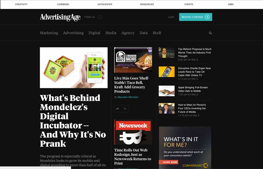
by Gene Crawford | Mar 14, 2014 | Gallery, Marketing
I dig the new Ad Age website. I like the top section that has the black background and how it uses that section for featured content. As you make your way down the page there’s some nice “sectioning” of specific styles of content. I love how the...
by Gene Crawford | Mar 14, 2014 | Gallery
The Five Simple Steps isn’t one of those sites that has tons of interactions and moving elements. But the design is simple and effective. I really like how the main hero image/area isn’t just a big JPG, that’d be lazy, they add the extra effort and...

by Gene Crawford | Mar 14, 2014 | Gallery, Marketing
This is a great example of how you can use a simple game like experience to create something memorable. Go ahead, click the colored boxes, they “pop” like one of those addicting games on your phone. The overall website experience is superb for a...