
by Gene Crawford | Mar 19, 2014 | Gallery
Beautifully designed product site here for Kin HR. I like the bold nature of the layout with all the screen/interaction displays down the page. I also dig how the nav slides up with you and fixes into place. That little bit of movement makes it really obvious to the...
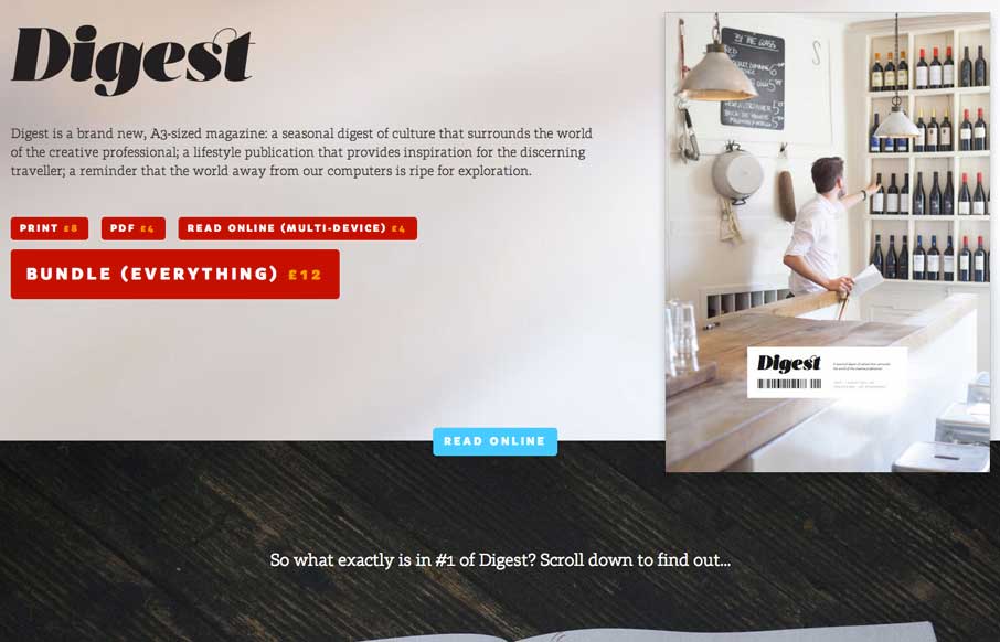
by Giovanni DiFeterici | Mar 19, 2014 | Gallery
The Digest is a beautifully editorial site that displays a tight print design sensibility. It’s a site that takes the idea of a magazine and translates the best of that medium to the web. The pages are fairly heavy at 4-5 MB, but the lush photography is largely...
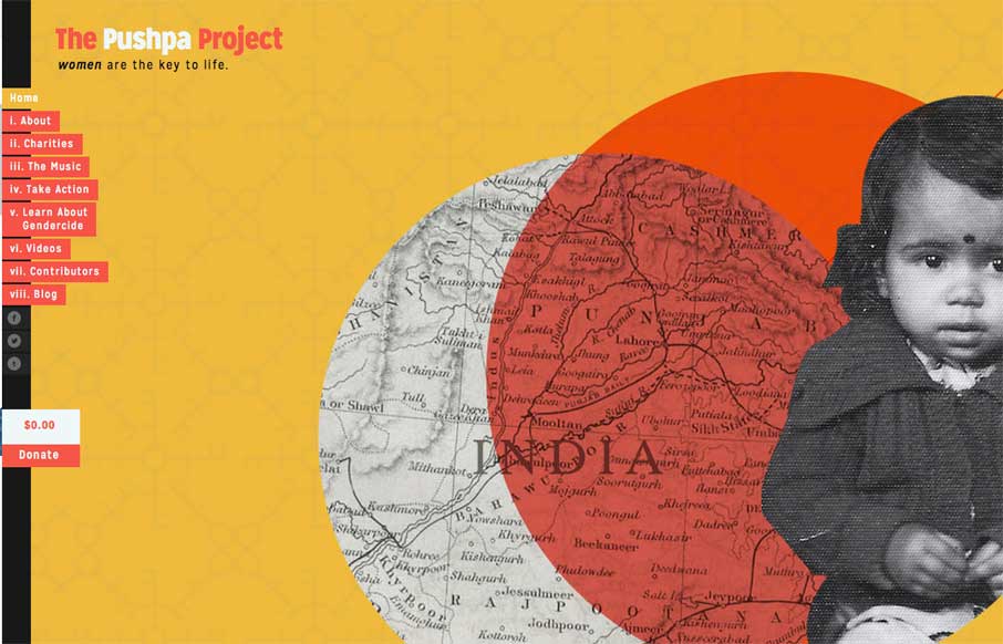
by Giovanni DiFeterici | Mar 19, 2014 | Gallery
The Pushpa Project is a narrative site that seems to draw strongly from print design. The minimal color does a great job of focusing the reader’s attention on the text. I really enjoy the site’s primary navigation, which does a great job of reenforcing the...
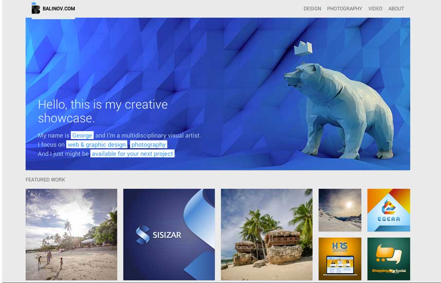
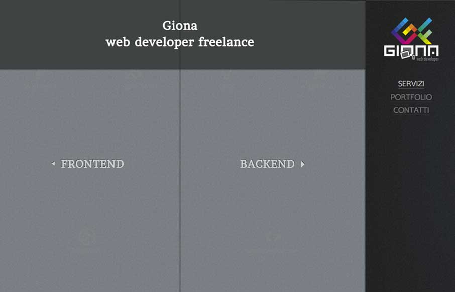
by Gene Crawford | Mar 18, 2014 | Gallery, Portfolio
Clever looking design. I like the Isotope interface piece and how it’s used, in that the design isn’t just based on using it. Beautiful work too.
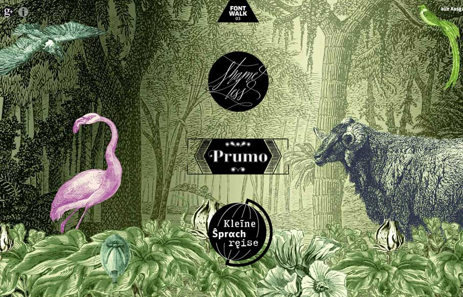
by Gene Crawford | Mar 18, 2014 | Gallery
Really cool way to show off the fonts. It is almost indeed like taking a walk or a tour. Lovely.
by Gene Crawford | Mar 18, 2014 | Gallery
Really nifty interaction design. I like how the interactions allow you to play, the left and right sides of what this person can do are represented pretty well with this design too. It’s also responsive which looks like it was a lot of work.