by Gene Crawford | May 21, 2014 | Blog, Gallery
What a beautifully thought out and executed experience the Code & Theory website is. I spent at least 15 minutes just clicking through and scrolling around this site.

by Gene Crawford | May 20, 2014 | Gallery
Cool interactions and content blocking. I really dig the first time experience when you hit this site. The way the portfolio navigation on the home page is designed is very cool along with the loading animations of the 3 marquee sections.
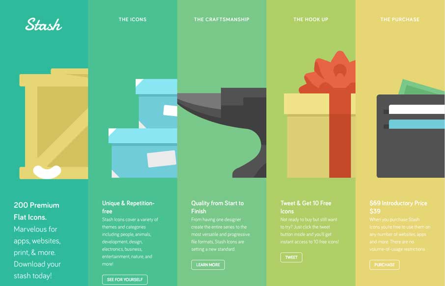
by Gene Crawford | May 20, 2014 | Gallery
Cool looking interaction base on this site. I like the big focused areas for the different pieces of how the icons are sold and packaged. I also like the responsive approach here too. Very cool looking and the experience is memorable too.

by Gene Crawford | May 20, 2014 | Gallery
Pretty cool interaction from the home page. I really like the original thought. Otherwise the design is super simple – half of it links elsewhere, which is also smart if you’re truly active in those communities. Really smart design here.

by Gene Crawford | May 19, 2014 | Gallery, Sports/Recreation
Nice looking straight forward site. Covers all the basis and is quite loaded with content. Also it’s something totally different than a portfolio website which is always nice to compare and contrast.

by Gene Crawford | May 19, 2014 | Gallery
Pretty cool layout, the angles make this website so different. I also dig how they change the navigation colors based on where you are on the page. Very interesting site design here.