
by Gene Crawford | Nov 19, 2014 | Gallery
I really dig the purpose of this app/community. Though first I dig the design of this thing. It’s simple and compact and really feels good as you use it. Give it a try folks.
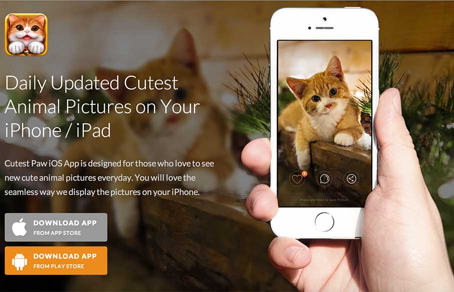
by Aaron Griswold | Nov 19, 2014 | Gallery
Awhhhhh….. If this app wasn’t free, I’m sure my family would spend all our money to obtain it… but that’s not important now. The app product page itself is a great design – flows easily – has great parallax work and good...
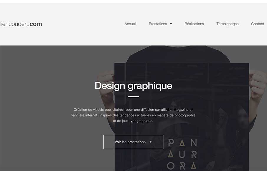
by Gene Crawford | Nov 19, 2014 | Gallery, Portfolio
I really like the asymmetrical feel to this site’s layout. It’s like not and is at the same time. I also like the subtle responsive design decisions he’s made as you scale the page down. Julien Coudert, french graphic designer working in webdesign...
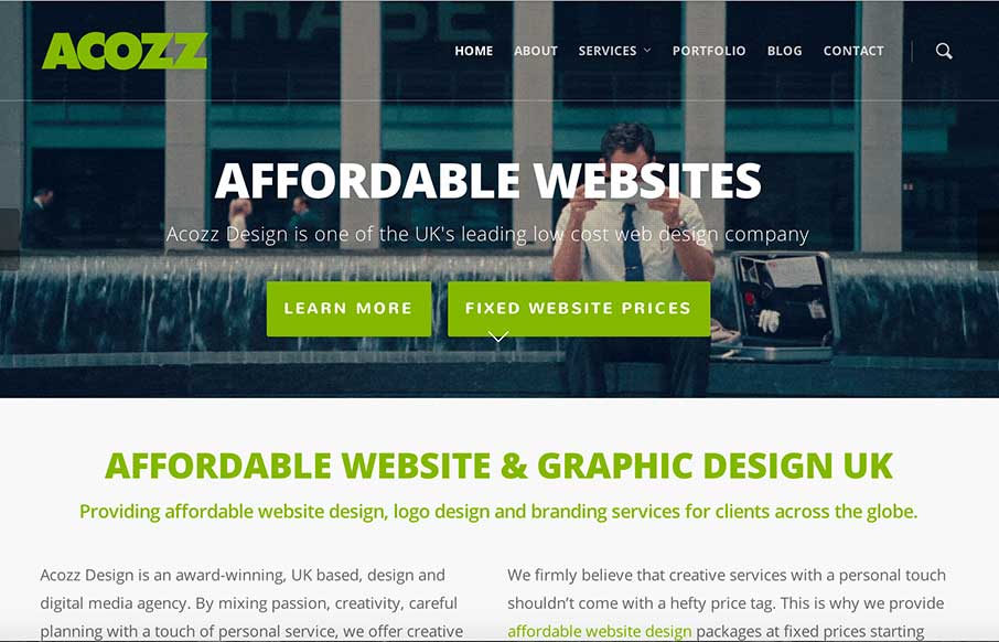
by Gene Crawford | Nov 18, 2014 | Gallery
Pretty clever and simple looking site for the web design agency Acozz Design. I dig the colors and the amount of content they’ve developed is wonderful. I particularly like the animated gif work on the headers. Though i’m not wild about the transition...

by Gene Crawford | Nov 18, 2014 | Entertainment, Gallery, Music
Man I love some Tom Petty, so does this guy. It’s a nicely designed and executed responsive design featuring one of the best subjects. I love it. If you like Tom Petty, you’ll love tompetty.rocks! Formerly gonegator.com which was reviewed by USA Today and...
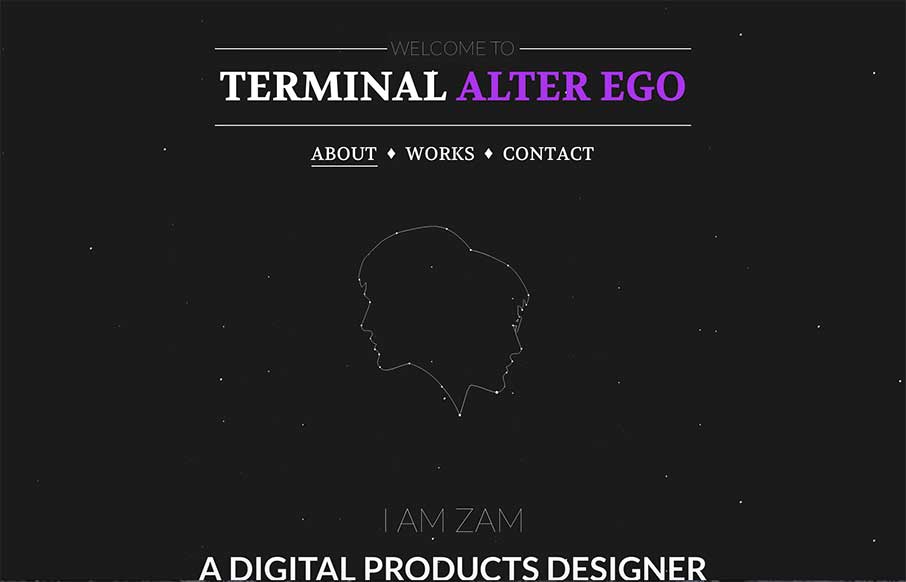
by Gene Crawford | Nov 18, 2014 | Gallery, Portfolio
I’m digging how this page scrolls, the way you go from the black background to the white with an angle down the page. Good stuff. Submitted by: Zulficar Ali @zulficar Role: Designer & Developer