
by Gene Crawford | May 7, 2015 | Food and Beverage, Gallery
Man! I love the illustrations on this website. I can stare at them all day! They are well done and the animations that load them up as you scroll down the page for the first time are very well timed. The colors and style all work so well with the content too. Lovely,...
by Gene Crawford | May 6, 2015 | Gallery, Travel
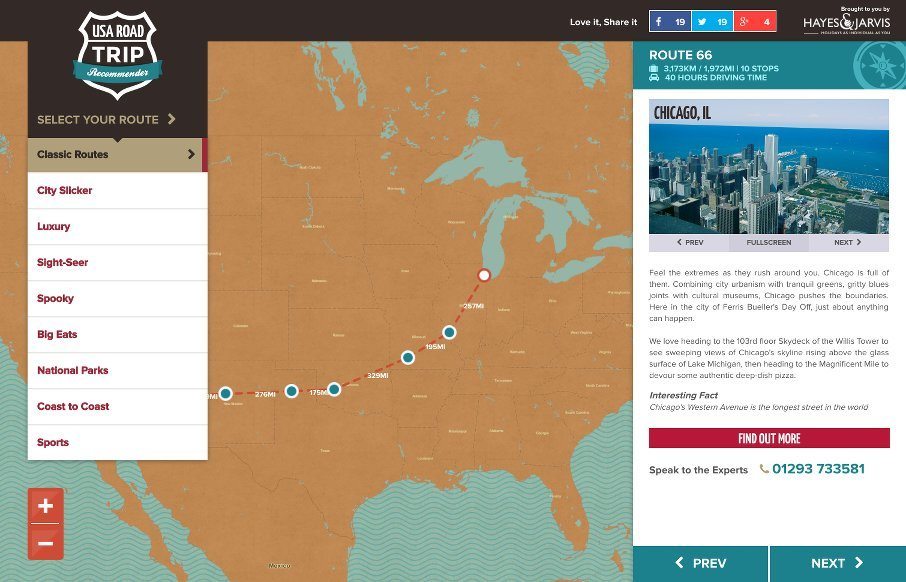
This website is fun. It’s fun to use and has fun content. It makes me want to go get in the car and start driving around the country. Cool stuff. The interactions need no instruction and you can be playing with it in seconds. Good stuff. From the Designer:...
by Gene Crawford | May 6, 2015 | Food and Beverage, Gallery
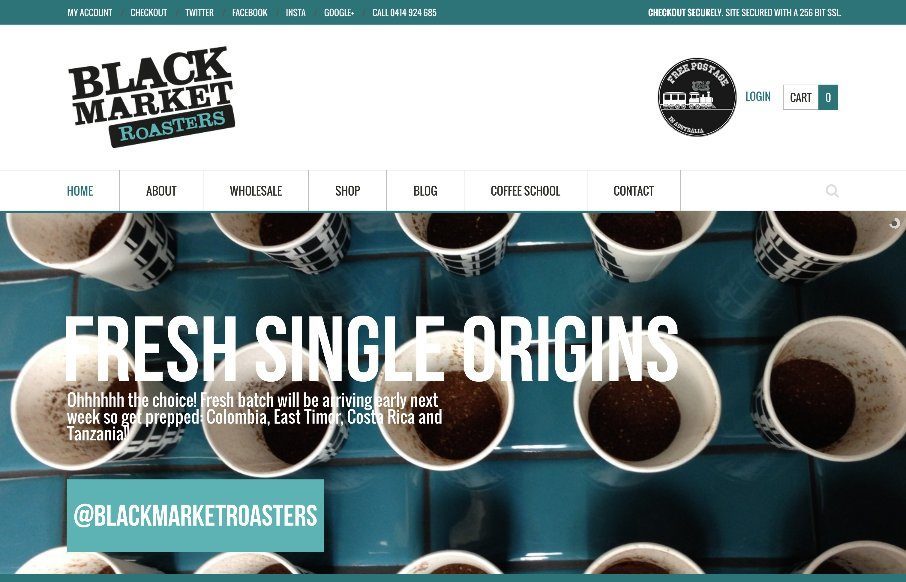
A strong grid and blocky design elements always make a good pair. Throw in some good photography and you have a winner. From the Designer: We are the dudes that source, roast & deliver fresh roasted coffee. From our base in Sydney, Australia, we run Barista...
by Gene Crawford | May 6, 2015 | Gallery
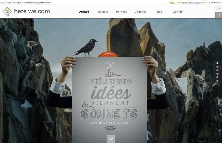
I like the illustrations, like the ice berg and some of the sub sections of this website more than the overall layout itself. It’s a strong website through and through, but some of it formulaic, then when you discover some of the sub sections you see what it is...
by Gene Crawford | May 5, 2015 | Gallery, Portfolio
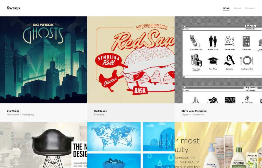
Sometimes simple is all you need to let the value of the work show through. This site is a perfect example of that and showing restraint. Take heed and enjoy. From the Designer: Sweep Studio is a Toronto based creative consultancy specializing in graphic design for...

by Gene Crawford | May 5, 2015 | Gallery
It’s a subtle thing but the way the main “hero” image slightly scrolls over the header/display copy is brilliantly done. Then there are other targeted little interactions and animations that really sells the “high class” vibe of this site...
