by Aaron Griswold | Jul 13, 2015 | Gallery
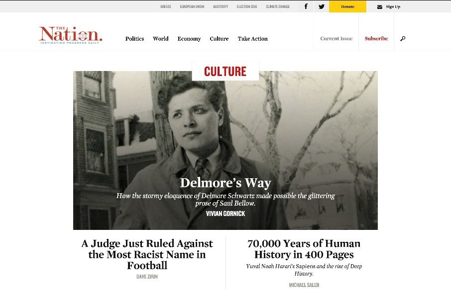
We’ve seen a lot of “newspaper / magazine” type site launches this year – and cool to see America’s oldest weekly magazine do the same. Like the top story categories at the top of the page (think they change as big issues do). Really like...

by Aaron Griswold | Jul 13, 2015 | Gallery
Pretty cool site from the National Safety Council, called My Car Does What?: “MyCarDoesWhat.org is a national campaign to help educate drivers on new vehicle safety technologies designed to help prevent crashes. These technologies range from increasing the...
by Aaron Griswold | Jul 10, 2015 | Design Firm, Gallery
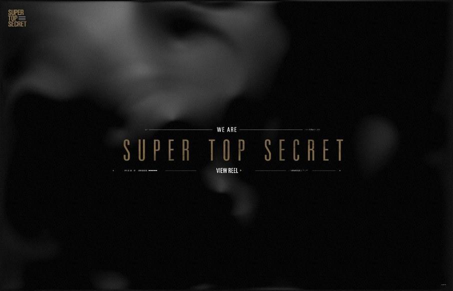
Dang. Enough said. @wearetopsecret
by Aaron Griswold | Jul 10, 2015 | Gallery
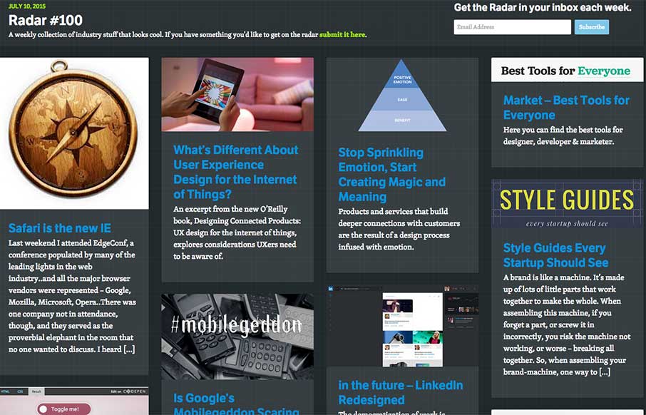
In this week’s 100th Radar (yay us): Safari is the new IE What’s Different About User Experience Design for the Internet of Things? Stop Sprinkling Emotion, Start Creating Magic and Meaning Market – Best Tools for Everyone Style Guides Every Startup Should...
by Aaron Griswold | Jul 9, 2015 | Gallery, Photography
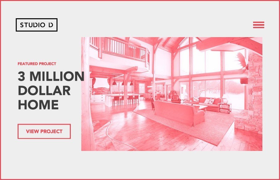
Really like this Studio D Photographers site out of Canada. A lot of moving parts through out the site and the blog – and I think it’s playing off of a newer color trend (red, black, off-white so we can start to get away from teal and magenta..). Very cool...
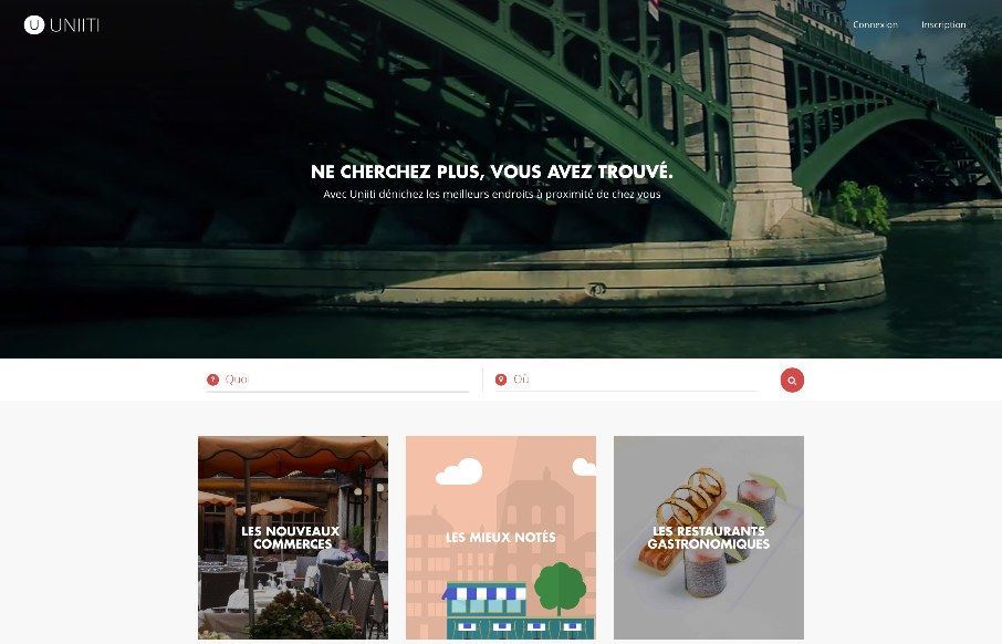
by John David Hunt | Jul 9, 2015 | Food and Beverage, Gallery
We’ve reviewed Uniiti’s work out of France before – this looks like their recommendation app for restaurants and other services. Apparently the footer landscape image changed. Last night it was a dark sky with a rocket ship and this morning...
