by Aaron Griswold | Jun 10, 2015 | Gallery
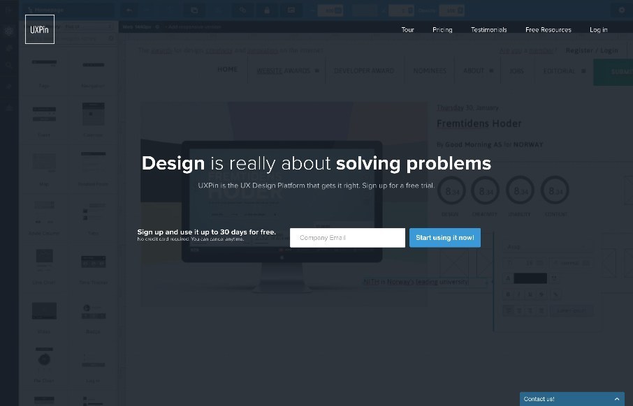
“Design is really about solving problems” – Amen. I can see that UXPin’s philosophy, matches the way they go about their design for their site too. Love the simple home page, that is still layered with a video background of the product, but...

by Aaron Griswold | Jun 10, 2015 | Gallery
Good looking “Family Trails” site from the National Center for Families Learning. It’s a very social site, and essentially it is a travel type blog, which seems to work very well for what the NCFL is trying to accomplish. @Family_Trails

by Aaron Griswold | Jun 9, 2015 | Education, Gallery
Like the clean site from Lehigh University College of Business and Economics – think it has good (and appropriate) UI / UX, even down to the main content / sub-pages. Like how they have the hamburger menu below the hero image so that you can go into more detail...
by Aaron Griswold | Jun 9, 2015 | Gallery, Government
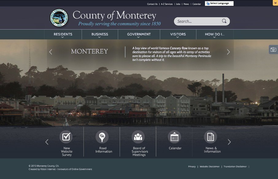
The above screen shot from the County of Monterey’s new website may be the single best feature of their website – that’s not to say that the site isn’t pretty decent on it’s own (don’t know if you know that government sites usually,...

by Aaron Griswold | Jun 9, 2015 | Food and Beverage, Gallery
It’s breakfast time in Nashville, Tennessee where we’re putting BDConf (www.bdconf.com) on this week. we just finished setting up, and I’m watching the dude get the breakfast ready for the attendees… and then I see this site in our inbox...
by Gene Crawford | Jun 8, 2015 | Gallery
Pretty fun scrolling animation of the wires/tubes that connect the sections for you visually. I like that part of it, it makes what is fairly standard fun. Would be extra super great for it to be responsive, but there’s always reasoning behind stuff so I...