
by Gene Crawford | Jul 2, 2015 | Gallery
Pretty slick design. It’s simple yet compelling in that I never have to leave the home page to really learn about Ascend, but there’s plenty of depth and further content to dig into when desired. Love that. Submitted by: Steven Monetti Twitter:...

by Gene Crawford | Jul 1, 2015 | Gallery
The Comovee site is a great example of a product website that gets the details right. I dig the clean design and mix of large imagery. The screen width differences are nice too, scale it and you’ll see what i’m talking about. Subtle yet solid design. From...
by Gene Crawford | Jul 1, 2015 | Gallery
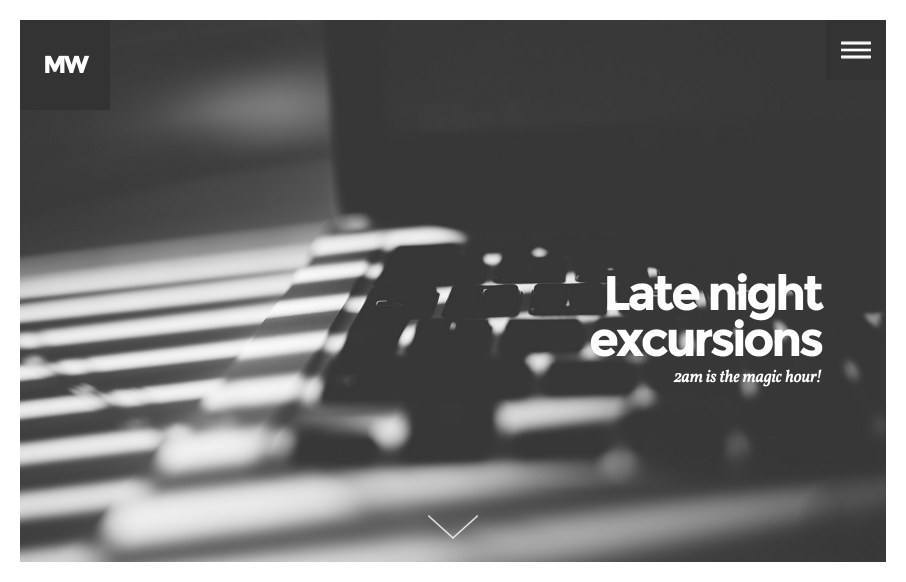
I like the strong imagery and the solid typography used in unison like it is here on Midnight Works. The vibe of the site as you scroll through it just feels good. Love it.
by Aaron Griswold | Jul 1, 2015 | Gallery, Sports/Recreation
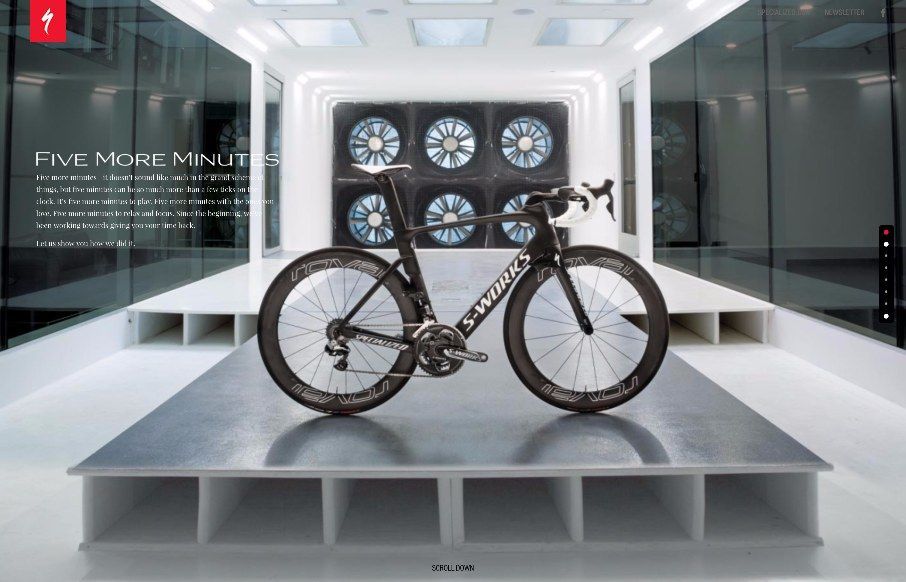
Pretty darn skippy on this one from Specialized Bicycles – their 5 More Minutes campaign. One more instance of scroll-jacking making a heck of a lot of sense. The bike looks pretty sweet too!

by Gene Crawford | Jun 30, 2015 | Gallery, Travel
We don’t normally do a lot of iPhone app page’s here in the Gallery but when Paravel does an app like this you gotta take notice. This one pager is stunning, from the logo/branding to the layout itself. Gushing here a bit but damn guys. Nice.
by Gene Crawford | Jun 30, 2015 | Gallery
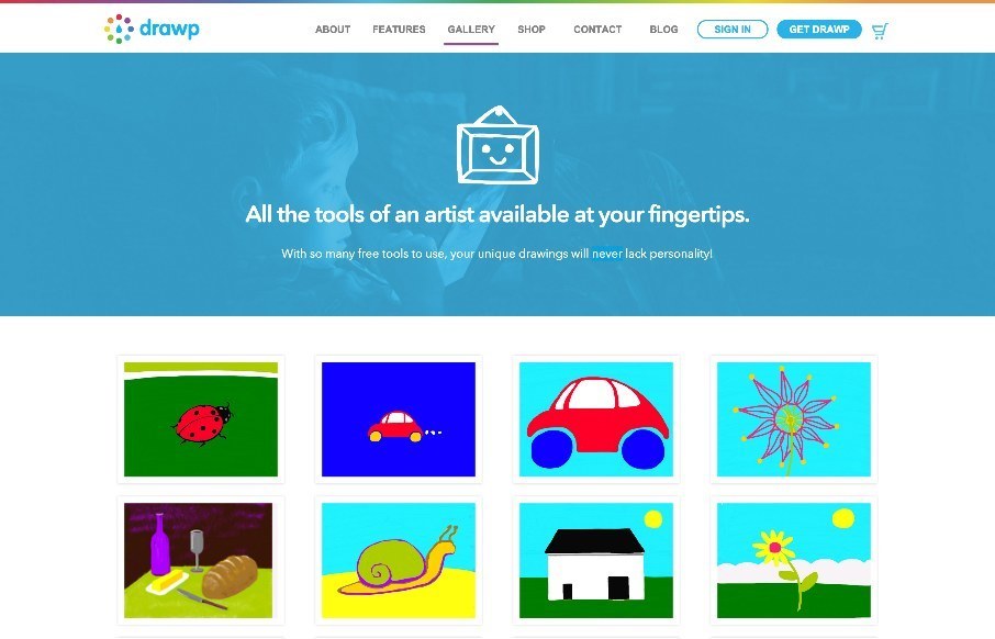
Fairly nice product website. Solid colors and delivers that “kids” vibe without pandering to all the cliches that come with it. Good work. @drawpit