by Aaron Griswold | Jan 11, 2016 | Gallery, Marketing Company
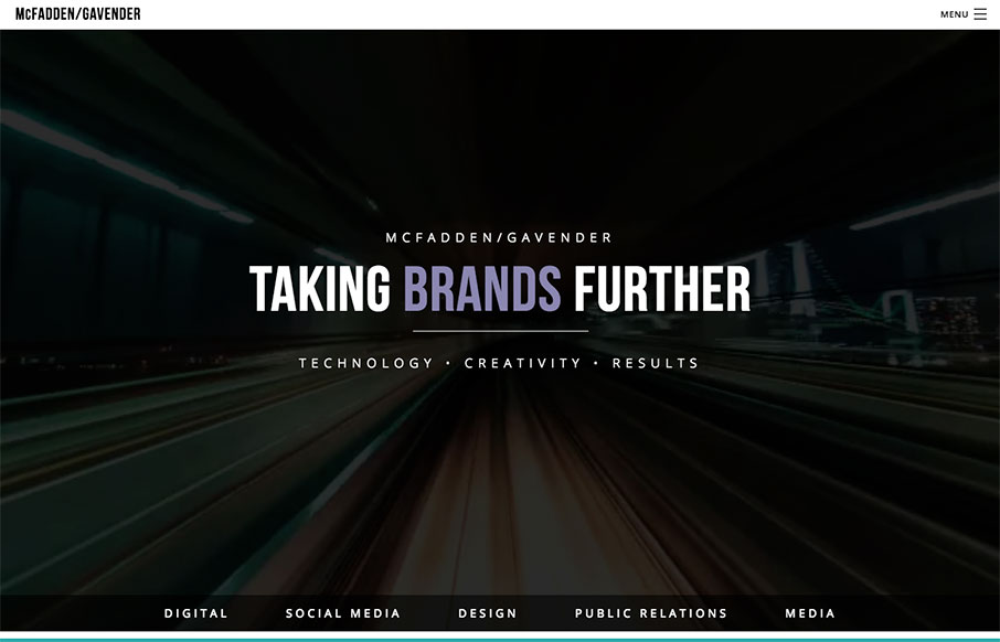
We really like this one from McFadden Gavender out of Tucson because of the awesome video background off what looks to be a elevated train (where though?) – and the good use of muted image / color backgrounds too on the home page. Great first step into their...

by Aaron Griswold | Jan 8, 2016 | Gallery, Radar
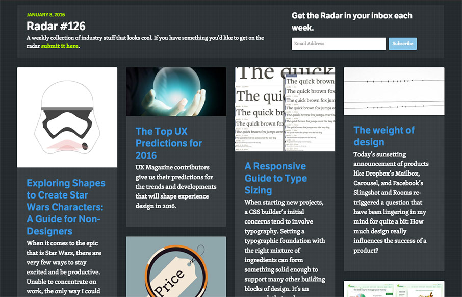
Happy New Year! Each week, we do a round up of curated “stuff from the interwebs” that we call Radar. In this week’s 126th Radar: Exploring Shapes to Create Star Wars Characters: A Guide for Non-Designers When it comes to the epic that is Star Wars,...

by Aaron Griswold | Jan 7, 2016 | Gallery
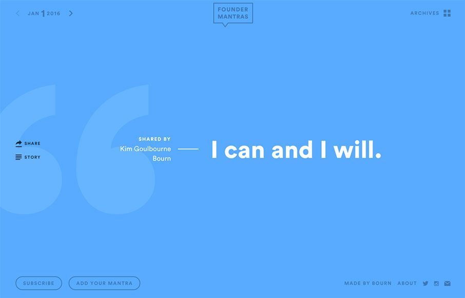
As a founder of seven companies over the years – I can say that something like the site Founder Mantras is good, quick inspiration in a pinch. Love the simple design – just load up the content – and let it go – nice.

by Aaron Griswold | Jan 7, 2016 | Gallery
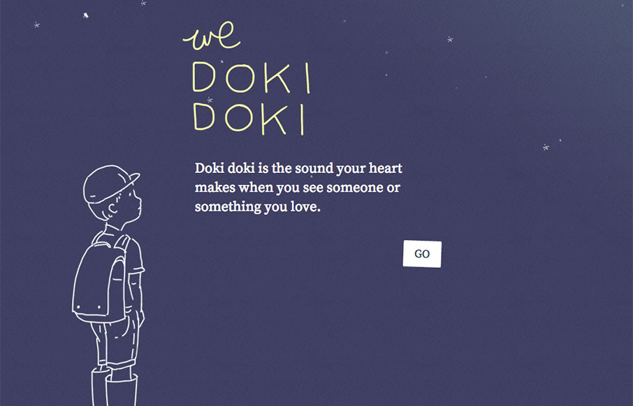
Cool site as a build up to a book release later this year, for The Sound of Silence – and the site I think is called We Doki Doki. See more from the designer here: From the Designer: We Doki Doki explores a new Japanese onomatopoeic sound each month and is the...

by Gene Crawford | Jan 7, 2016 | Gallery, Portfolio
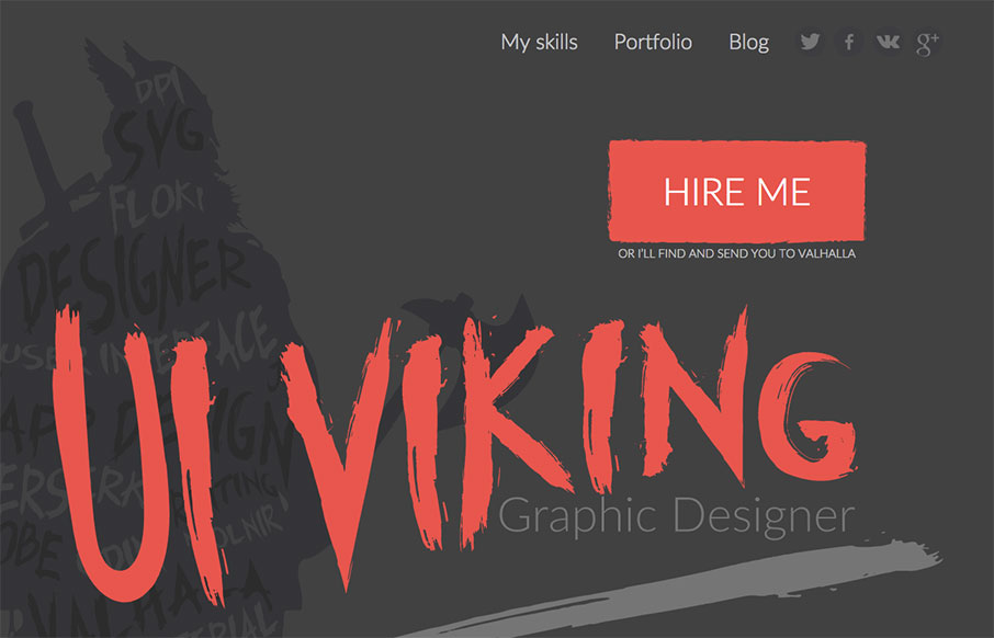
This. Site. From top to bottom I love. It’s a great exercise in branding and keeping your message through every single detail. It’s also super well done and beautiful. Also, I like Vikings. Seriously, go spend time on the site and enjoy the details. From...

by Aaron Griswold | Jan 6, 2016 | Gallery, Sports/Recreation
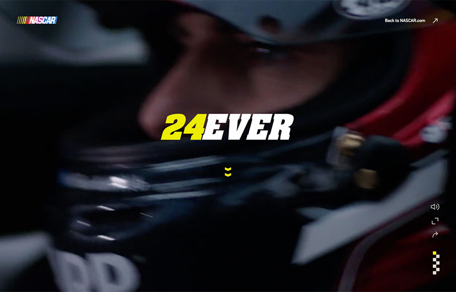
I have to admit that when Jeff Gordon came into the sport of NASCAR, I wasn’t a big fan (I was an Earnhardt fan) – but I’ve grown to like Wonder Boy and the Rainbow Warriors over the years. This tribute site to his 24+ year career is pretty sweet...
