by Gene Crawford | Mar 16, 2016 | Design Firm, Gallery
Very interesting site design here. I love the colors, the soft pallet and then the usage of the photos in the grid like that, clever work.
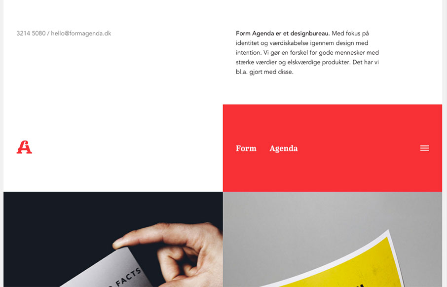
by Gene Crawford | Mar 15, 2016 | Design Firm, Gallery
Super non-traditional looking layout for the Form Agenda website. It does everything right IMHO. I like the contact info in the top left – instead of a logo. Very clever. Then the rest of the grid is very active and keeps it fresh feeling as you scroll down the...
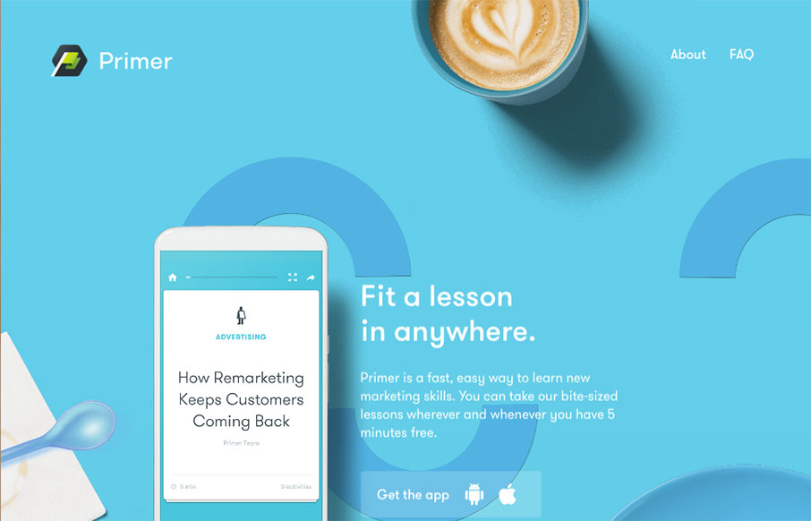
by Gene Crawford | Mar 15, 2016 | Gallery
Yeah, yeah, scroll-jacking and all that. I know i’ve complained about it myself too. But this is a fairly beautifully designed website. I like a ton of the details in play here. Solid design on top of a bad paradigm, I still find it enjoyable.
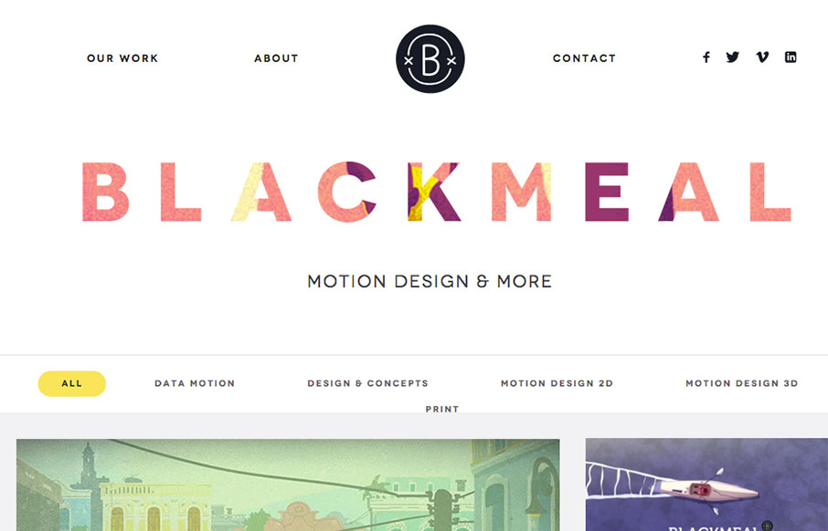
by Gene Crawford | Mar 15, 2016 | Gallery
I freaking love the grid layout here for Blackmeal. It’s very dynamic and transitions between screen widths quite well. My favorite part however is the transformative design aspect to the header, as you scroll down, it’s mesmerizing to me. It’s...
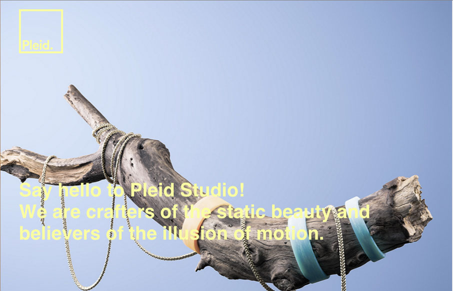
by Gene Crawford | Mar 14, 2016 | Design Firm, Gallery
Kind of a crazy ass website. I’m enjoying it tremendously even though it largely goes against most of my gut telling me the UX is bad. What do you all think?

by Gene Crawford | Mar 14, 2016 | Gallery, Portfolio
Nice portfolio website. It functions almost like a power point would, with big screens you move between. In that aspect I like the simplicity of the approach. What do you guys think? Does that work for you here?