by Gene Crawford | Feb 29, 2016 | Gallery, Nonprofit
Very simple color palette, and good typography from the TSE Foundation out of Hong Kong. I first saw it in a smaller screen – but it really opens up on a desktop and looks great, because it’s simple.

by Gene Crawford | Feb 29, 2016 | Gallery
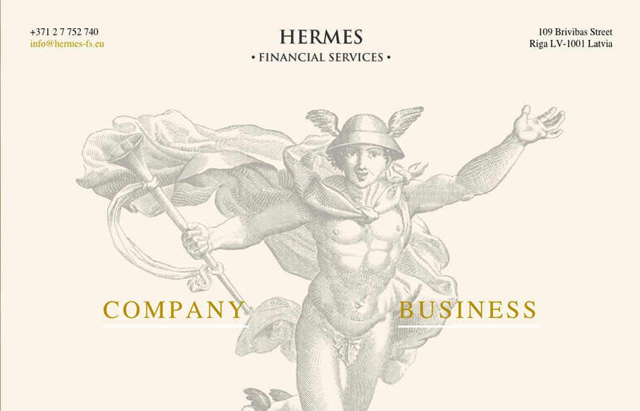
This Latvian site for Hermes Financial Services is extremely minimal… but we like it because of that. Very simple and to the point, but also has a good look to the site – from the Hermes illustration, to the coloring and fonts.

by Aaron Griswold | Feb 29, 2016 | Food and Beverage, Gallery
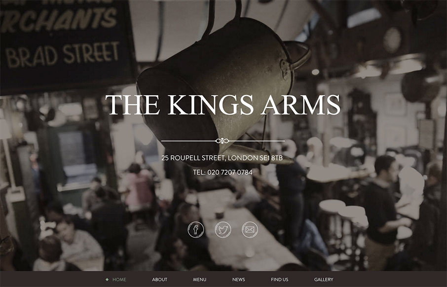
Great, tight one-pager from The Kings Arms pub out of London. Subtle grays and greens to give the site a warm aesthetic, which I’m assuming is the same for the pub itself (will have to find out next time in London).

by Aaron Griswold | Feb 26, 2016 | Gallery, Radar
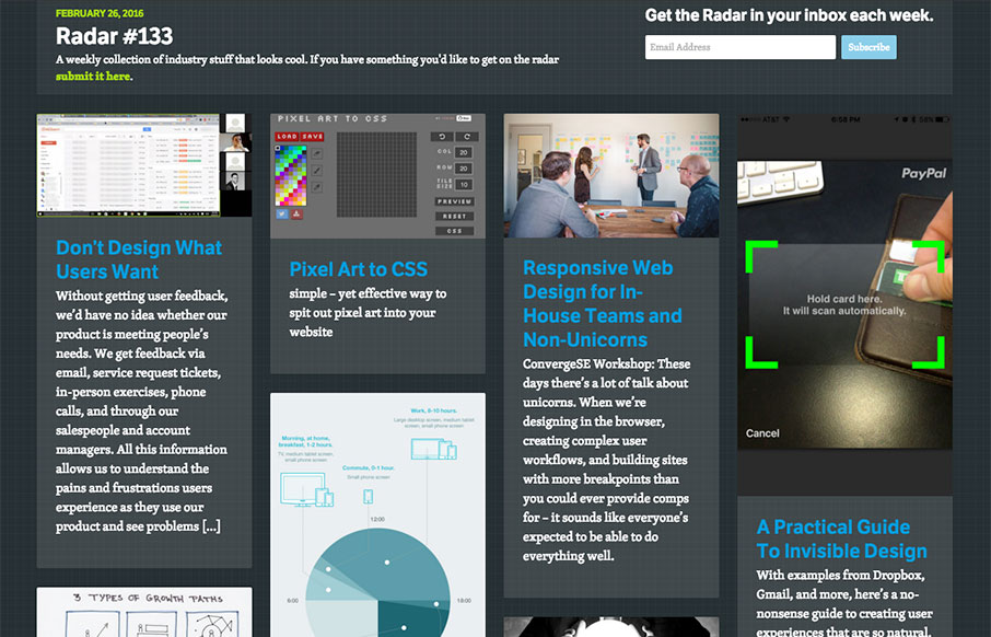
Each week, we do a round up of curated “stuff from the interwebs” that we call Radar. In this week’s 133rd Radar: Don’t Design What Users Want Without getting user feedback, we’d have no idea whether our product is meeting people’s needs. We get...

by Aaron Griswold | Feb 25, 2016 | Gallery, Music
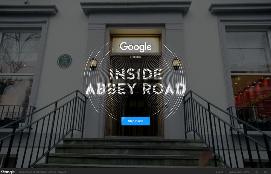
Man, I love this virtual tour of Abbey Road Studios done in collaboration with Google and their indoor mapping / 3d imaging / video / webgl work. It all combines into an incredibly cool, immersive experience, complete with quadrophonic sound (if you’re using...

by Gene Crawford | Feb 25, 2016 | Gallery
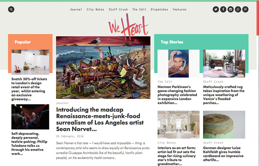
This digital magazine / newspaper from We Heart out of Barcelona and London is pretty sweet. It’s a great example of our “old timey” blogs have evolved into robust and exciting centers of knowledge – and with so much content, I think...
