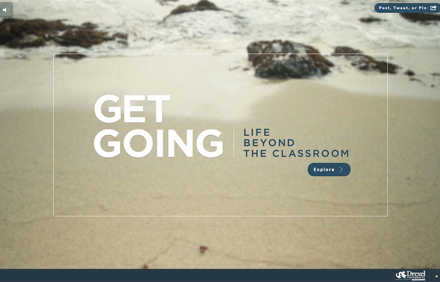
by Aaron Griswold | Mar 14, 2016 | Education, Gallery
Great use of multiple video backgrounds (and a slider) to tell stories for Drexel University’s Sacramento campus through the site “Get Going Today”. It’s a cool way to navigate through a site, and just explore.
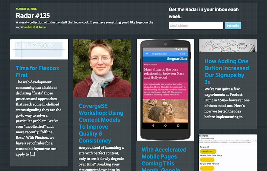
by Aaron Griswold | Mar 11, 2016 | Gallery, Radar
Each week, we do a round up of curated “stuff from the interwebs” that we call Radar. In this week’s 135th Radar: Time for Flexbox First The web development community has a habit of declaring “firsts” those practices and approaches that...
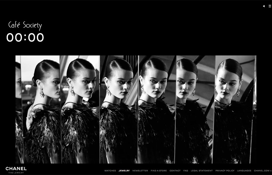
by Aaron Griswold | Mar 10, 2016 | Fashion, Gallery
Cool design for Chanel’s Cafe Society one-pager. Especially like the work with the video background work as you scroll through the page.
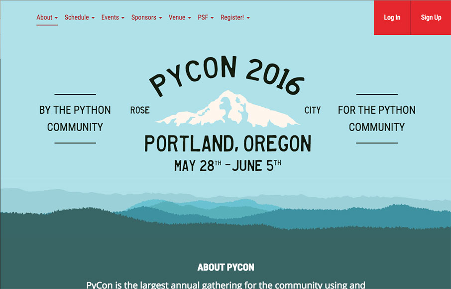
by Aaron Griswold | Mar 10, 2016 | Conference, Gallery
Good looking home page for PYCON 2016, happening in Portland, Oregon this year. I love the blends of the coloring with the svg work to make the page look really good in any responsive state. It looks to be designed by the Caktus Group out of Baltimore.
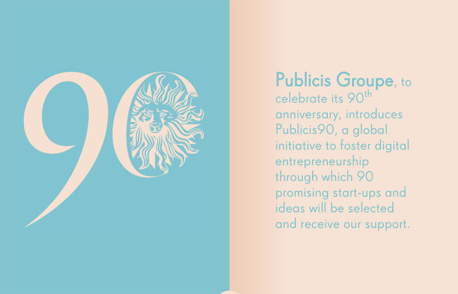
by Gene Crawford | Mar 9, 2016 | Gallery
Pretty read animation/interactions as you scroll down the page. If you can get over the scroll hijacking here you’ll dig it. The colors are spot on and the overall feel/vibe is very welcoming and soothing.
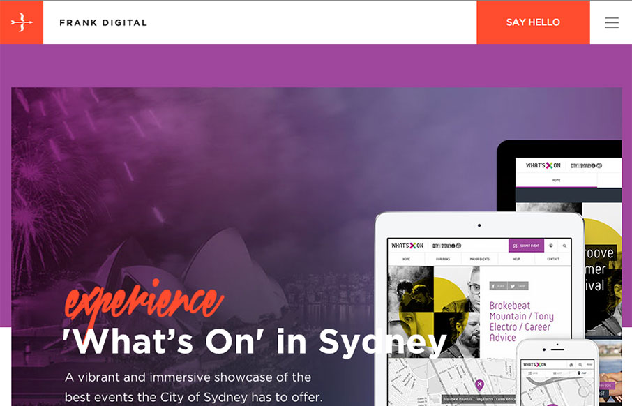
by Gene Crawford | Mar 9, 2016 | Gallery
Really good vertical rhythm for the Frank Digital site. I love the top section and how it feeds into the second, third and footer areas. That blog/news section is very nice as well. I love the asymmetry to it all, but at the same time it all comes off quite...