
by Aaron Griswold | Jun 26, 2014 | Gallery, Nonprofit
A good use of white (blue) space, in order to highlight what matters (on the site, and in life). I like the liquid background, that continues to enforce the theme of providing clean water for children. The “See how people are taking action to help children...

by Gene Crawford | Jun 4, 2014 | Environment, Gallery, Nonprofit
Darn nice web design here for Conservation.org from Viget. I especially like the interactions on the who we are section of the home page. Very nice work. There’s a pretty good case study setup on the Viget website about this one as well. Good stuff to read...
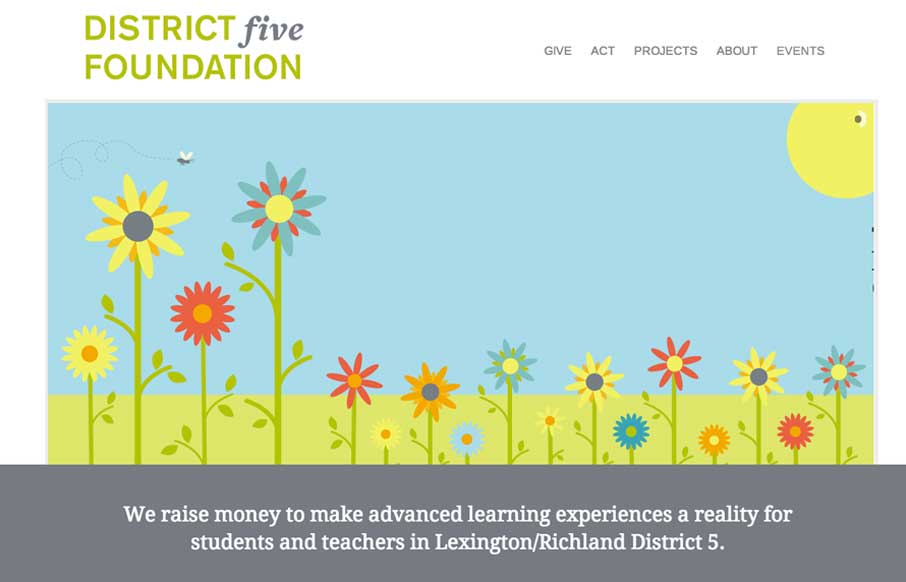
by Gene Crawford | Jun 3, 2014 | Education, Gallery, Nonprofit
I love simple design, it’s not as easy to pull off as you first think it is. This is why i’m always impressed when I find someone who has. This site for District 5 Foundation is one of those. Well thought out, well designed, deceptively simple websites. By...
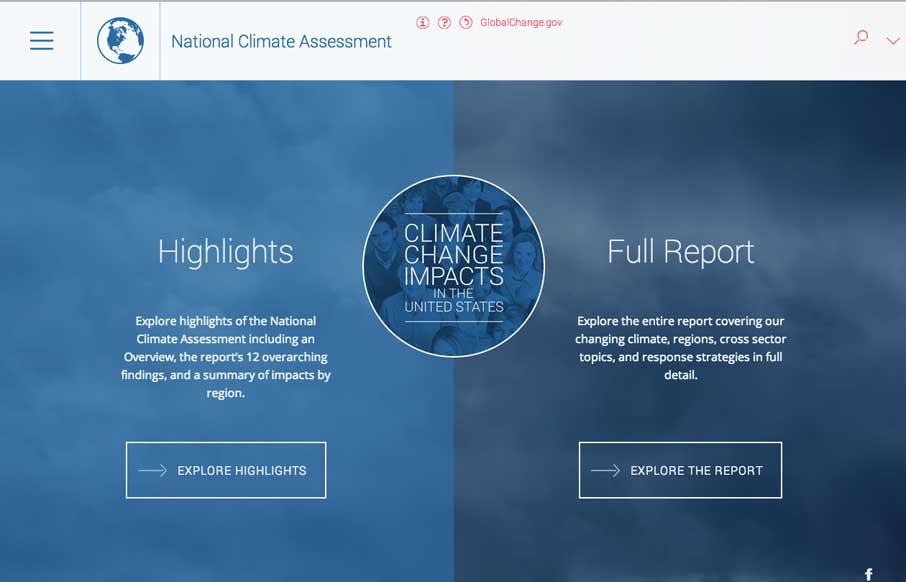
by Gene Crawford | May 23, 2014 | Gallery, Government, Nonprofit
Aside from being scared now. The National Climate Assessment website is a thing of beauty. Fully responsive and pretty dang immersive. Beautifully executed.
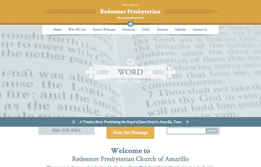
by Aaron Griswold | May 7, 2014 | Gallery, Nonprofit
A nice easy going design for the Redeemer Presbyterian here. I’d love for it to be responsive but you can’t always get what you want, eh? I do really dig the header area’s design a great deal.
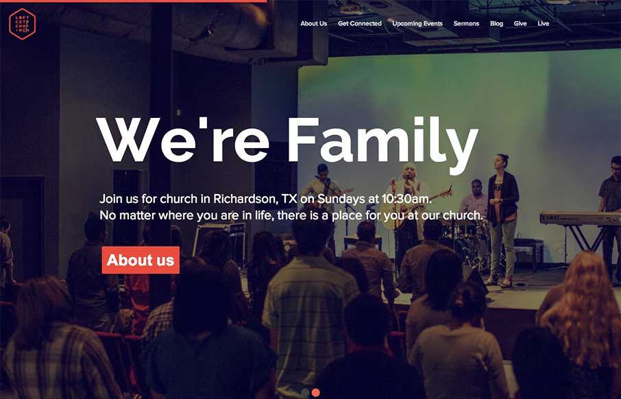
by Giovanni DiFeterici | Jun 24, 2013 | Gallery, Nonprofit
The loftcitychurch site strikes a wonderful balace between it’s use of images, typography and color. At large screen sizes the site feels big and open, which is perfect for a church, and at mobile sizes everything feels compact but not cramped. The use of fixed...