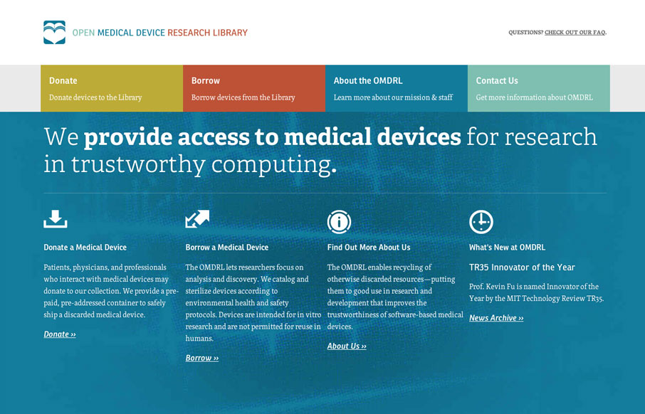
by Gene Crawford | Apr 9, 2012 | Gallery, Medical, Screencast Review
Love the omdrl.org website, it’s a beautifully minimal example of solid design. The typography and hierarchy of most everything across the site is in order. Particularly interesting is to study the three different phases of the main navigation design for the...
by julia | Sep 19, 2011 | Gallery, Medical
This is definitely not what I think of when I think about insurance benefits sites. It’s modern and refreshing – it’s even responsive! The doodle illustrations are friendly and have a fun contrast against the more realistic textures of the...
by Gene Crawford | Aug 22, 2011 | Gallery, Medical
This is a pretty cool looking single page website design. I like the concept and the naming. I even like the scrolling. I am confused over the animated navigation sections though, it feels unnecessary to me. Overall nice looking design though.
by Giovanni DiFeterici | Aug 11, 2011 | Gallery, Medical, Sports/Recreation
Danogborn.com cuts straight to the point. It’s refreshing to see a site like this (not a personal or agency portfolio site). Dan’s blog says a lot about the aesthetic that he wants to present, the choice of language and the… well, if...
by Gene Crawford | Jul 29, 2011 | Gallery, Medical
I really like the interactions and response of the page when navigating around this site. The fly out content boxes for the Dr’s bio’s are pretty cool. Normally I don’t like to hide info like that but in this case I think it’s super practical...
by Gene Crawford | Jul 12, 2011 | Gallery, Medical
Nice easy going website design visually. This site is deep on content and organization. The thing I like about this site is that it’s not a flashy client and the result of the work is all business. That’s what it’s about in what we do every day....
