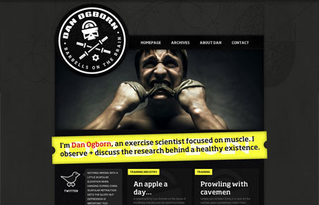
Danogborn.com cuts straight to the point. It’s refreshing to see a site like this (not a personal or agency portfolio site). Dan’s blog says a lot about the aesthetic that he wants to present, the choice of language and the… well, if you’ll pardon the term, “manliness” of the graphical treatments and the focused content all give a clear indication of this site’s intended audience and purpose. IMHO its a little overstated but the photography is nice and if you read through his blog entries, some fascinating content is there just waiting to be discovered.
Glassmorphism: The Transparent Design Trend That Refuses to Fade
Glassmorphism brings transparency, depth, and light back into modern UI. Learn how this “frosted glass” design trend enhances hierarchy, focus, and atmosphere, plus how to implement it in CSS responsibly.


I really like the feel of this site in that it comes off as very purposeful and not shy about it’s identity. I’ll admit to a little bit of cognitive dissonance between the science and training aspect and the masculinity of it all. It’s like if Hulk Hogan donned some reading glasses and asked to be taken seriously. And if you read some of his articles it seems like they are targeted to anybody who has interest in training, and they seem very well thought-out and researched but I wonder if the visual tone could be off-putting to some people.
I also think the type in the blog posts could be a little larger with a bit more leading and a smidge less contrast to make them easier to read.