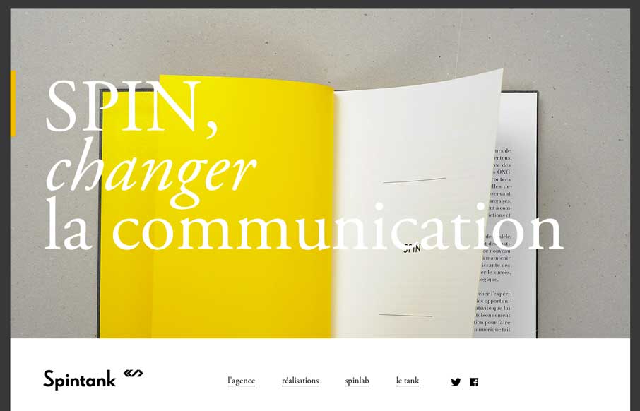
by Aaron Griswold | Jul 3, 2014 | Gallery, Marketing
With as many website submissions as we get, I admit that we have to look at some of them twice to see the clever, little things that make a site worthy of posting in the gallery. Spintank’s site was one of them for me. I think I was thrown off initially by not...
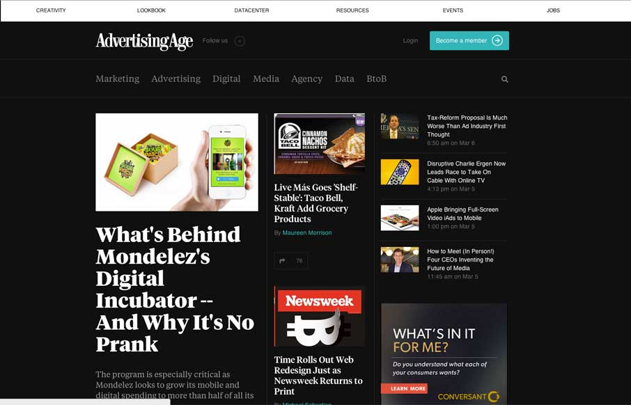
by Gene Crawford | Mar 14, 2014 | Gallery, Marketing
I dig the new Ad Age website. I like the top section that has the black background and how it uses that section for featured content. As you make your way down the page there’s some nice “sectioning” of specific styles of content. I love how the...
by Gene Crawford | Mar 14, 2014 | Gallery, Marketing
This is a great example of how you can use a simple game like experience to create something memorable. Go ahead, click the colored boxes, they “pop” like one of those addicting games on your phone. The overall website experience is superb for a...

by Giovanni DiFeterici | Mar 7, 2014 | Gallery, Marketing
Realtii does a great job of using animation to focus the user’s attention on key details. The colors are soft and friendly. A pleasant site with simple detailing.
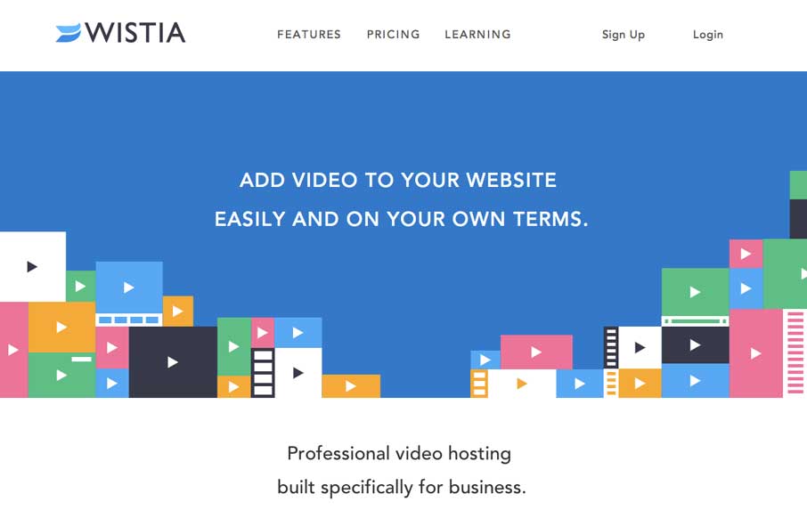
by Aaron Griswold | Mar 5, 2014 | Gallery, Marketing
This is a fast loading video based site that was made for a large screen. It has subtle parallax elements that don’t detract from the main video feature of the site. They could probably go with a cleaner social media linking system, but since it’s a new...
by Gene Crawford | Mar 4, 2014 | Gallery, Marketing
Love the colors and icon/illustration work on this site. The layout is pretty formulaic by design trend standards but sometimes that’s okay and with well designed elements you can really make things sing.