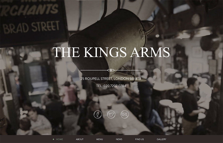
by Aaron Griswold | Feb 29, 2016 | Food and Beverage, Gallery
Great, tight one-pager from The Kings Arms pub out of London. Subtle grays and greens to give the site a warm aesthetic, which I’m assuming is the same for the pub itself (will have to find out next time in London).
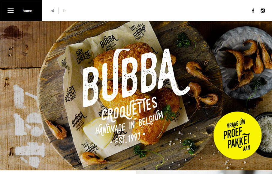
by Aaron Griswold | Feb 22, 2016 | Food and Beverage, Gallery
Good looking block design site fro Bubba Croquettes by Skinn out of Bruges, Belgium. Two things I especially like – first – the hamburger menu drawer opens to just the nav items – not to this huge overlay. Then second – I like how the footer...
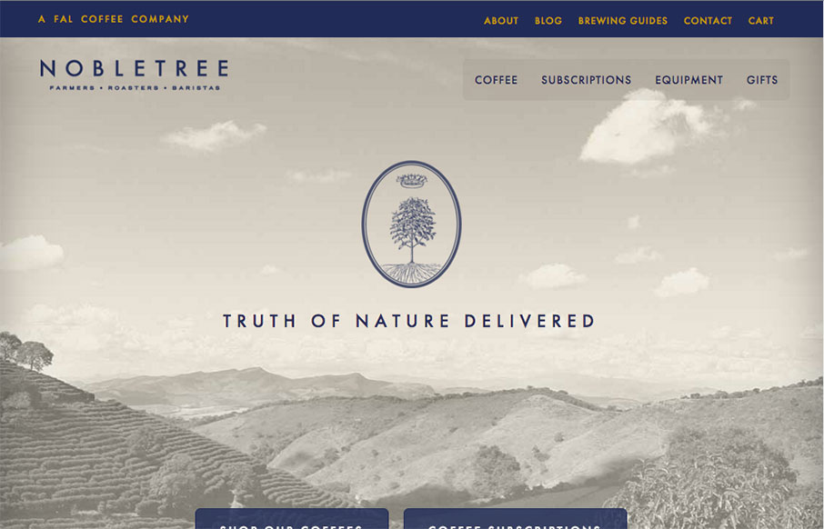
by Aaron Griswold | Feb 16, 2016 | Food and Beverage, Gallery
Rich and subtle color palette for Nobletree Coffee out of Brooklyn (looks like it was made by Figureground out of Minnesota). Really like the card design for the coffees – smart way to present the flavor and body notes. From the Designer: Clean, elegant and easy...
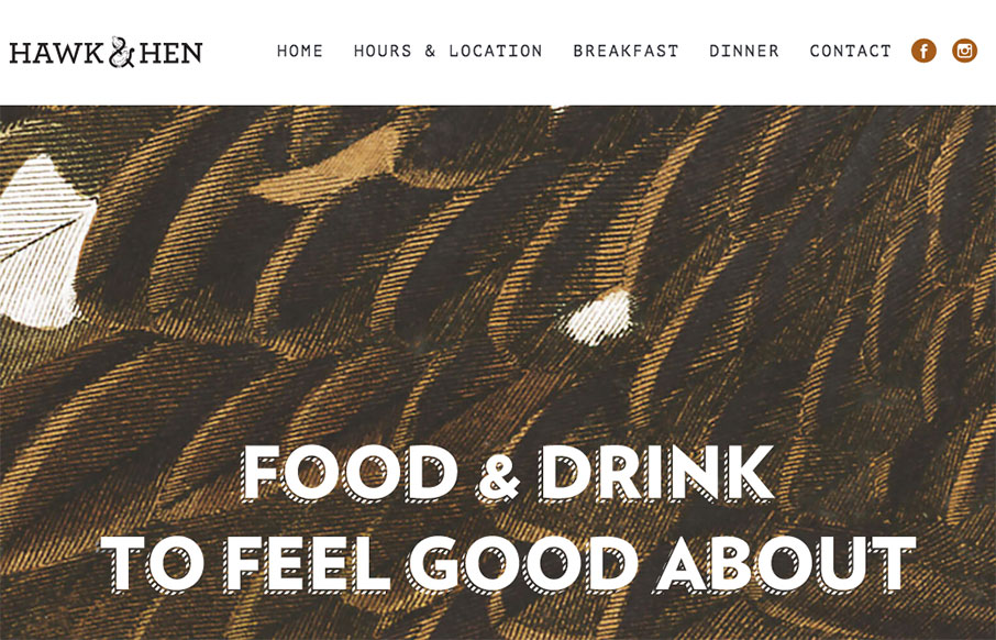
by Gene Crawford | Jan 19, 2016 | Food and Beverage, Gallery
Pretty cool website for this restaurant. I dig the name and branding too. Pretty straight forward but very openly usable by people. Love it.
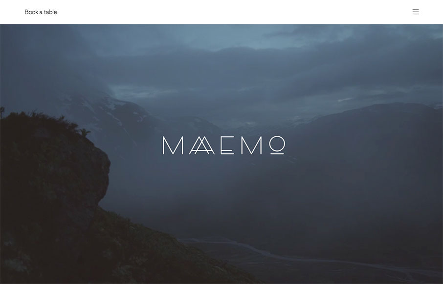
by Aaron Griswold | Jan 12, 2016 | Food and Beverage, Gallery
Love the background video for Maaemo out of Norway – great intro. This site is for a restaurant, so also like that they don’t let you miss that point – booking a table is a must for this place. The rest of the site has great photography on a simple...
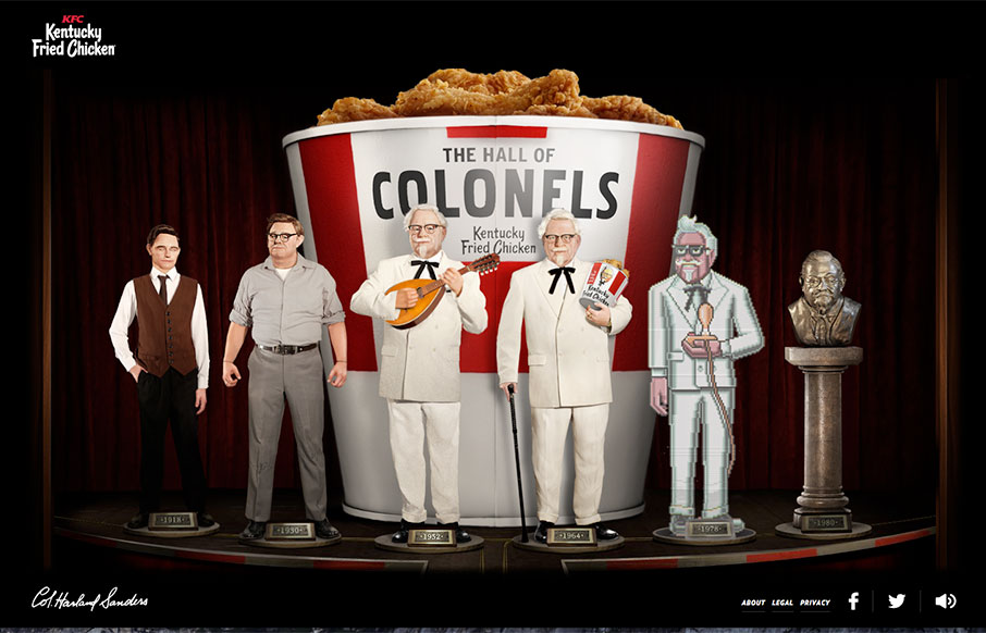
by Gene Crawford | Jan 12, 2016 | Food and Beverage, Gallery
Aside from being just extremely weird, this is a pretty fun delivery for the content. It has one aim, to better the KFC brand, It’s funny i’ll give ’em that.