GitHub Universe

GitHub Universe

Nice conference website for GitHub Universe. I like a lot about this, what do you think?

Better Off

Better Off

Cool targeted scrolling points on this design. I love the oversized typography too. Interested in your take on the business concept. What do you say?

All Things Open 2024

All Things Open 2024

I really love the illustration work and the textures. There are a lot nice little nuggets of animation and interaction as you scroll the home page. Bravo!

World Peace Foundation

World Peace Foundation

Really nice grid usage for this website. I really dig the simplicity in the layout and then all the little surprises as you start to interact with it. Subtle and straightforward.

Ebb

Ebb

Another pretty great minimal design. This is a wonderful example of a design approach working for something other than a designer or design firm's website. Love it.

Molly

Molly

Super cool minimal approach to the design for this website. I really like the way it 'uncovers' itself for you as you scroll. Smartly done.

Black Fountain Capital

Black Fountain Capital

Superbly done grid and overall layout. I love the monochromatic approach the colors too. Very classy and 'high-end' vibe.

Buonq

Buonq

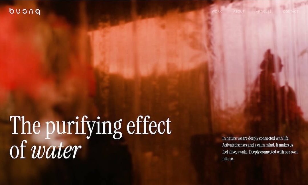
I really dig the super clean grid. Juxtaposing the text/copy and the images in such a clean way makes the vibe very professional. Museum level almost.

COB

COB

Really visually fun design. Much like the subject matter, popcorn, the designers could really go for it. I love the branding here, even the pop-up keeps with it.

CIELIA

CIELIA

Nice clean grid based design with minimalist color palette. There are some nifty visual surprises as you scroll the page(s). Well done.

Z2A Digital

Z2A Digital

I like the background, it 'feels' fuzzy and clean at the same time. I really dig the grid as well, feels swiss in it's approach.

UnD NY

UnD NY

Pretty radical looking design for something pretty straight forward as pastries. I kinda love it.

Train Hard

Train Hard

I like the stark black and white approach to this website design. It keeps it classy and focused. The strong typography matches well with the subject matter.

GoodBytes

GoodBytes

Explore this maximalist site at with interactive shaders, poppable balloons, GSAP animations, a 3D character, and a showreel of Three.js class demos and student projects.

UX & PRODUCT DESIGN WEEK

UX & PRODUCT DESIGN WEEK

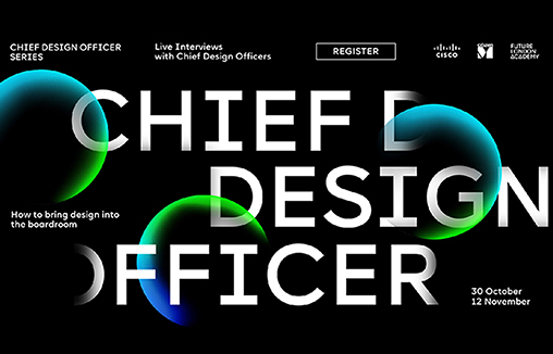
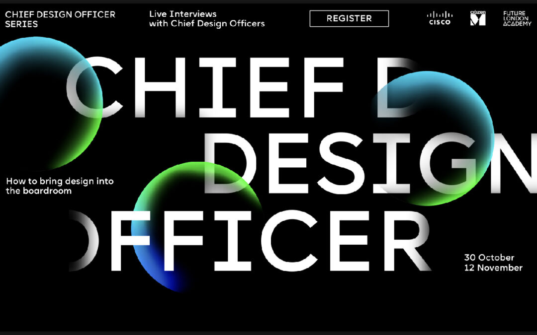
To celebrate the upcoming UX & Product Design Week Future London Academy’s design team created a fun and engaging landing page.

5forests

5forests

5forests is globally-recognized for our award-winning wine, beer, and spirits marketing.

Alchemy Digital

Alchemy Digital

Nice grid layout very dutch feeling to me. I like the presentation you get as you scroll down the page.

Life at Spotify

Life at Spotify

Nice scroll effects. This seams to be a trend for big brands in the audio/visual industry, not to mention the tech industry. This is done well in this example and still keeps the Spotify vibe going.

Ang Studio®

Ang Studio®

Cool home page presentation of work. I dig it, it is a bit disorienting if I look at this through a pure UX lens, but man it's fun and I think that may trump worrying too much about UX here.

DES

DES

Cool presentation delivered as you experience scrolling down on this website. Targeted animations used strategically always make me smile.

The Weather

The Weather

Design that turns heads. Digital advisory that wins hearts. No-nonsense web development.

Violet’s Code

Violet’s Code

Website to promote a new graphic novel, Violet’s Code, by J.D. Paulsen

Patch

Patch

I like the simple approach to color here. Not black and white but not too much color, keeping it surface level and focused on the content and story it's working to communicate. Smartly done website.

Workshop

Workshop

Really SWISS design vibe here. I dig how the layout feels like their furniture designs too. Minimal and solid. Great work.

Pony Studio

Pony Studio

Designers. Dreamers. Doers. Our branding stands for: Love the creative loop process | Our studio is our people | Love diversity and colours.

Konpo

Konpo

Website Design for ourself, Konpo studio, A software design team specialized in branding, websites, products and systems from 0 → 1

G R Ö N

G R Ö N

Experimental feeling design. Very stark and wild, reminds me of the old days of design with people like David Carson leading the trends.