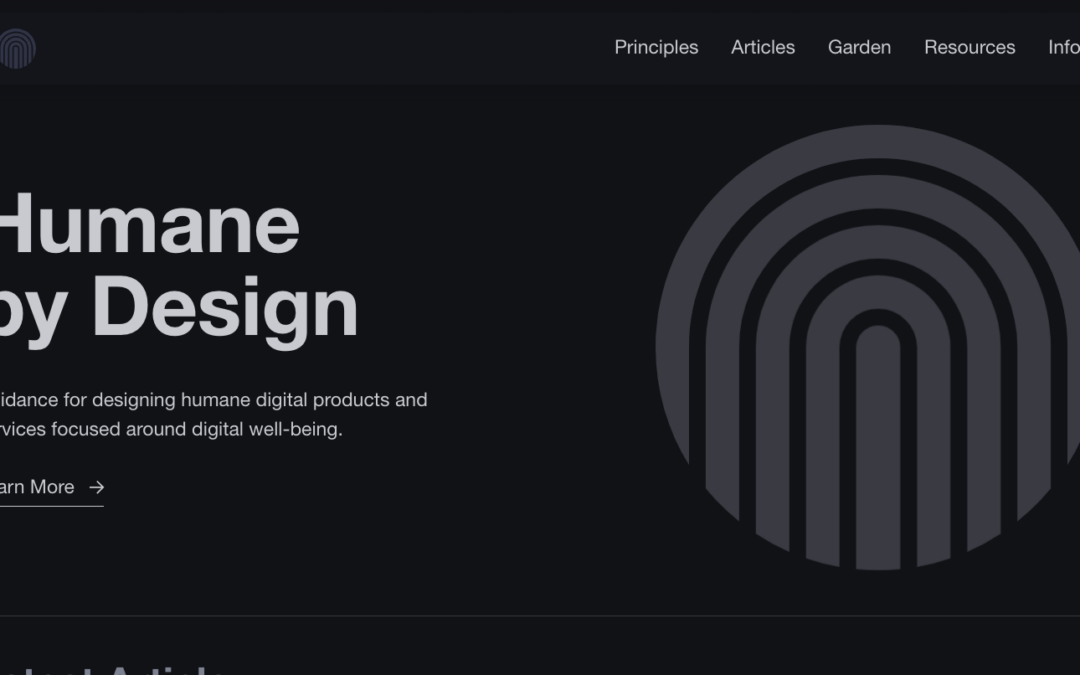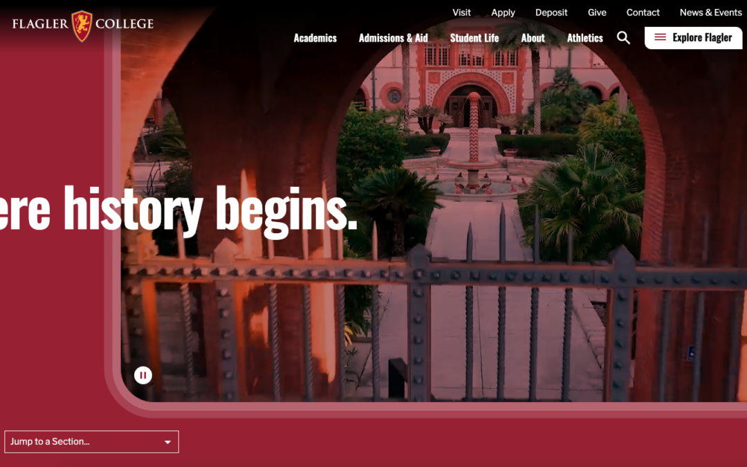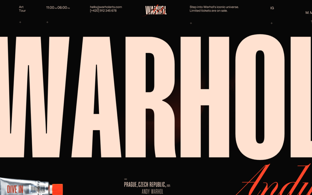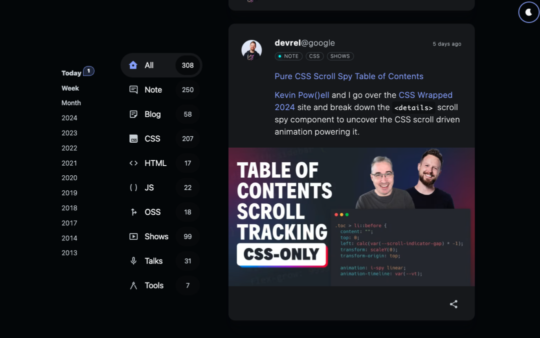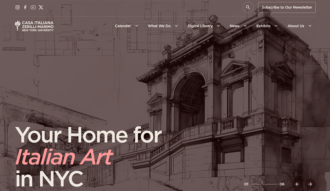
Nice minimal design. I love the light/dark switcher too. Menu is top notch.
Cantina Del Sol
Super fun design. I love the oversize graphics and dark colors. That menu is wild too!
Gardener
Dope Folk
Stevia Please
Interesting interactions here. I like the side scroll and the mouse-over ripple stuff. Cool vibes. i also really dig the about page copy being delivered as a chat bot look.
Max & Timber
A lot of browser slider interactions on this website. I always dig a website that comes off more as a designer portfolio but is actually a commercial project/product.
Tobias van Schneider
Very immersive visual experience with this website as you scroll down the page. Just go check the details.
Playground
Pretty cool visual experience here. I dig the grid layout and the simple color approach. Beauty through simplicity!
MindPalace
I love the shapes this website has utilized for design elements across the page. Somehow reminds me of print and that's a good refreshing thing for me.
CRI
Monolith Studio
Very cool use of photography and 3d movement. Not a fan of the music playing automatically but I can get over myself on it. Very cool visual experience.
Khagwal
Really nifty minimal design approach. It's hard to do to minimal well. It's not simply about being 'simple' – it's about having less or just having what's needed. This website is minimal and also has interactions and fun in places where they are pleasantly surprising....
SNP Agency
I like the visual vibe of this website, however some of the interactions and scroll-loading get's tedious feeling IMHO. Overall pretty well executed design.
BR Studio
Solid grid based design and subdued colors and typography.
Webisoft
Very cool interactions and subtle animations. I really like the future-tech vibe too.
Firefly Partners
Very cool interaction between loading the home page and getting to the content. I really like this. I love the colors and typography as well.
Faith Of A Mustard Seed
Very cool 'experience' with this website. I like how it's engaging as you scroll down the site and it's 100% appropriate for the subject matter too. Well done visual journey.
Better Off
Solid typography and grid work. I love the grayscale/mono coloring and the boldness of it. Another subscription design based shop too. Interesting IMHO.
Rendezvous
I really like this design, especially considering it's not a web design firm website. It's for a barber/stylist!
Wondermake
Fun interactions and layout. I don't normally love the cursor take-over but in this case it's fun and works. Clean interactions make this website really work.
Mercredi Studio
Bold typography and photos. I like a lot of the details here like the overlay meta info on the images. Solid work.
Genbrand
Nice bold typography and sticky grid. I like the dark background utilized here too.
NorthPoint
Branding, design & creative agency in Sydney. Specialising in brand identity, packaging design, print & digital communications, websites, advertising campaigns.
CROCS – the brand they love to hate
Website on the history of Crocs: from a startup in 2002 to a global leader in comfortable footwear, thanks to innovative designs and materials. Discover key milestones and the brand’s worldwide popularity.
Loadsmith
Navigating the complexities of the autonomous trucking world, La Visual redefined and reinforced Loadsmith’s position as a “Driver First” leader. Drawing upon our previous branding success and using comprehensive digital strategies, we further established Loadsmith as a trailblazer, seamlessly intertwining technology with a deep-rooted respect for the driver’s role in the industry.
Flat
Very nice product website. It's got some of what you'd expect with the layout but also has some nice minimal interaction as you scroll. Good clean work here.
Intrepid
I love the simplicity in the layout but the layered complexity from the interaction of this website.
Halo
Dentistry tool website that comes off like an agency website. I dig it, it brings some fun to an otherwise stuffy feeling industry.