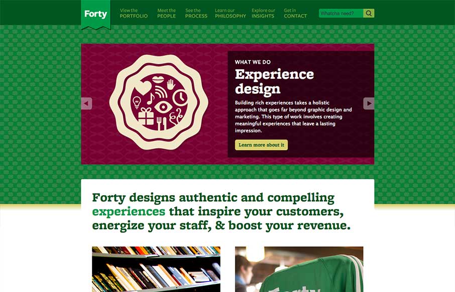
by Gene Crawford | Apr 8, 2013 | Design Firm, Gallery
The thing that stands out to me most on the Forty Agency website is the copy. It’s clean, thorough and has a really strong personality too. I love the main navigation naming too with the sub titles/microcopy. Overall solid design too, nice fixed header...
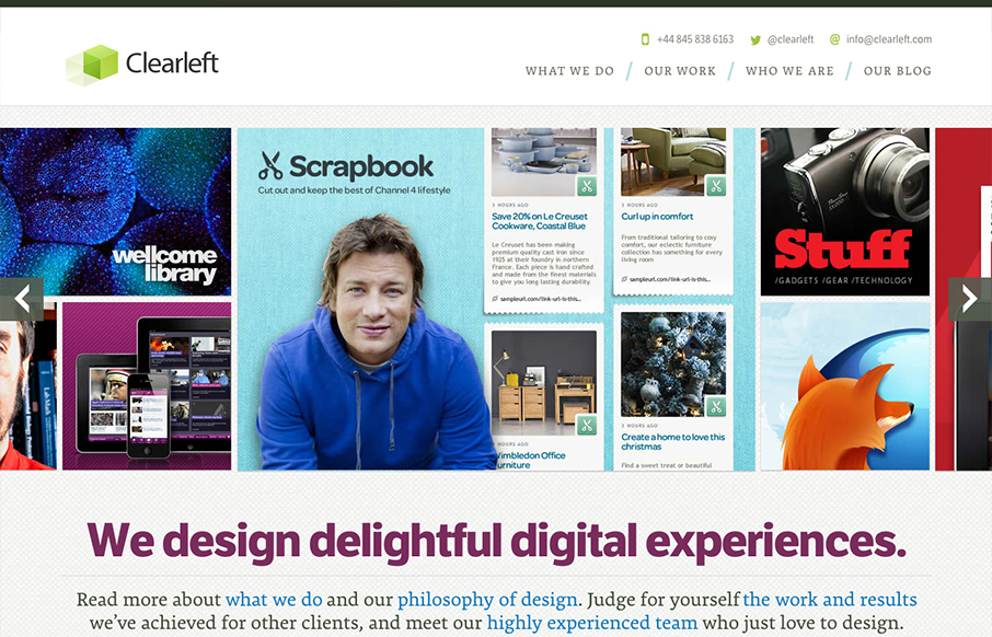
by Gene Crawford | Jan 14, 2013 | Design Firm, Gallery
What a great re-launch of one of the companies I’ve watched for several years help lead our industry. The new Clearleft site is a thing of beauty. It’s simplified yet not too much, it has some complex(ish) interactions with the slideshow and detailed links...
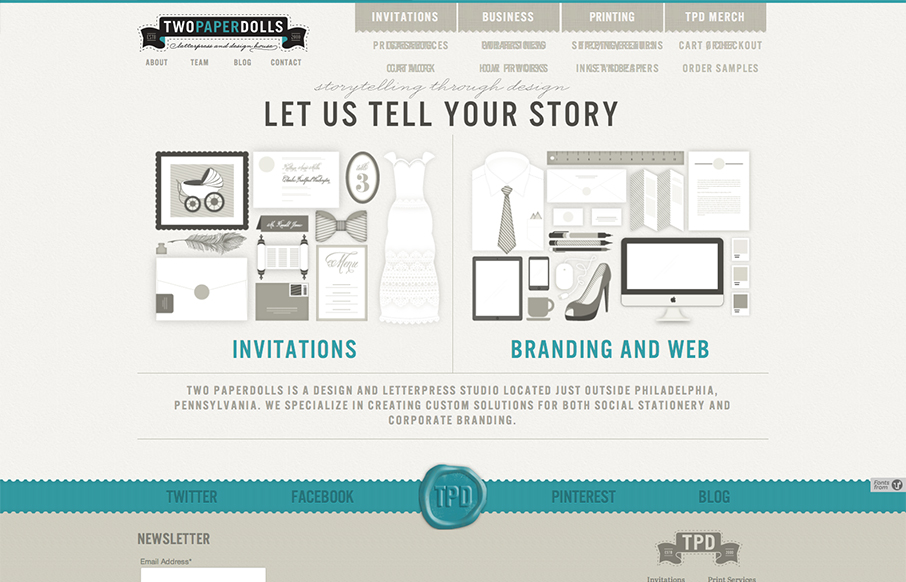
by Gene Crawford | Dec 17, 2012 | Design Firm, Gallery
Gawd I love these illustrations, so precise and fun. The second thing is I like how upfront the two directions in service are displayed. “Invitations” and then “Branding & web” you can choose your adventure. That’s smart if the...
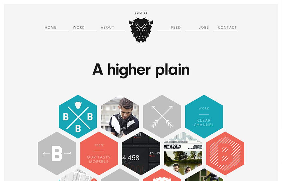
by Gene Crawford | Dec 4, 2012 | Design Firm, Gallery
I LOVE the new Built By Buffalo design. So clean and sharp. The hexagon shapes feel very new compared to other sites too. Slick responsive design solution that’s just as clean and concise as other screen width versions of it. Beautiful! Ascii buffalo head...
by Gene Crawford | Nov 30, 2012 | Design Firm, Gallery
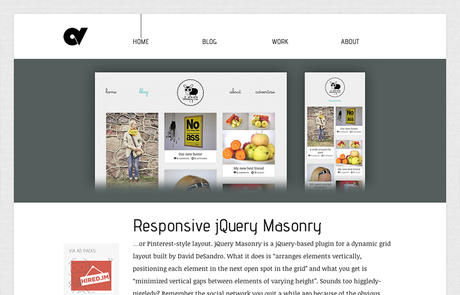
I just love this site design. The minimal color palette and the simple yet deep approach to the layout. The single list of posts on the home page just sings to me for some reason. I think it’s the balance the designer has struck vertically with the layout....

by Gene Crawford | Nov 19, 2012 | Design Firm, Gallery
Bold colors and simple copy help sell this company even if I can’t speak the language. It’s a nice simple yet bold interaction design that has a nice feel to it. I like the little contact envelope that rolls out to be more info in the bottom right the...