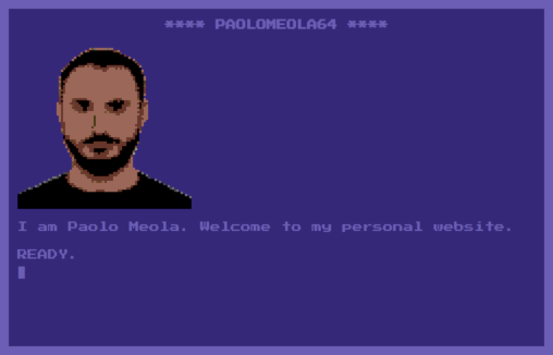
by Gene Crawford | May 11, 2020 | Design Firm, Gallery
terminal-like navigation personal website inspired by Commodore64 monitor colors and design. Name: Paolo Meola Short Author Bio: I am a digital entrepreneur with a solid technical background. Role: Designer & Developer Twitter: @ymx1zq Country:...
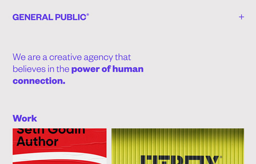
by Gene Crawford | May 8, 2020 | Design Firm, Gallery
We are a creative agency that believes in the power of human connection. Name: Jim Richardson Short Author Bio: Designer with 20 years experience working on branding, print and digital projects. Your Role in this Website’s Production: Designer Country: United...
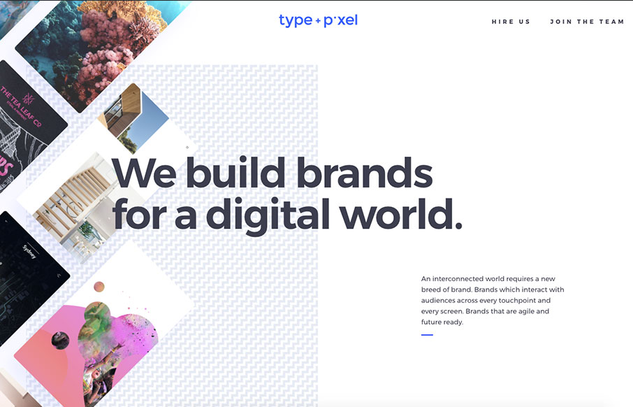
by Gene Crawford | Jun 26, 2017 | Design Firm, Gallery
Pretty rad rhythm to this layout. I love the vertical spacing and imagery used to kick off points of interest as you make your way down the page. Good looking work here. We design brands and digital experiences that engage audiences and deliver return on investment...
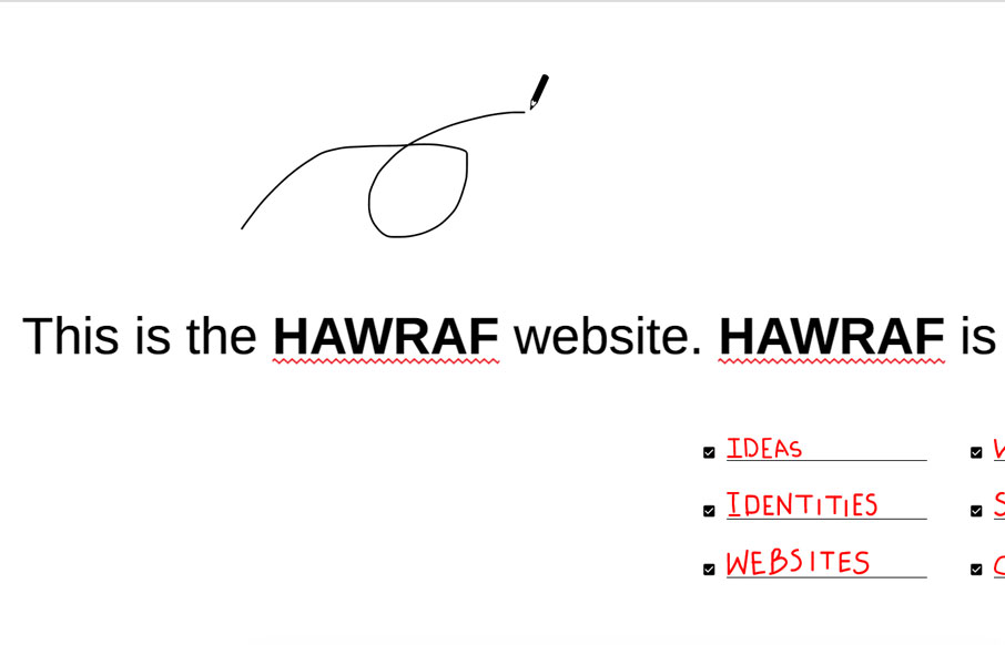
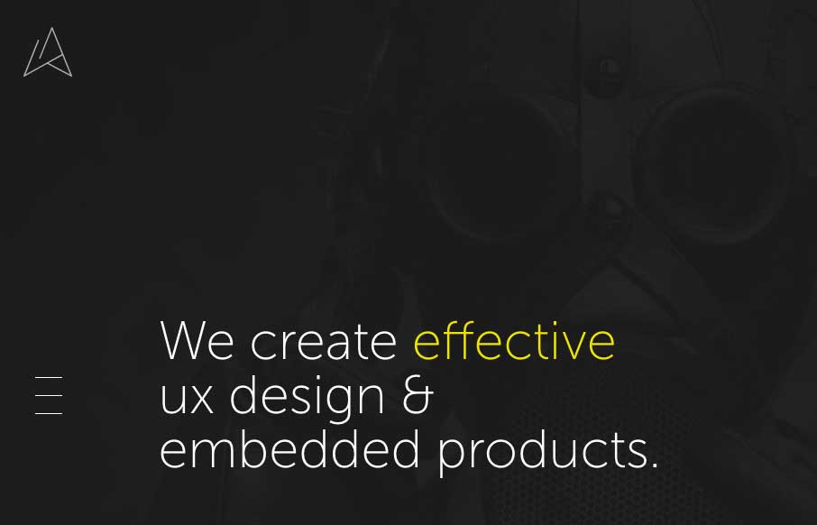
by Gene Crawford | Apr 27, 2017 | Design Firm, Gallery
Pretty dang crazy website. I kinda dig it though. It’s highly confusing form a standard set of expectations, but it ends up working just fine. I actually called someone over to my desk and asked them to figure out how to do something on the site and they did no...
by Gene Crawford | Nov 2, 2016 | Design Firm, Gallery
Love the vibe of this site. I really dig how the side nav icon/thing moves up so you notice it as you scroll down. Like the dark background setup here too. From the Designer: We are digital agency based in Ukraine. Our independent team help you to provide the best...
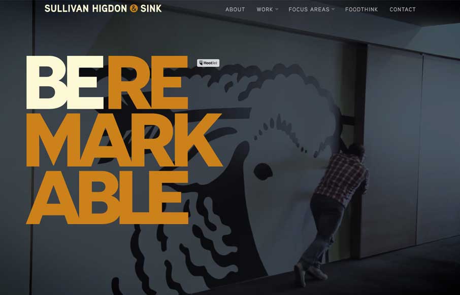
by Gene Crawford | Oct 11, 2016 | Design Firm, Gallery
Love the bold typography and dark/rich colors. I also really dig the way the marquees are used for the case-studies. Very clever and bold design.