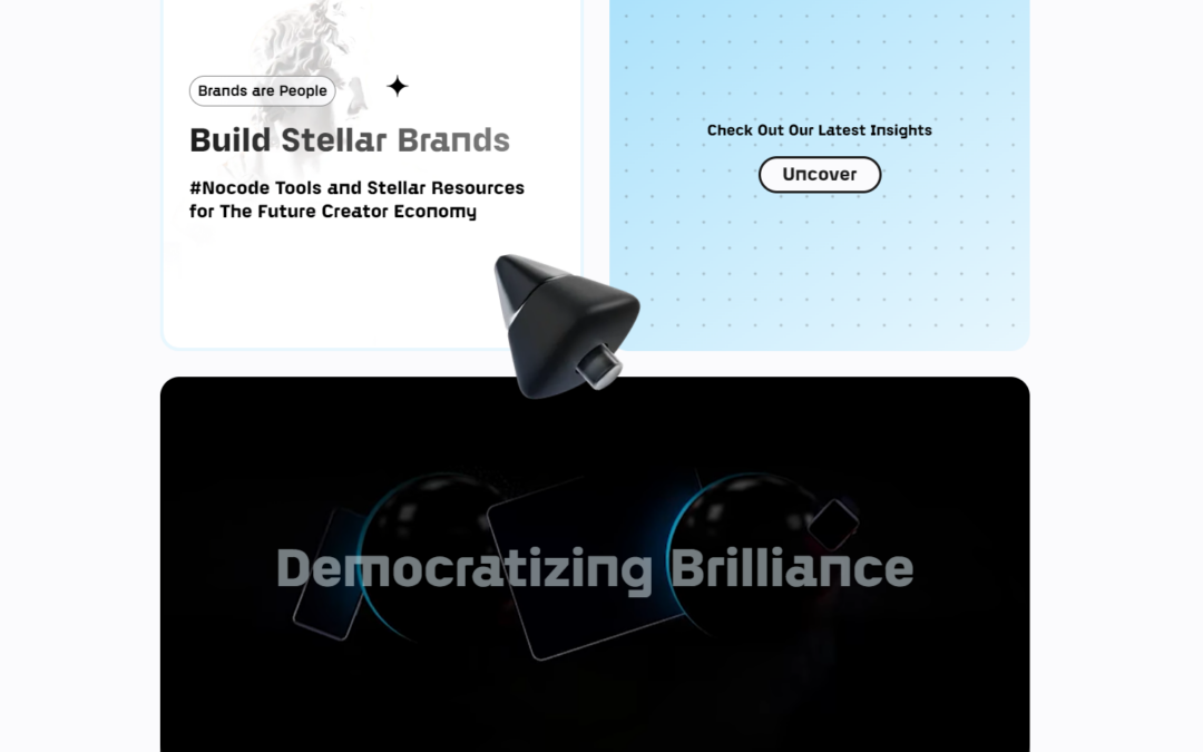
by Gene Crawford | Jul 27, 2023 | Design Firm, Gallery
Create Bespoke No-Code Brands Using Our Tools and Insights.
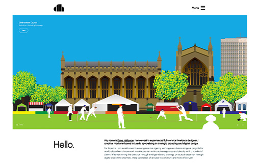
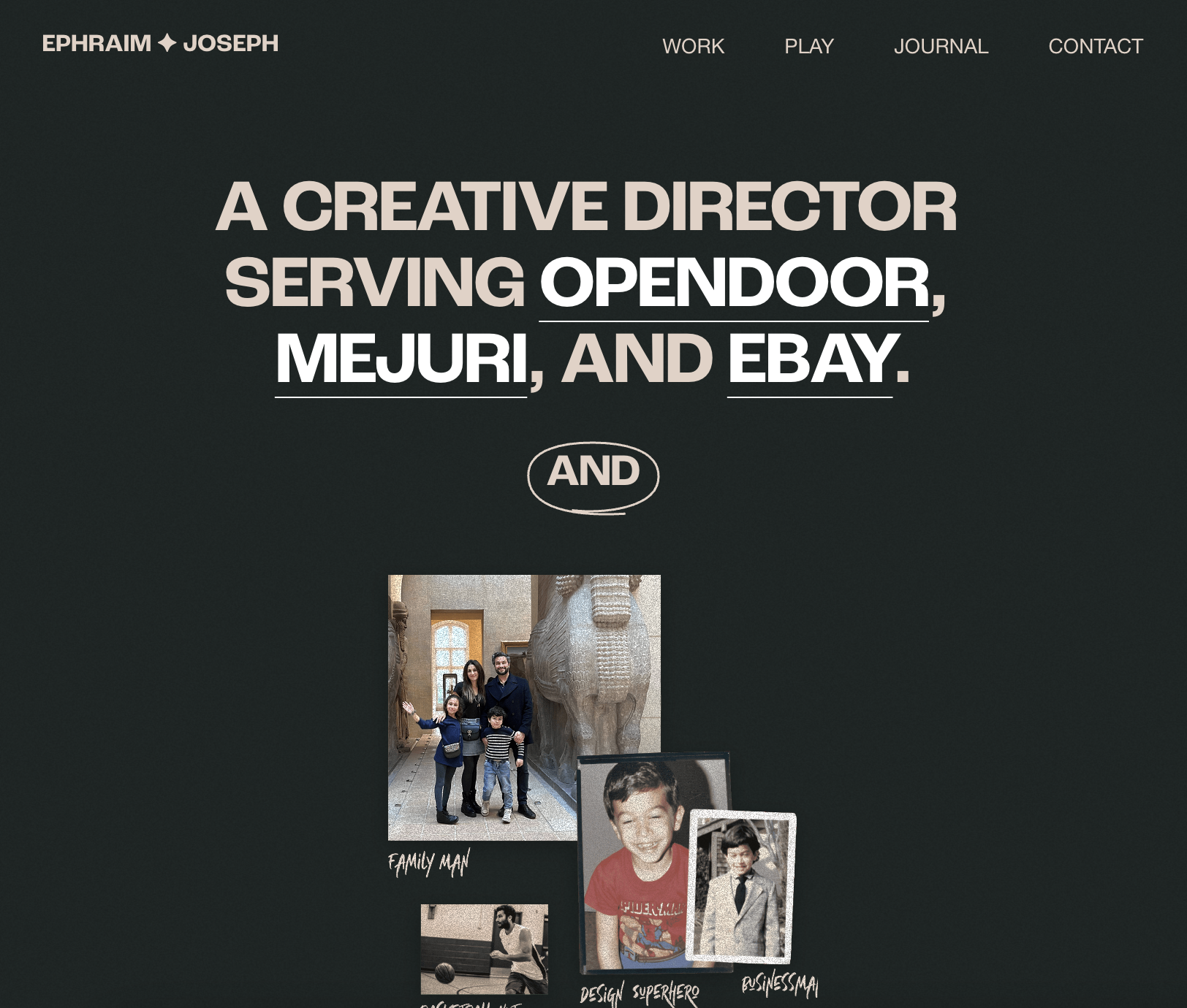
by Gene Crawford | Jul 21, 2023 | Design Firm, Gallery
Portfolio website for Dave Holloway – a vastly-experienced full-service freelance designer and strategist based in Leeds (UK) specialising in strategic branding and digital design. Also features a cool Blog / Midjourney AI image gallery
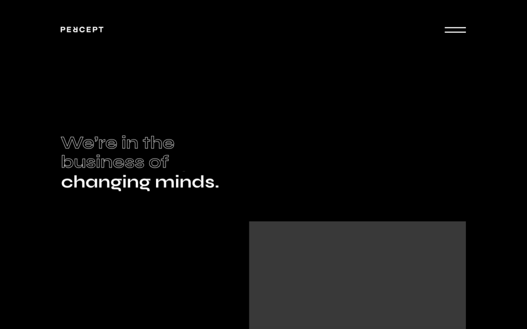
by Gene Crawford | Jul 20, 2023 | Design Firm, Gallery, Screencast Review
Percept Brand Design is a results-driven Sydney creative agency. Our expertise is in all things related to brand design; from branding and packaging design right through to marketing communications and of course website design. Percept Brand Design is here to help...
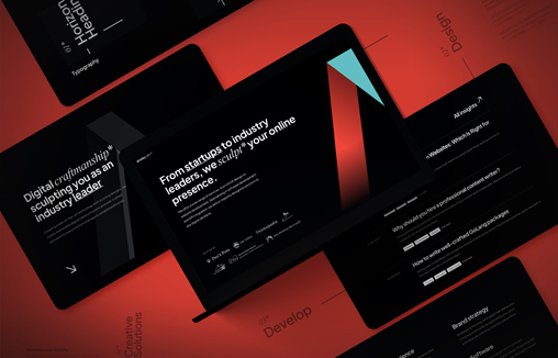
by Gene Crawford | Jul 19, 2023 | Design Firm, Gallery
Coupling state-of-the-art technology with stunning designs, ainsley.dev creates bespoke websites & custom in-house software from startups to established brands.
by Gene Crawford | Jul 18, 2023 | Design Firm, Gallery
Modern design and easy to navigate!
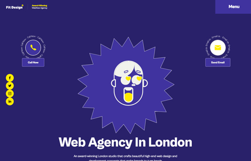
by Gene Crawford | Jul 17, 2023 | Design Firm, Gallery
We are a creative web design agency in London, that specializes in bespoke and affordable website design, web development, SEO service, and eCommerce solution.