by Giovanni DiFeterici | Sep 6, 2012 | Conference, Gallery
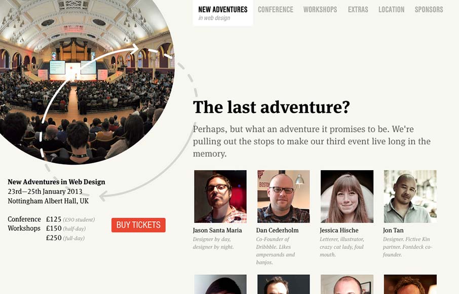
Nice site. I really like the static content on the left. Really, this site is all about selling tickets. It makes sense to keep that button on the page at all times. I think that the collapsed nav is interesting, though I feel that area of the page has room for a...
by Gene Crawford | Aug 20, 2012 | Conference, Gallery
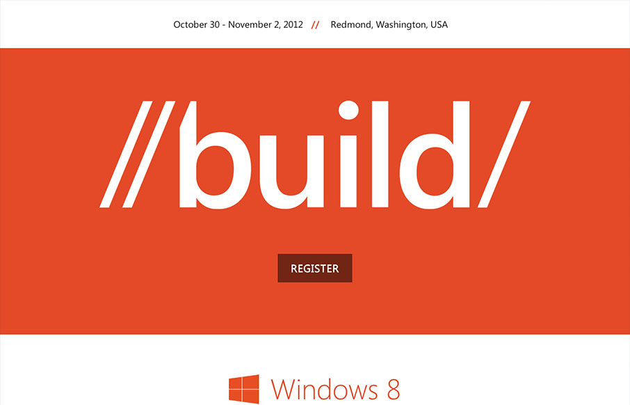
Those fine folks at Paravel have launched a new responsive masterpiece. This time for the 2012 Build conference for Microsoft. Trent Walton posted a nice write up to commemorate the launch: Lesson learned: Get it in the browser as soon as you can (if you don’t start...
by Gene Crawford | Aug 1, 2012 | Conference, Gallery
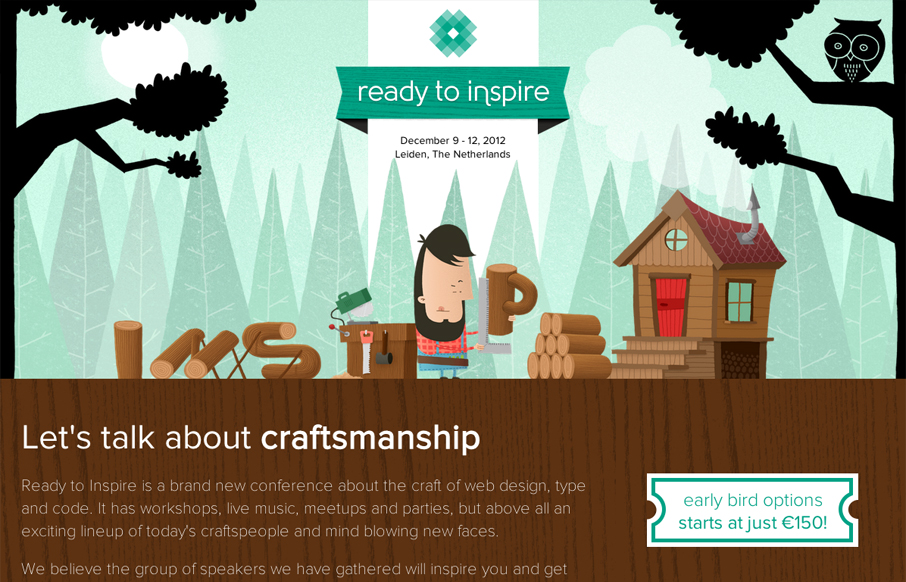
The 2012 Inspire Conference website is wonderfully illustrated. I like the little lumberjack dude and how it’s all tied into the theme. Nice responsive design too. Lovely site and it looks like a kick-ass conference too!
by Gene Crawford | Jul 17, 2012 | Conference, Gallery
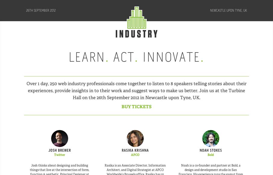
Super simple yet clean and open looking conference website. I like the green & gray color palette too.
by Gene Crawford | Jul 16, 2012 | Conference, Gallery
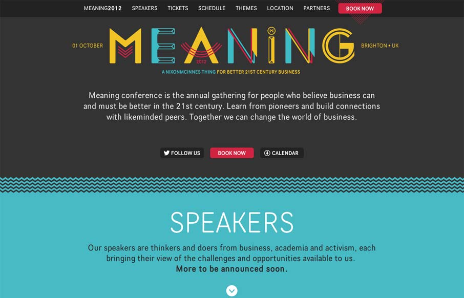
Nice clean conference website design. I like the mix of the green and dark grey. The “book now” button is very clearly/obvious by being red and they also designed that little triangle pattern behind it. The sections are clearly marked with wavy lines and...
by Gene Crawford | May 30, 2012 | Conference, Gallery
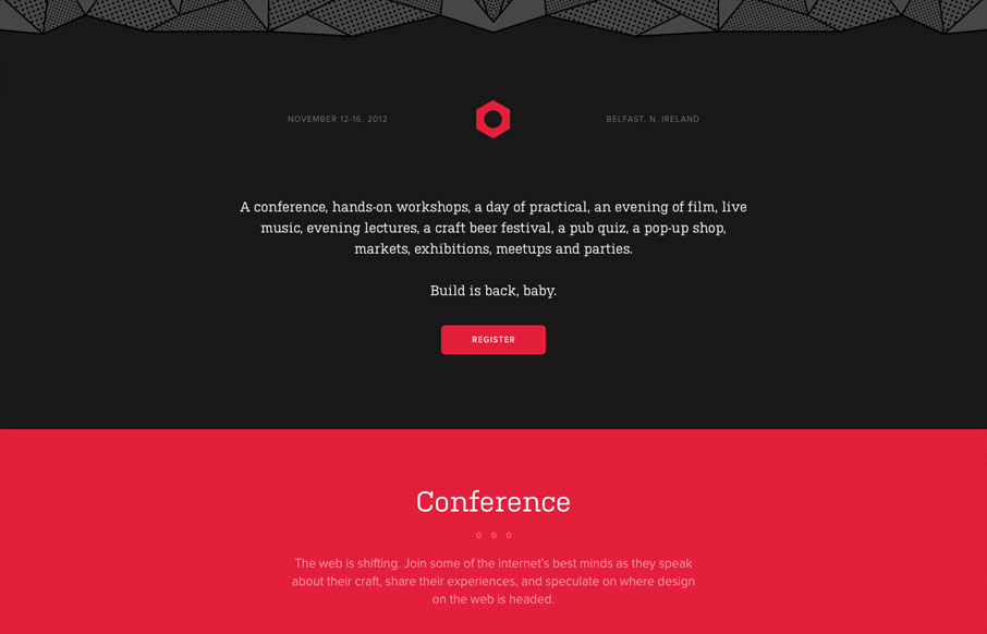
The 2012 Build Conference website is just beautiful. It makes me happy to scroll down and see the rounded headshots and then to discover the icons that have been designed to tell the tale of the workshops and finge events. The icon/illustration of Aaron Draplin is...
