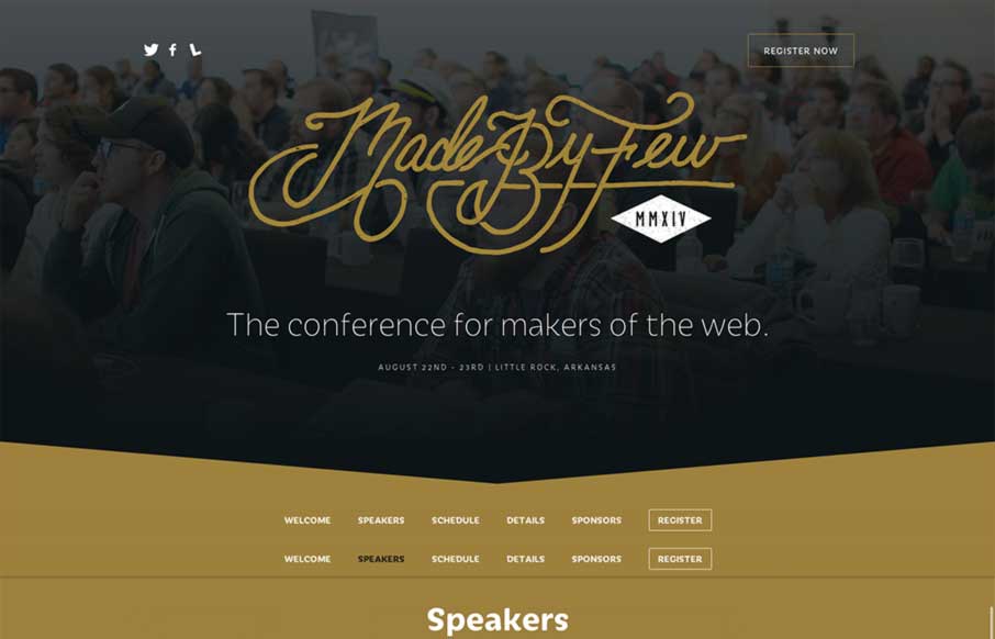
by Aaron Griswold | Apr 2, 2014 | Conference, Gallery
The new Made By Few site for 2014 is marvelous. The lineup is looking good too. I really dig this design pattern where the top of the page is used for a big hero area and as you slide down the page the main nav sort of sticks into place and is set. This site does that...
by Gene Crawford | May 21, 2013 | Conference, Gallery
What a great simple concept for a conference website. It’s super appropriately designed for the audience and for the subject matter. I LOVE stuff like this. I’ll also let Cameron Moll’s quote do the explanin’: Also, click the speaker’s...
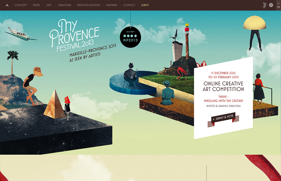
by Gene Crawford | Jan 22, 2013 | Conference, Gallery
Submitted by: Florian Monfrini @AgenceUzik Role: Project Manager My Provence Festival is an online creative art competition, open to all, and run by Bouches-du-Rhône Tourisme (France) between December 15, 2012 and February 10, 2013. This year the theme of the...
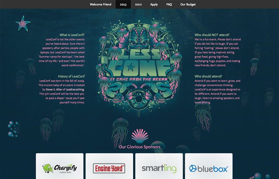
by Gene Crawford | Jan 21, 2013 | Conference, Gallery
I love the LessConf guys, Alan and Steve. They put on a great conference (if you can call it that) and each year they utilize pretty fun and far out illustrations. It’s almost theme like, but generally just fun. This year it’s an animated under sea...
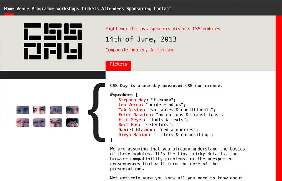
by Giovanni DiFeterici | Sep 6, 2012 | Conference, Gallery
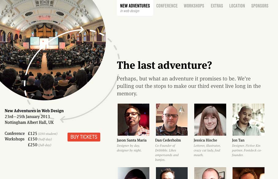
Nice site. I really like the static content on the left. Really, this site is all about selling tickets. It makes sense to keep that button on the page at all times. I think that the collapsed nav is interesting, though I feel that area of the page has room for a...
by Gene Crawford | Aug 20, 2012 | Conference, Gallery
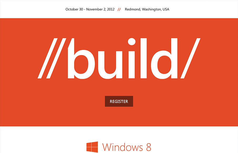
Those fine folks at Paravel have launched a new responsive masterpiece. This time for the 2012 Build conference for Microsoft. Trent Walton posted a nice write up to commemorate the launch: Lesson learned: Get it in the browser as soon as you can (if you don’t start...