by Gene Crawford | Apr 2, 2024 | Gallery, Marketing, Product
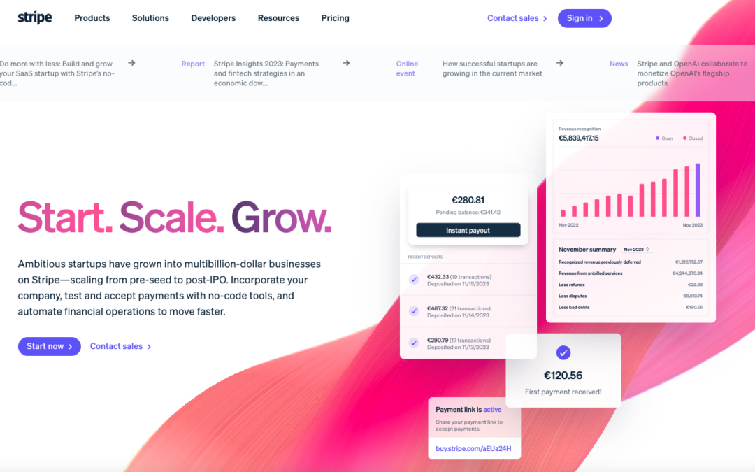
Holy cow what a super detailed design for Stripe Startups. Now this isn’t the most trendy, over the top, designer portfolio style design but if you are a UX professional you’ll just love to pick this one apart. Dig into it with the video...
by Gene Crawford | Apr 1, 2024 | Radar
.bh__table, .bh__table_header, .bh__table_cell { border: 1px solid #C0C0C0; } .bh__table_cell { padding: 5px; background-color: #FFFFFF; } .bh__table_cell p { color: #2D2D2D; font-family: ‘Helvetica’,Arial,sans-serif !important; overflow-wrap: break-word;...
by Gene Crawford | Mar 29, 2024 | Gallery, Product
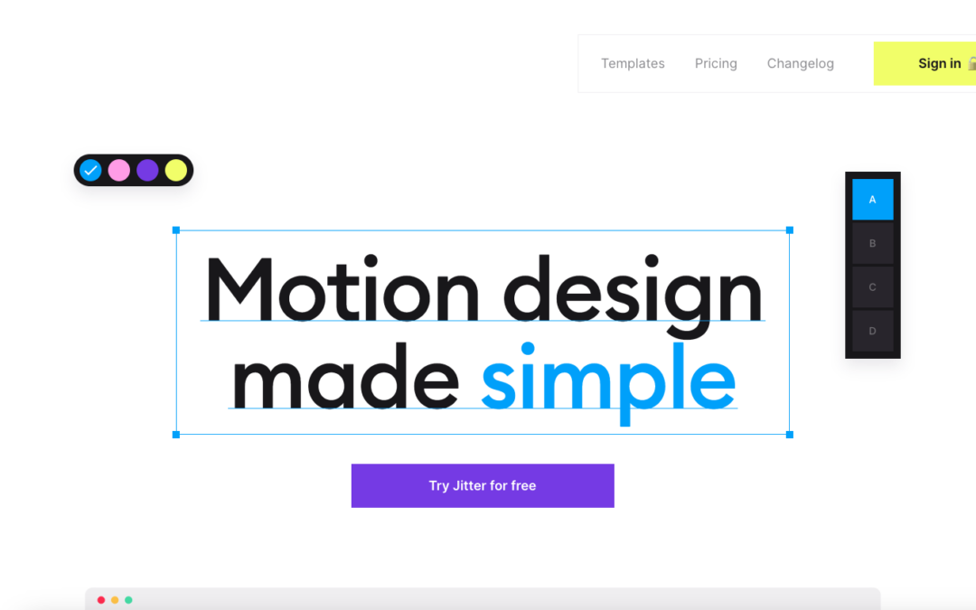
Very cool interactions. Well, it kinda has to have it, yeah? Lolz. Seriously though this is a fun one to scroll down the page on. Check it out.

by Gene Crawford | Mar 28, 2024 | Design Firm, Gallery
The Fantasy website(s) have always been pretty rad. Even back in the Flash days – they’ve continued this sort of approach here. I’m not normally a fan of the scroll (down) but get horizontal movement thing, but it somehow feels natural here. As...
by Gene Crawford | Mar 27, 2024 | Gallery, Marketing
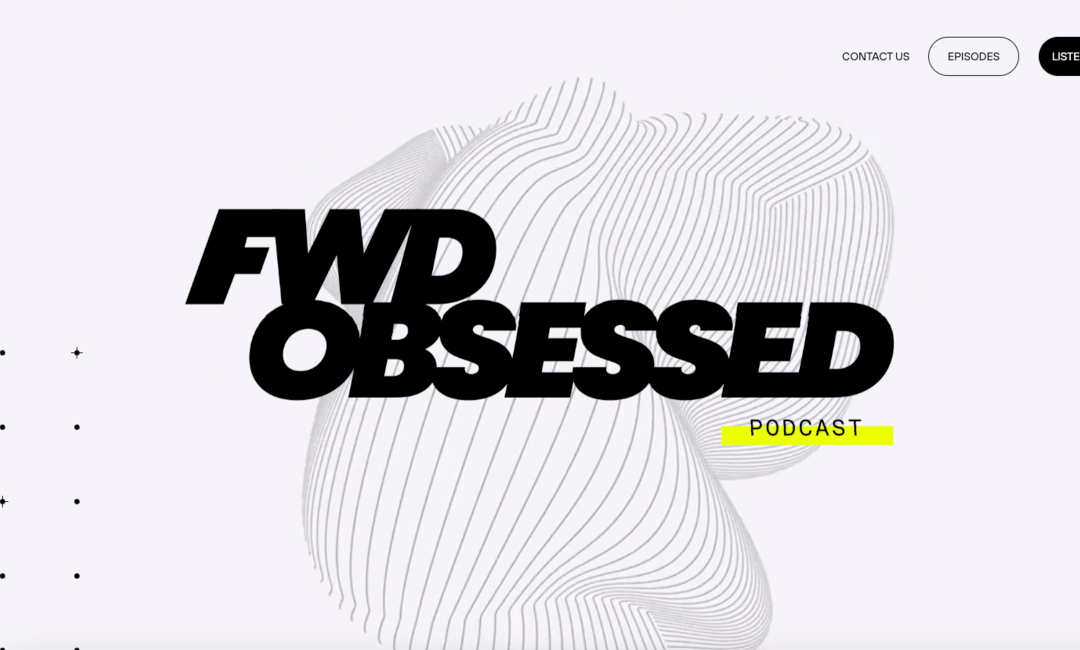
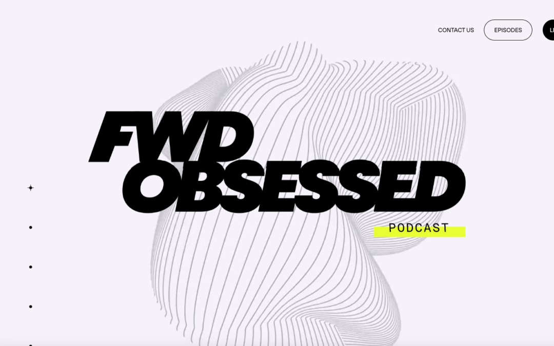
I like the stark black and white approach to the design on this podcast website. The scrolling display of sections is pretty trendy and this example works really well. I dig the background/hero animation as well.