by Gene Crawford | Oct 30, 2024 | Design Firm, Gallery

by Gene Crawford | Oct 29, 2024 | Design Firm, Gallery
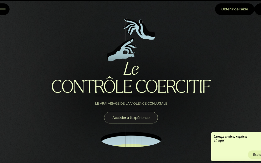
Beautiful interactions and nice dark mode inspired design. I love the light green/yellow color used for all the details.
by Gene Crawford | Oct 28, 2024 | Gallery, Marketing
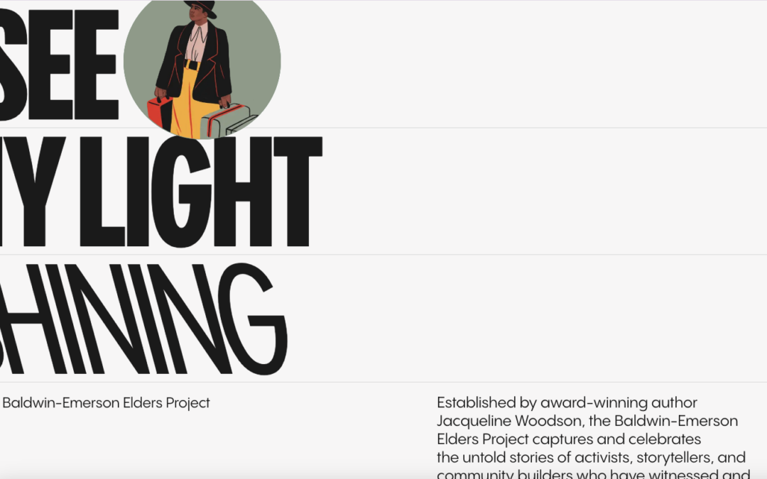
Very nice simple design but packed with strong illustration and detail work. I love seeing real commercial work that pulls in what the studio that created it can really do. Solid work.

by Gene Crawford | Oct 25, 2024 | Design Firm, Gallery
