by Gene Crawford | Jan 4, 2013 | Gallery
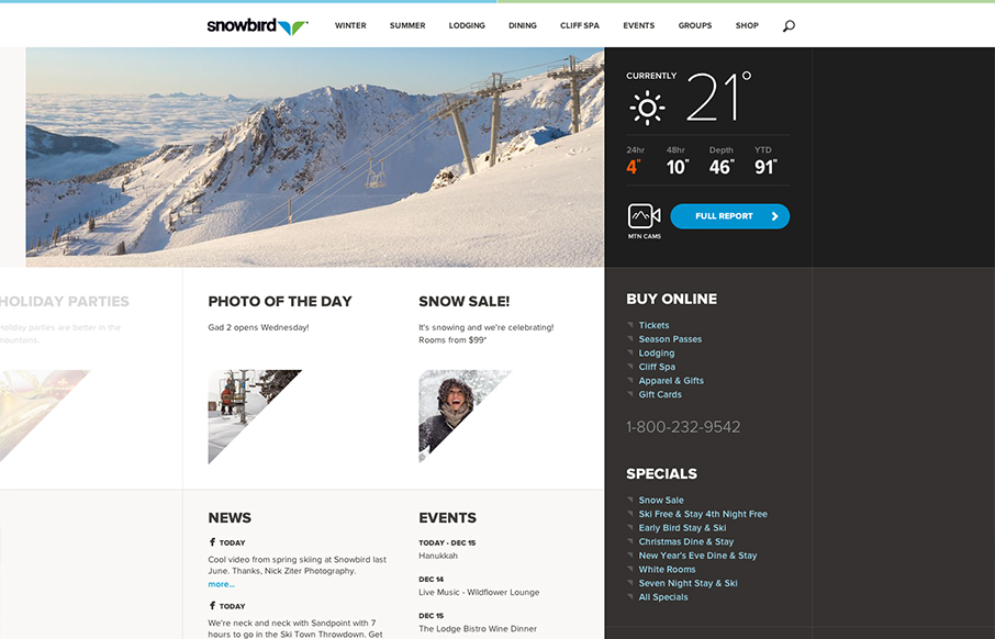
Well that’s a nice looking’ site. snowbird.com via @alliwagner— Chris Coyier (@chriscoyier) December 11, 2012 Agreed, it’s an amazing experience as you use it. The interactions are spot on and even more it’s fun to use. That’s...
by Gene Crawford | Jan 4, 2013 | Gallery, Music
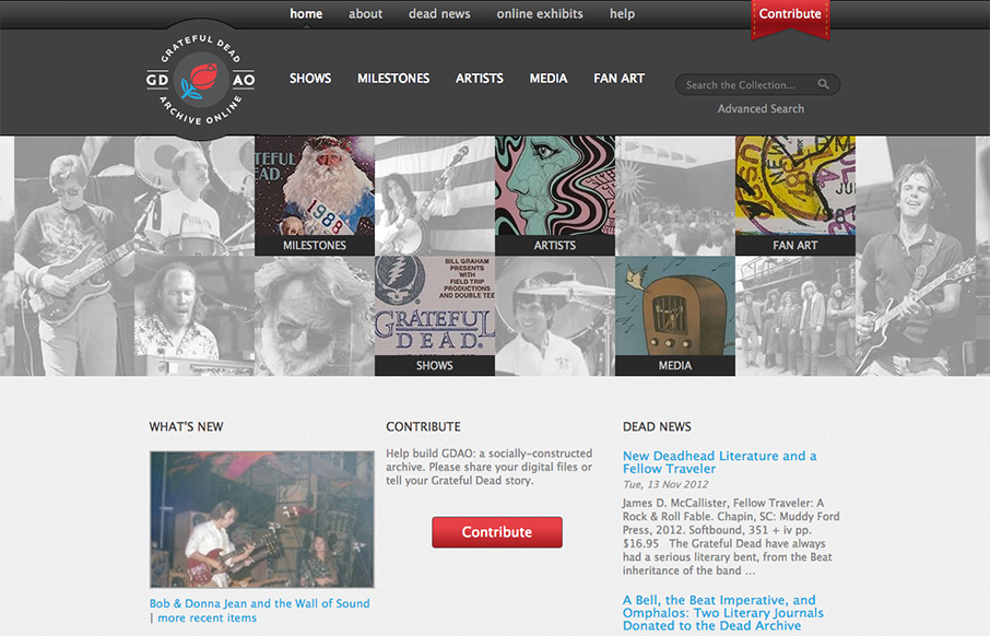
Went to gdao.org & time got away from me. What a wonderfully done site. One of my favorites.— Samantha Warren (@SamanthaToy) January 1, 2013 The thing I most like about this site is it’s information design. There’s a ton of stuff here to slog...
by Gene Crawford | Jan 3, 2013 | Gallery, Software
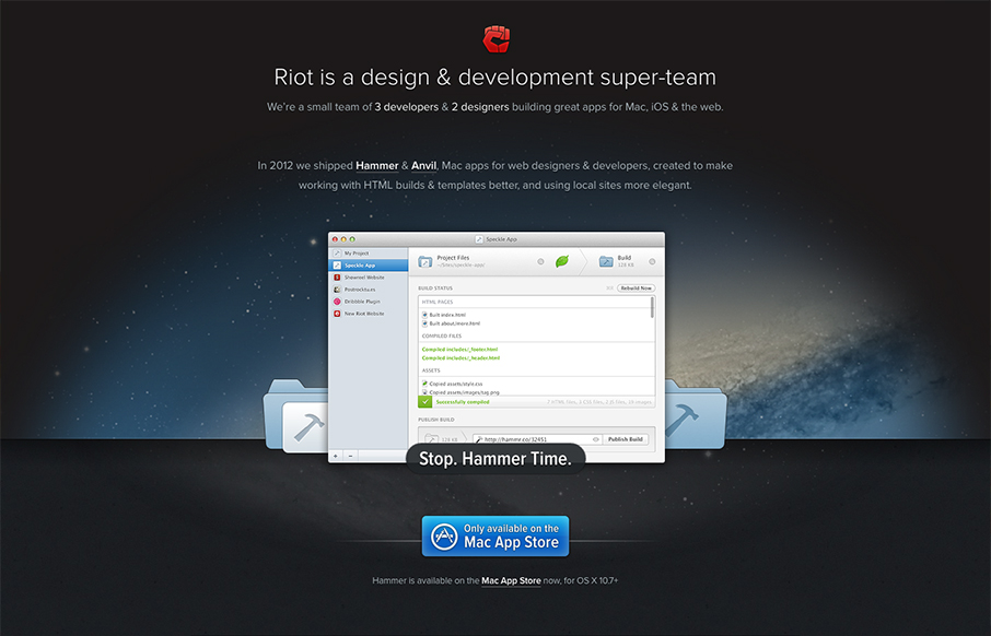
The crispness of this design just makes me smile. Then the subtle execution of the visual elements from the perfectly chosen color blue for the call to action, to the team display down to the faded map in the footer. There’s so much here visually it’s...
by Gene Crawford | Jan 3, 2013 | BizCraft, News, Podcast
Play or Download this Episode (Recorded live on 12/14/2012) Download MP3 (24.42 MB / 00:26:41) Subscribe to the Show iTunes / RSS feed / Get Email Updates About the Show This is BizCraft, the podcast about the business side of web design, recorded live almost every...
by Gene Crawford | Jan 3, 2013 | Gallery
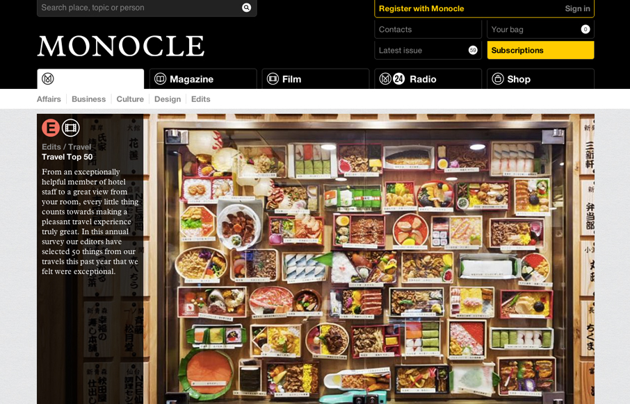
The new Monocle design is smart and sleekly crisp. I really love the header interaction design. It goes from full height to small and sticky very fluidly. Then the asymmetrical feel to the broken up grid of story blocks as you make your way scrolling down the home...
