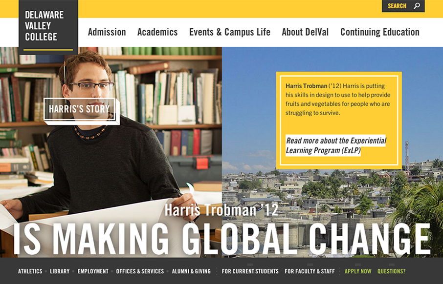
by Gene Crawford | Jan 7, 2013 | Education, Gallery
The @happycog-designed responsive redesign of delval.edu is seriously stunning. Love. /via @zeldman— Responsive Design (@RWD) December 19, 2012 I love the visual style of this site. It’s blocky and squared off and generally feels very graphic. I dig the...

by Gene Crawford | Jan 7, 2013 | Gallery, Marketing
Beautiful design from a great company.pro.buysellads.com— allan branch (@allanbranch) December 20, 2012 Like Allan said, this design is beautiful. I like the vertical spacing of the elements, the clean color palette, the clear narrative of what BySellAds Pro is...
by Gene Crawford | Jan 7, 2013 | Draft, News, Podcast
Play or Download this Episode Download MP3 (7.18 MB / 00:07:51) Subscribe to the Show iTunes / RSS feed About this Episode When Gene was on the BizCraft + Shoptalk Show crossover episode with Chris Coyer and Dave Rupert, he asked “Why use Sass?”. While...

by Gene Crawford | Jan 7, 2013 | Gallery
It’s a pretty standard design, big hero image, slider, long scrolling page. But what this design does well is rhythm, from the top nav bar down to the footer it just sings to me visually. I like how it goes from heavy dark background to light, do clean icons...
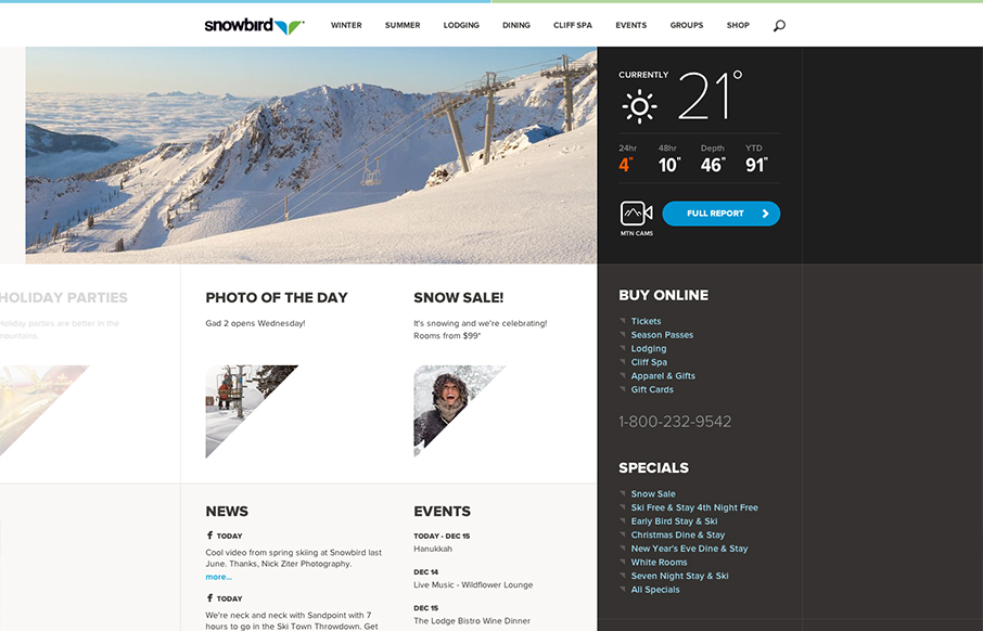
by Gene Crawford | Jan 4, 2013 | Gallery
Well that’s a nice looking’ site. snowbird.com via @alliwagner— Chris Coyier (@chriscoyier) December 11, 2012 Agreed, it’s an amazing experience as you use it. The interactions are spot on and even more it’s fun to use. That’s...