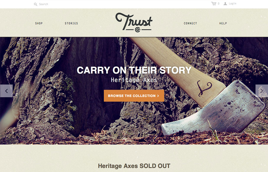
by Gene Crawford | Oct 1, 2013 | Gallery
What a great website. First off it’s about Axes, which are just cool to think about and use. The design of the site has lots of little surprises but executed in a simple way. The main nav has these great large icons that are worked into the drop-down navigation...
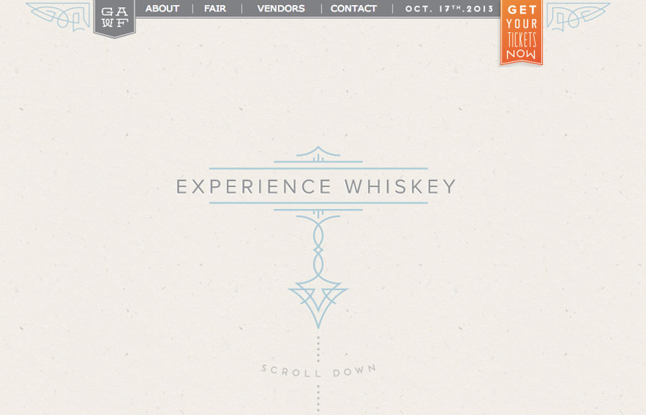
by Gene Crawford | Oct 1, 2013 | Food and Beverage, Gallery
Super simple design but I love the illustration work and limited feel to the layout while being ornate at the same time. It’s almost like whiskey itself, simple yet full of volume when it comes to taste.
by Gene Crawford | Sep 30, 2013 | News
Design Quips is a growing vault of quotable statistics that examines the web from both statistical and human perspectives: How people access the web, what they do online, and how technology evolves. ZURB, a close-knit team of product designers, created Design Quips to...
by Gene Crawford | Sep 24, 2013 | BizCraft, News, Podcast
Play or Download this Episode (Recorded on 09/20/2013) Download MP3 (49.35 MB / 00:53:54) Subscribe to the Show iTunes / RSS feed / Get Email Updates About the Show This is BizCraft, the podcast about the business side of web design, recorded live almost every two...
by Gene Crawford | Sep 4, 2013 | Gallery
Pretty standard layout here but it has enough little bells and whistles to keep it feeling quite fresh. I love the slight squeeze that the main nav across the top does as you scroll down. It’s enough to make you notice it and follow it. The rest of the layout...