by Gene Crawford | Aug 12, 2014 | Education, Gallery
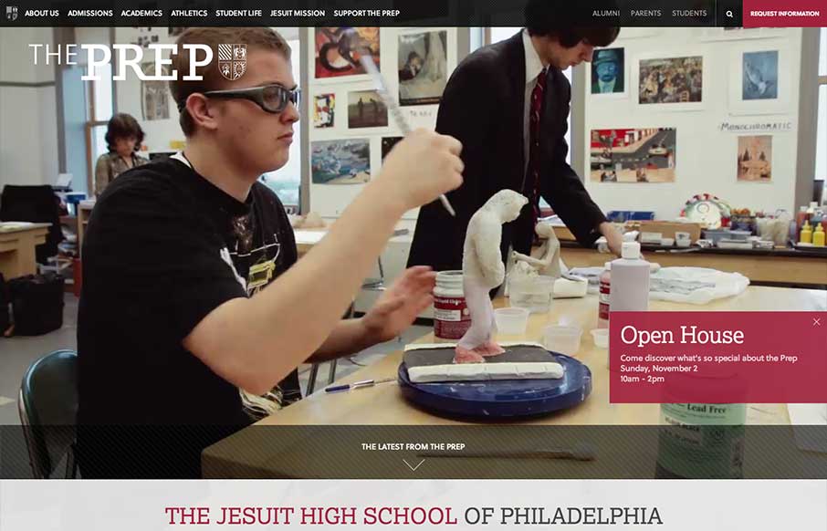
The St. Joseph’s Prep website is quite nice. I like the video background and how when the page scales down to smaller widths they swap out for a static image and then down to nothing for mobile devices. Nice strong easy to scan grid design too. Looks to be...
by Gene Crawford | Aug 11, 2014 | Food and Beverage, Gallery
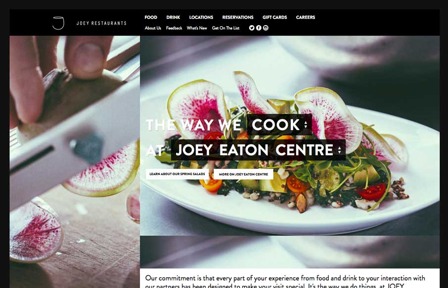
Decent responsive effort on the JOEY Restaurant Group website, it doesn’t appear to scale all the way down past say an iPad width though. I like how they keep the home page short and succinct and stuff.

by Gene Crawford | Aug 11, 2014 | Gallery, Travel
Pretty cool grid based layout, very solid. I’m not wild about using the hamburger icon alone as the navigation kick off for all screen widths and stuff. But I do give them points for just sticking with it. Airbus Group (formerly EADS), the largest aviation and...
by Gene Crawford | Aug 5, 2014 | Gallery
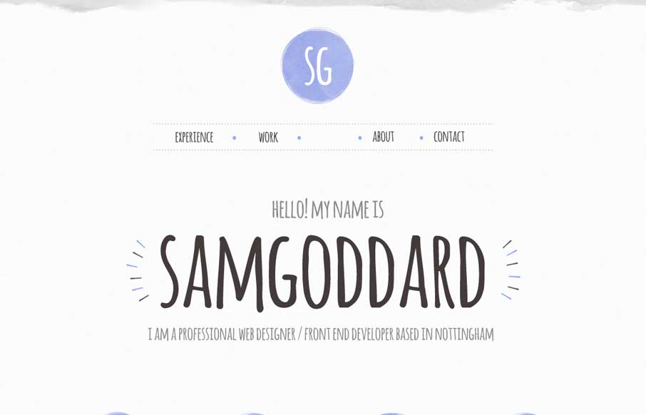
Cool portfolio site that looks like Sam is into trying out new stuff – including some nice animations and icon work. Like in the Work areas how he specifically refers to what skills he used per project, instead of a nebulous skill set dashboard like most...
by Gene Crawford | Jul 29, 2014 | Food and Beverage, Gallery
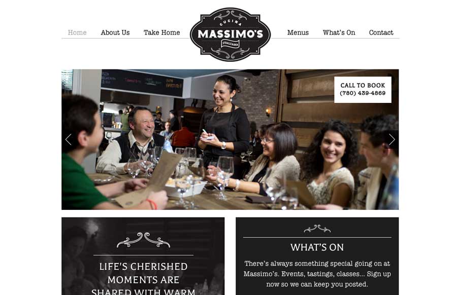
We love websites that make great use of fonts, and Massimo’s Cucina Italiana uses a couple of different fonts, accent illustrations, vibrant pictures, and black, white, and gray to tell the story of their restaurant. Simple, and effective. Submitted by: Landon...
