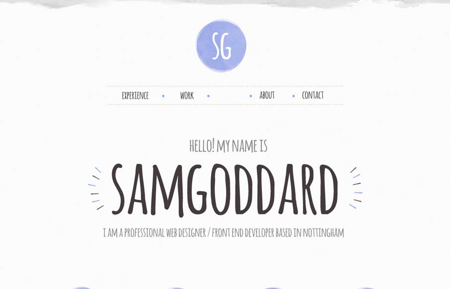
by Gene Crawford | Aug 5, 2014 | Gallery
Cool portfolio site that looks like Sam is into trying out new stuff – including some nice animations and icon work. Like in the Work areas how he specifically refers to what skills he used per project, instead of a nebulous skill set dashboard like most...
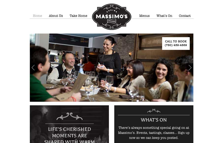
by Gene Crawford | Jul 29, 2014 | Food and Beverage, Gallery
We love websites that make great use of fonts, and Massimo’s Cucina Italiana uses a couple of different fonts, accent illustrations, vibrant pictures, and black, white, and gray to tell the story of their restaurant. Simple, and effective. Submitted by: Landon...
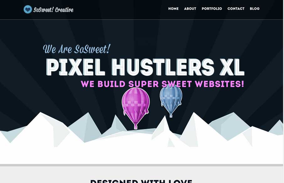
by Gene Crawford | Jul 25, 2014 | Gallery
Nice strong colors and graphic feel to this design. I really like the beating heart when the page loads up. I extra dig the way the contact form loads in too, nice touch. Submitted by: Stephen Scaff @SoSweetCreative Role: Designer & Developer SoSweet! Creative is...

by Gene Crawford | Jul 25, 2014 | Gallery
Just a really clean and nicely subdued site design for a designer. I like it much. Submitted by: Christopher Ware @christopherware Role: Designer & Developer
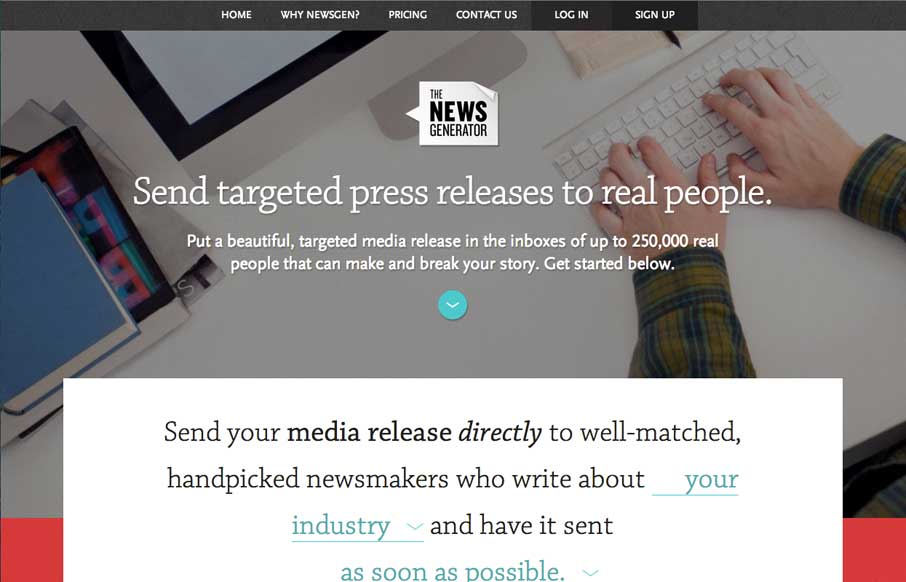
by Gene Crawford | Jul 25, 2014 | Gallery
Nice layout, it uses a lot of tried and true layout but it just feels a little different to me. I really dig the way the main signup form is right in the center of the home page but not in your face at the same time. Some clever form field design to go along with it...