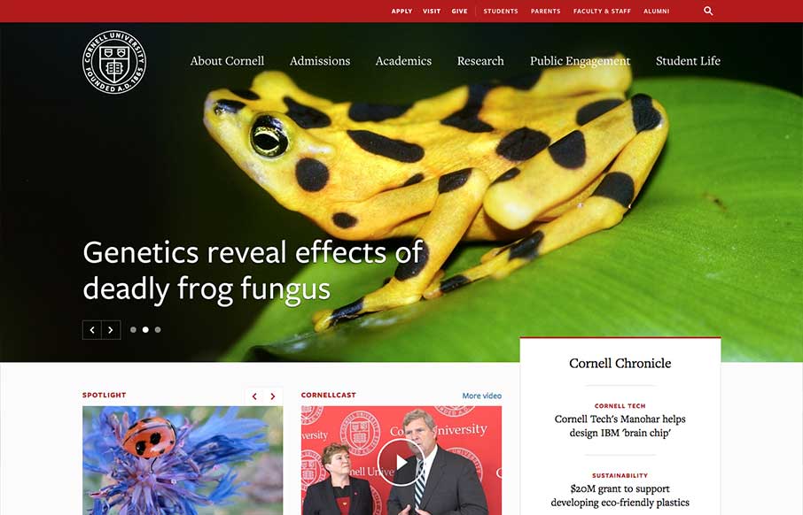
by Gene Crawford | Aug 14, 2014 | Education, Gallery
One of the better responsive higher ed site’s i’ve ever reviewed. There’s tons of nice design patterns in play here as well as other detail work. What’s most striking is that the responsive design isn’t just the home page, but seems to go...

by Gene Crawford | Aug 12, 2014 | Gallery
Nice clean simple website for a web designer’s portfolio. I like the long form write ups and just the simple showing of work. Submitted by: Phil Stringfellow @psdesignuk Role: Designer & Developer This is v6 of my personal website and portfolio, featuring...
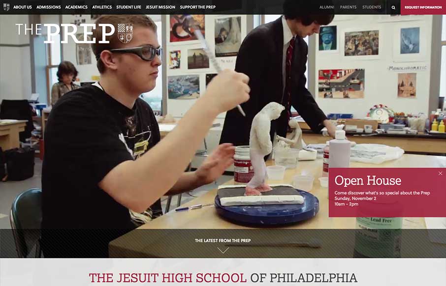
by Gene Crawford | Aug 12, 2014 | Education, Gallery
The St. Joseph’s Prep website is quite nice. I like the video background and how when the page scales down to smaller widths they swap out for a static image and then down to nothing for mobile devices. Nice strong easy to scan grid design too. Looks to be...
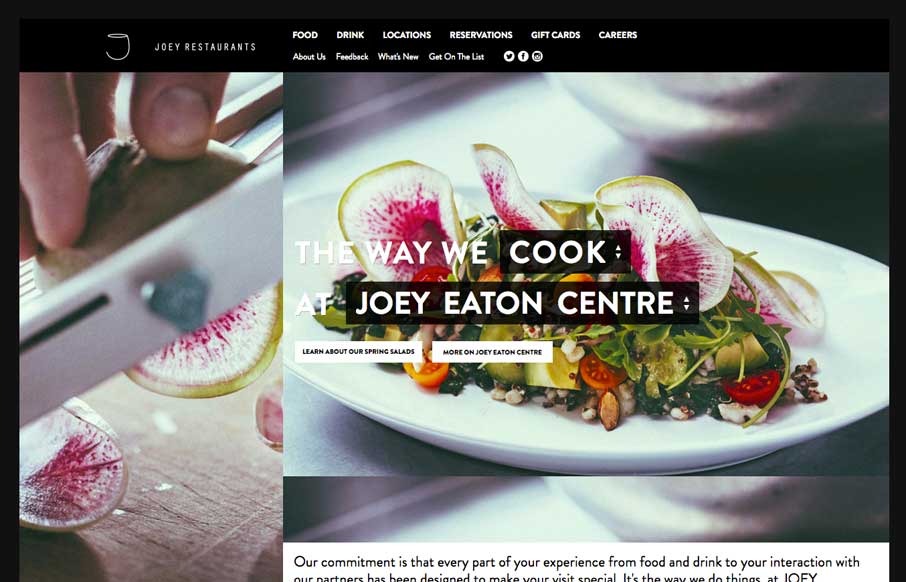
by Gene Crawford | Aug 11, 2014 | Food and Beverage, Gallery
Decent responsive effort on the JOEY Restaurant Group website, it doesn’t appear to scale all the way down past say an iPad width though. I like how they keep the home page short and succinct and stuff.

by Gene Crawford | Aug 11, 2014 | Gallery, Travel
Pretty cool grid based layout, very solid. I’m not wild about using the hamburger icon alone as the navigation kick off for all screen widths and stuff. But I do give them points for just sticking with it. Airbus Group (formerly EADS), the largest aviation and...