by Gene Crawford | Aug 10, 2016 | Gallery
Pretty rad asymmetrical layout for No-EE-KO. The layout is bold and paired perfectly with the bold photography to show it off almost perfectly.
by Gene Crawford | Aug 10, 2016 | Gallery, Portfolio
Very cool and fun approach to this design. I love the blend of the illustration work and the website’s pieces/parts as well. Beautifully done.
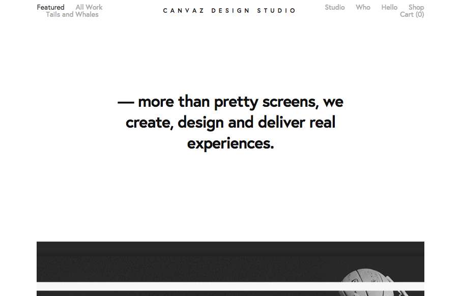
by Gene Crawford | Aug 10, 2016 | Design Firm, Gallery
Pretty cool breakdown of the links/interface on top of what is essentially a poster. I dig the graphic design approach a great deal here. From the Designer: This was made with the sole purpose of showcasing what we do best but also to some hidden and cool details that...
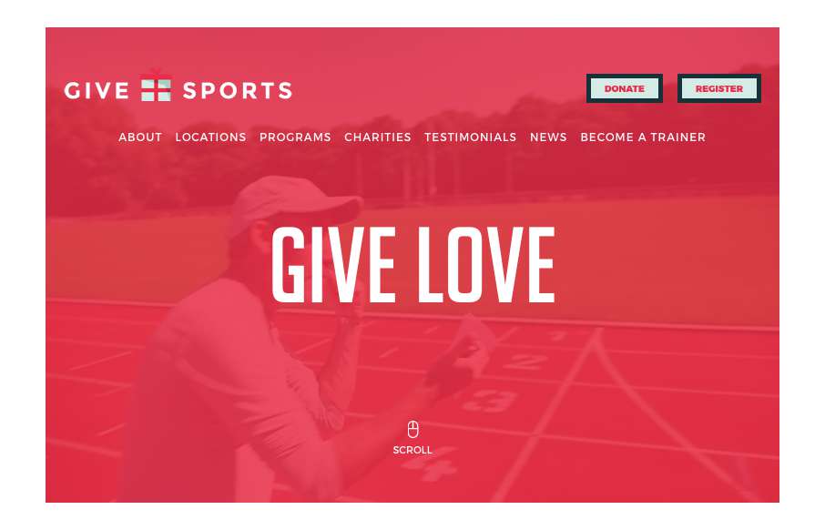
by Gene Crawford | Aug 9, 2016 | Gallery, Nonprofit
Strong, bold and clear design vibe. I love the heavy lines and graphic feel to the overall design esthetic. I like the interaction work too, simple yet strong. Really great work on this site design.
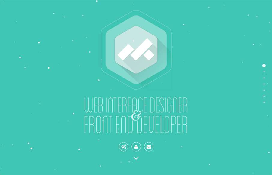
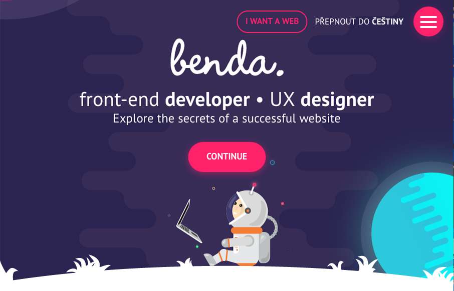
by Gene Crawford | Aug 9, 2016 | Gallery, Portfolio
Pretty fun website design. I dig the animation on the hero area then the design of the portfolio section is unique too. I dig it! From the Designer: Myk is a remote freelance WordPress front-end developer based in the Philippines. Submitted by: Myk Tongco Twitter:...