by Aaron Griswold | Jun 9, 2015 | Education, Gallery
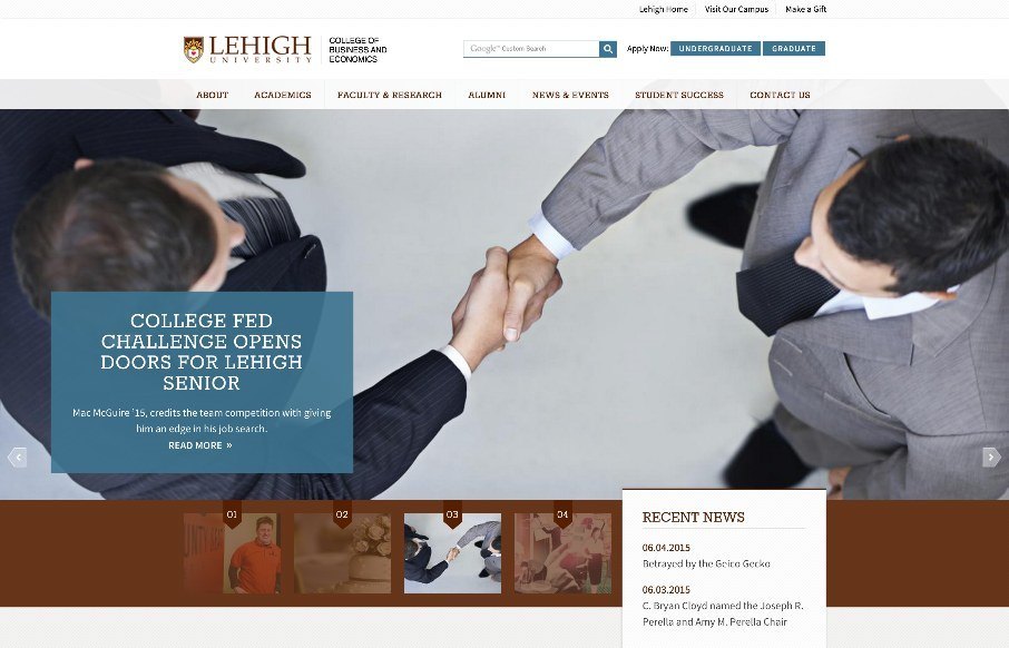
Like the clean site from Lehigh University College of Business and Economics – think it has good (and appropriate) UI / UX, even down to the main content / sub-pages. Like how they have the hamburger menu below the hero image so that you can go into more detail...
by Aaron Griswold | Jun 9, 2015 | Gallery, Government
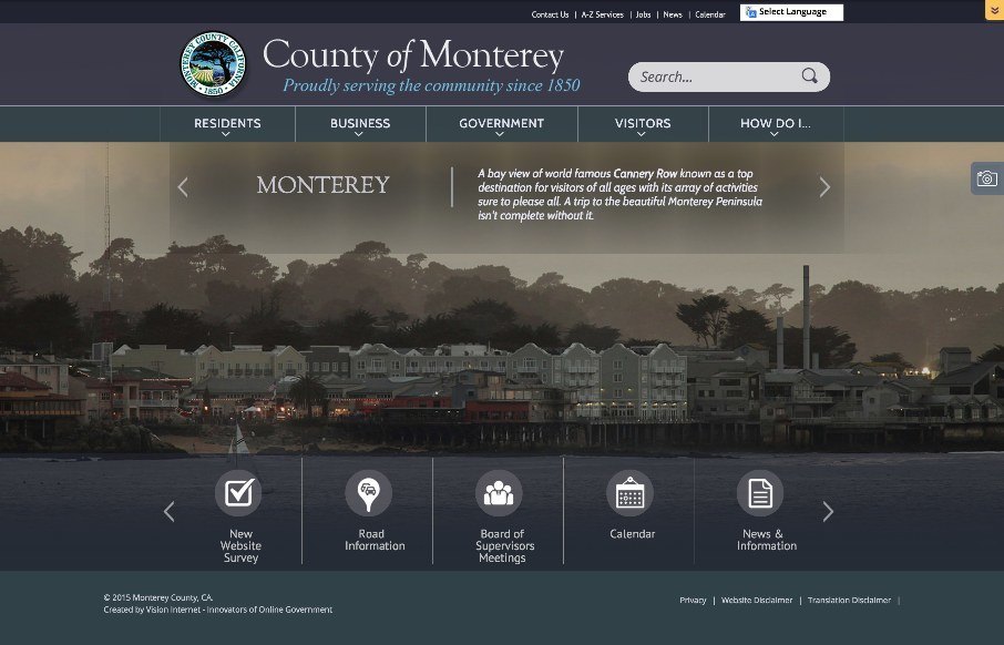
The above screen shot from the County of Monterey’s new website may be the single best feature of their website – that’s not to say that the site isn’t pretty decent on it’s own (don’t know if you know that government sites usually,...

by Aaron Griswold | Jun 9, 2015 | Food and Beverage, Gallery
It’s breakfast time in Nashville, Tennessee where we’re putting BDConf (www.bdconf.com) on this week. we just finished setting up, and I’m watching the dude get the breakfast ready for the attendees… and then I see this site in our inbox...
by Aaron Griswold | Jun 5, 2015 | Gallery, Radar
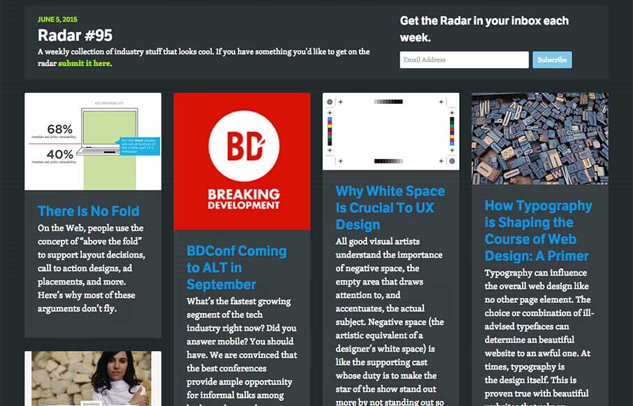
In this week’s Radar: There Is No Fold BDConf Coming to ALT in September Why White Space Is Crucial To UX Design How Typography is Shaping the Course of Web Design: A Primer Exploring the Hero Image Trend in Web Design A Designer’s Checklist For Designing...
by Aaron Griswold | Jun 4, 2015 | Gallery, Government
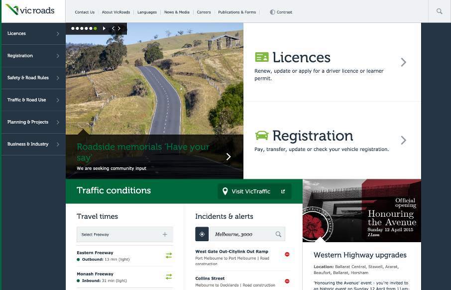
So I’ve looked at reviewing the Vic Roads site, out of Australia, a couple of times since it’s been in our queue and it took me a little while to come to peace with it. I think my initial problem was that it is very text heavy, so we don’t often look...