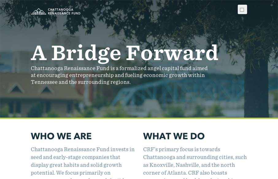
by Aaron Griswold | Jan 9, 2015 | Gallery, Nonprofit
Good way to end the week. The Chattanooga Renaissance Fund’s site has great sweeping full-width shots and video backgrounds of Chattanooga that is fun just to look at from a design perspective. Especially like the footer image. Also like the vertical type on the...
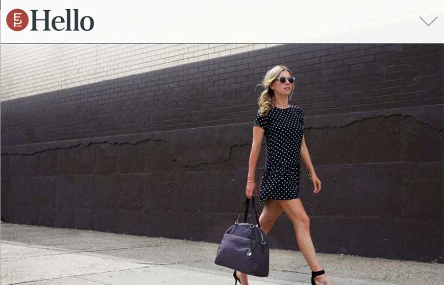
by Aaron Griswold | Jan 9, 2015 | Gallery
When I was starting to look at Electric Pulp’s new site, I realized this is the third time we’ve reviewed their website (2010, 2013 below). So it’s cool to see evolution of websites, and especially from companies that we really like. This new version...
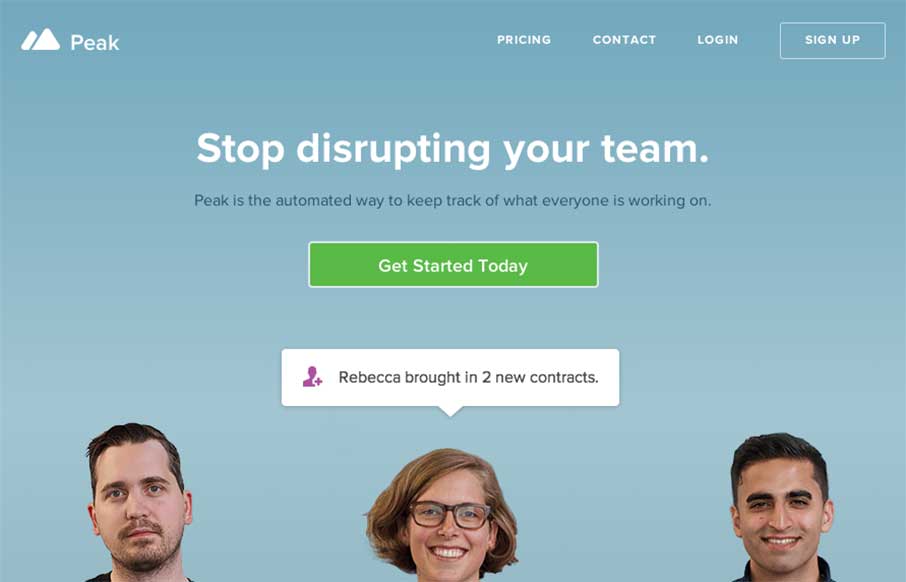
by Aaron Griswold | Jan 9, 2015 | Gallery
Looks like the folks at MetaLab (that made Slack) have added to their suite of apps with Peak. The app’s site is clean and has some of the expected app product page features – screen shots and explanatory copy – but what I like is how it handles...
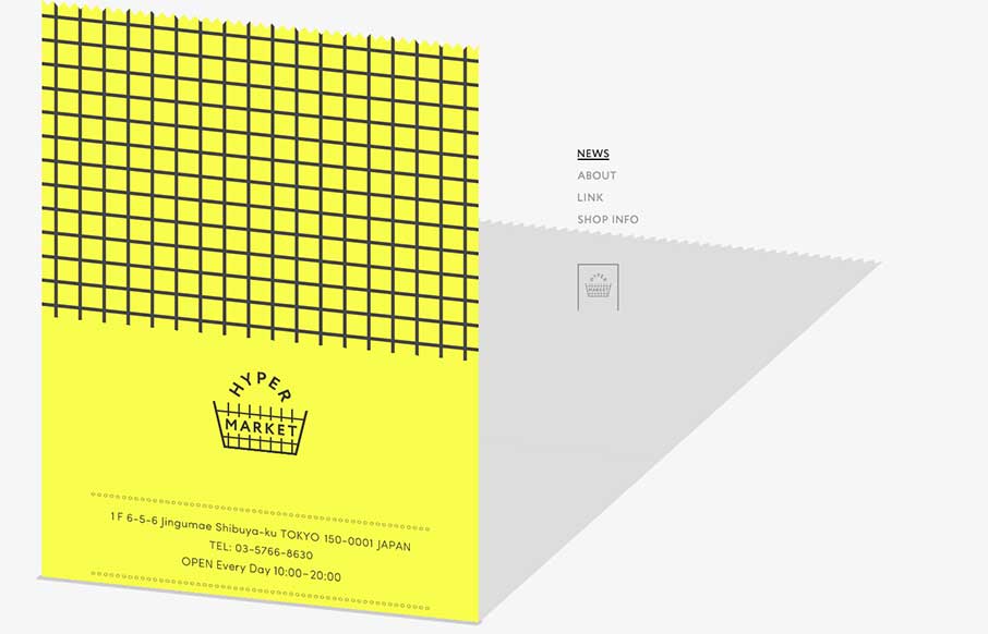
by Aaron Griswold | Jan 8, 2015 | Gallery, Shopping
Ok – it took me a minute to see what Hyper Market’s website was doing here. Scroll all the way down, and you see the gray on the right is a shadow of the yellow that’s scrolling up the screen – which is a cool effect. To accomplish that, it...
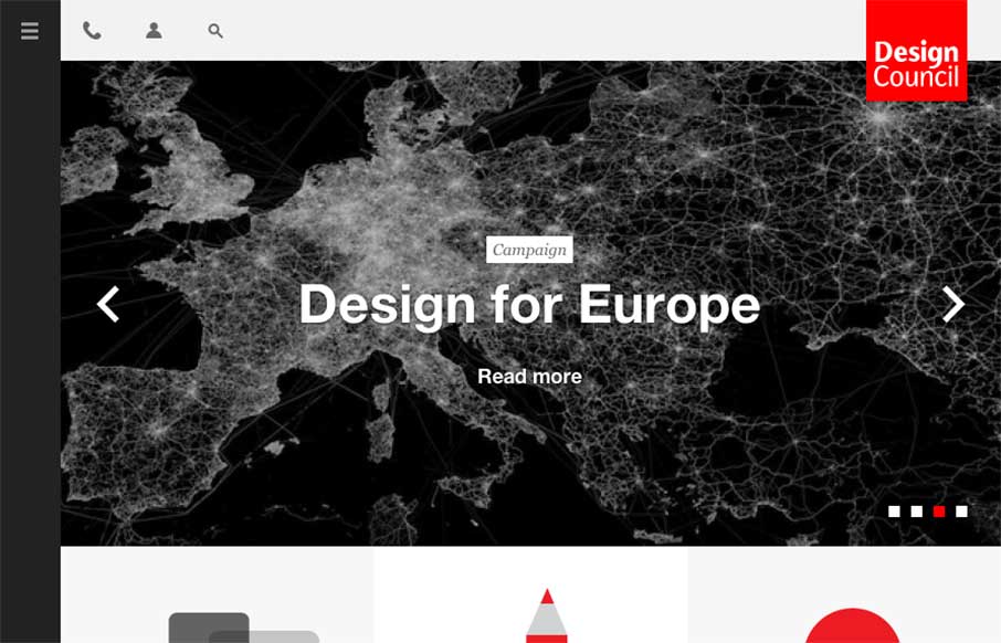
by Aaron Griswold | Jan 8, 2015 | Gallery
Make sure you expand / contract your browser width on this one – the menu and svgs grow and animate with the changes – meaning the Design Council has also thought about what designers do when we look at other websites: we experiment (the fact that the...